Unapologetic

By Alex Guyot ("Ghee(As in "geesegoose")-yo")

Double-click for controls.

Double-click to expand.

Double-tap for controls.

Double-tap to expand.

Fallback logo image for when CSS 3D transforms fail or are unavailable.

PayPal's Blunder with Apple Pay

September 30, 2014

Ian Kar, for Bank Innovation:

Apple and PayPal started talking early on in Apple’s development of Apple Pay, as Apple was setting up partnerships with the card issuing banks and card networks. Since PayPal’s a payments industry leader, it would have been shortsighted for Apple to not reach out to PayPal.

But while these talks were going on, PayPal went ahead and partnered with Samsung on the Galaxy S5 fingerprint scanner, a move that was reportedly forced onto PayPal by eBay CEO John Donahoe. PayPal’s now-former president David Marcus was purportedly categorically against the Samsung deal, knowing that it would jeopardize PayPal’s relationship with Apple. Donahoe won the day, however.

Apple was said to be absolutely furious that PayPal did the deal with Samsung, which led Apple to cut PayPal out of the Apple Pay process entirely. (One source said: “Apple kicked them out of the door.”) This dust up with Apple was a big reason that David Marcus ended up leaving PayPal for Facebook.

Ouch.

We'll find out just how big a mistake this was for PayPal when Apple Pay launches this month, but based on how much the banks are already pushing Apple Pay (the Chase app on my phone has had an Apple Pay advertisement on the main login screen since the day of the Apple event earlier this month), I think this could be a pretty huge loss. It's a shame that PayPal's president knew the right way to go and was overruled anyway.

Via Daring Fireball

iPhones 6 Approved for Sale in China

September 29, 2014

Reuters:

The Ministry of Industry and Information Technology (MIIT) said on its website on Tuesday that it had approved the iPhone 6 after Apple addressed potential security risks that could allow personal data to leak.

In the U.S. Apple is being criticized by the FBI for iPhones having too much security. In China, iPhones were being held back from sale because they posed security risks for people's data.

Something is off here.

Consumer Reports Bend Tested a Variety of Smartphones

September 27, 2014

Consumer Reports:

Two days ago, the Internet erupted with photos of bent iPhone 6s, and a very-viral video of a guy creasing an iPhone 6 Plus with his bare hands. It seemed like a serious concern, yet everything about the uproar was highly unscientific. We don’t like unscientific, so we promised then that we would use our lab equipment to find out just how delicate the iPhone 6 and 6 Plus really are. We also promised to run the same tests on comparable smart phones. We’ve done that now, and our tests show that both iPhones seem tougher than the Internet fracas implies.

So much for Bendgate.

On a somewhat related topic, I'm impressed that pockets are strong enough to concentrate 110 pounds of pressure on something without ripping or otherwise relieving the force. I've never really thought about it, but as John Siracusa noted in the latest ATP, cloth is a surprisingly strong material. Also, you have to be a special class of stupid to feel that much pressure accumulating and continue trying to force your device into that position instead of just taking it out of your pocket.

More From Tim Cook

September 20, 2014

Part two of Tim Cook's interview with Charlie Rose came out on Monday. It was a crazy week so I just got around to listening, but Cook has more interesting points on Apple's view on privacy (as well as some thoughts on the environment and humanity in general), a good addition to their new privacy page which I linked yesterday.

The end of Cook's interview is only the first 21 minutes, after that is Yves Behar. Behar's thoughts on design are interesting as well, but if you're only interested in Cook then note that this section is not nearly as long as the first part was.

Tim Cook on Privacy

September 19, 2014

Tim Cook:

A few years ago, users of Internet services began to realize that when an online service is free, you’re not the customer. You’re the product. But at Apple, we believe a great customer experience shouldn’t come at the expense of your privacy.

Our business model is very straightforward: We sell great products. We don’t build a profile based on your email content or web browsing habits to sell to advertisers. We don’t “monetize” the information you store on your iPhone or in iCloud. And we don’t read your email or your messages to get information to market to you. Our software and services are designed to make our devices better. Plain and simple.

[...]

Finally, I want to be absolutely clear that we have never worked with any government agency from any country to create a backdoor in any of our products or services. We have also never allowed access to our servers. And we never will.

Our commitment to protecting your privacy comes from a deep respect for our customers. We know that your trust doesn’t come easy. That’s why we have and always will work as hard as we can to earn and keep it.

Follow the title link to check out Apple's entire mini website on privacy. Great stuff, this is what should be expected from all companies that we give our personal information to.

Federico Viticci on How iOS 8 Has Changed How He Works on His iPhone and iPad

September 19, 2014

Federico Viticci:

There are hundreds of new features in iOS 8 and the ecosystem surrounding it that signal a far-reaching reimagination of what iOS apps should be capable of, the extent of user customization on an iPhone and iPad, or the amount of usage data that app developers can collect to craft better software.

Seven years into iOS, a new beginning is afoot for Apple's mobile OS, and, months from now, there will still be plenty to discuss. But, today, I want to elaborate on my experience with iOS 8 in a story that can be summed up with:

iOS 8 has completely changed how I work on my iPhone and iPad.

Great post. It's long, but find some time to sit down and read through the whole thing (▼)(▲)Perhaps while waiting in line at the Apple Store to get the new iPhone.. Exciting times to be an iOS user.

iOS 8 Coverage

September 17, 2014

I would be writing things about iOS 8 over here except there's no point because MacStories is doing such a fantastic job that I would be doing you all a disservice by not simply pointing you in that direction (title link).

On another note, one of their articles is mine, so I guess I did write something about iOS 8. You can find my review of the new Messages app here.

My Review of Messages for iOS 8

September 17, 2014

I mentioned this in my last link but I'll give it its own dedicated post, too. My next article for MacStories is out today, an in depth review of the new Messages app for iOS 8, including the completely new direction Apple is trying to point us in.

With iOS 8, Apple wants Messages to be about more than just text.

Charlie Rose Interview with Tim Cook

September 14, 2014

Part one of a really great interview of Tim Cook by Charlie Rose. Cook chooses his words carefully, and many of the lines he delivers are marketing speech, but looking past those he talks surprisingly openly about Apple, including its strategies, culture, and leadership. You can see and hear the passion Cook has for the company. His thoughts on working with and eventually taking the reins from Steve Jobs are sincere and very interesting as well.

Well worth a listen if you have the time. Part two comes out tomorrow.

The Watch Punt

September 13, 2014

Marco Arment:

The ideal smartwatch would have a high-resolution, color, self-illuminated but not too bright, highly visible yet completely subtle screen that’s always on, but isn’t tacky and doesn’t draw much attention to itself from others. The screen must be as large as possible so you can read and touch it nicely, but as small as possible so it isn’t ostentatious and doesn’t look out of proportion on a wrist. This screen, and all of the other components, must use as close to zero power as possible because the battery needs to last at least a week (ideally much longer), weigh as little as possible, and occupy almost no space.

So it needs to be bright, dim, bold, subtle, large, and small, with a battery that lasts a month with zero mass, and some compelling everyday applications beyond telling time and showing phone notifications. The true design challenge isn’t making it pretty — it’s making it good.

Seeing other smartwatches fail at these impossible challenges, many of us assumed that Apple had to be working on something different for their “wearable”.

[...]

Nope. They don’t. It’s a watch. And it’s very similar to other smartwatches we’ve seen — just executed far better. (We hope.)

Apple didn’t find a way around the laws of physics. They didn’t somehow unveil a revolutionary battery or screen technology that the world had never seen before. They punted again. In the absence of any better alternative approaches, they just did what they could with today’s technology.

Apple Moves Current Subscribers to Special Annual iCloud Storage Plans

September 12, 2014

From an email I received from Apple Wednesday morning:

We recently announced new, more affordable iCloud storage plans. As a thank you for being a current iCloud storage plan subscriber, we’ve increased your storage plan and you will be receiving a refund based on the reduced plan price.

[...]

Your plan has been upgraded from 15 GB of total storage at $20.00 a year to 20 GB at just $10.99 a year.

[...]

NOTE: This annually priced storage plan is only available to current iCloud storage plan subscribers. You may cancel or downgrade from your device at any time. If you choose to change to one of our new plans, you won’t be able to switch back to this annual plan.

Nice of Apple to refund current subscribers and automatically move them to the new plans. Nicer that they allow us to stay on the annual plans we're accustomed to instead of forcing us into month to month payments.

That said, seems like annual plans should be an option for everybody. Month to month charges are annoying, even small ones. And while I may still have my annual plan now, if I ever need more than 20GB of storage I will be forced into month to month payments as well. Which is probably exactly what they expect and want to happen.

Shawn Blanc on This Week's Apple Announcements

September 12, 2014

Great article from Shawn Blanc on Tuesday's Apple event and new product announcements.

Apple Watch and Apple Pay are stupid names for cool things

September 11, 2014

Lex Friedman:

As named by Apple, we have an Apple Watch that can use Apply Pay to buy an Apple TV at the Apple Store.

That’s lame.

I'm not sure I agree with Lex's opinion that they should go back to using “wacky, original names like Performa and Quadra”, but I definitely agree that if they are bringing the age of “i” prefixes to an end, replacing it with “Apple” is not the right direction.

Side note: Lex has some kind and thoughtful words at the top of this post on the recent Macworld layoffs as well. Worth a read.

A Watch Guy's Thoughts on the Apple Watch After Seeing It in the Metal

September 10, 2014

Absolutely fantastic write up from Benjamin Clymer at Hodinkee on Apple's Watch (▼)(▲)Apple's Apple Watch? Screw this name...:

I won't get into the raw functionality of the Apple Watch – for that, refer to my colleague Kelly Jasper's introductory article here. Instead I've chosen to focus on the many things I believe Apple got right and those I believe they got wrong, all the while viewing this piece of wearable technology not as a digital peripheral, but as an actual watch. Essentially, what can our friends in Switzerland learn from Apple, and what can Apple learn from the Swiss.

Reading this post got me much more excited for the Apple Watch than I was after the keynote. In particular I was worried about how the watch would look on the wrist. I don't want a watch that's as big as my entire wrist, or one that's small width-wise but too tall in depth. Clymer mostly put those fears to rest with this:

The Apple Watch is available in both 38 mm and 42 mm. I tried them both on, and they both worked perfectly on my wrist. They didn't exaggerate the options and make one decidedly male oriented at 44 mm and a girly equivalent at 35 mm or the like. Any man, woman, or child could pull off either size with ease. This may not seem like much, but remember this is Apple's first watch, and it would be a very easy mistake to make it too big or too small. I'm sure there was much discussion about making it larger – how could there not be? It would've made the entire interface bigger, bolder, more recognizable from afar and easier to use. The fact that they chose to actually make the thing wearable shows a great deal of restraint. The 38 mm example is particularly nice on the wrist as seen here.

And here's the image that accompanied that paragraph:

38 mm Apple Watch

From that picture I think the Apple Watch looks great. I'll probably be getting the 38 mm version. As nice as the bigger screen size would be, this is a wearable device, so in this case more than with any devices before it, physical appearance really does trump functionality (to an extent, of course).

Macworld Staff Laid Off, Jason Snell Leaving

September 10, 2014

Sad news from Macworld today. Most of their staff has been laid off and their print magazine is coming to an end. Jason Snell has also announced his own departure from IDG, but more on his own terms.

From Snell's post this morning:

Unfortunately, many of my colleagues lost their jobs today. If there's anything I can do to help them, I will. I have had time to plan for this day, but they haven't. You probably know some of them. Please join with me in giving them sympathy and support.

IDG waited until the day after the huge Apple event, squeezing the last bit of use out of Macworld's fantastic staff before canning them. Just terrible.

Thoughts on This Morning's Event

September 9, 2014

This morning was the big September Apple event. In the lead up, and in the past, this event has often been referred to as the “iPhone event”. This year however, while Apple did introduce 2014's iPhone lineup, it was clear from the start that it was not the main focus.

From what I could make out between live stream outages and over the voice of the Mandarin translator, which was mistakenly overlaid on the main feed, Apple rushed straight into iPhones, skipping their usual lead up of numbers and statistics. The first things we saw, not surprisingly, were the two new iPhone models, the 6 and the 6 Plus.

iPhones

iPhone 6 and iPhone 6 Plus

I'm excited about the new iPhones. I stand by my own past admonitions that 5.5 inches is far too big, but 4.7 seems like an acceptable leap, especially with the nice new gestures they've added to make reaching the top of the display easier. The improvements to the camera, 240 FPS slo-mo, A8 & M8 chips specs, improved display, etc. are all welcome upgrades, but the biggest news for iPhones is of course the new Apple Pay system. Using the new NFC antennas in the iPhones 6 and 6 Plus, we will be able to add our credit cards into our phones and pay at participating stores by simply holding the phone near the NFC sensor and authenticating via Touch ID. I'm slightly regretting backing Coin now, but oh well.

Unfortunately, none of my wishes from yesterday seem to have been answered. While we can't be fully certain at this point since it isn't mentioned anywhere, leaks suggest that Apple likely still hasn't revved the RAM. The camera has been improved in general, but since they made no mention of improvements in shooting at night I think we can assume it's still about the same.

The memory intervals just confuse me. The iPhone 6 starts out at the same 16GBs of memory for $199 that the last few baseline iPhones have begun with, but the step up model for $299 leaps all the way to 64GB. There is no model of iPhone 6 or iPhone 6 Plus which comes with 32GB of memory. So why keep 16GB around at all? Particularly with 240 FPS slo-mo videos and 43MP panorama shots, 16GB of memory is a ridiculously low level. And while many customers will reduce the impact of these huge files by turning on the “Optimize iPhone Storage” setting, recall that the free iCloud storage plan is still limited to 5GB. It stands to reason that many of the same customers who don't want to pay a premium for an iPhone with more storage will also be opposed to paying for extra iCloud storage, so storing all their photos and videos in the cloud is not an option.

If you go all the way to the bottom of the lineup, you'll find the iPhone 5c hanging around at a single storage capacity of 8 gigabytes. That Apple is keeping such a low level of storage around astounds me. Even more so because people having open space on their devices is in fact in Apple's own interest. Many of my friends here in Tucson take months and months to update their iPhones to the next OS simply because when they try they are informed that their devices do not have enough storage to download the update. If Apple would just give them the extra storage, as the company most certainly has the ability and resources to do, then they could increase the speed of their upgrade numbers. But maybe those numbers are so high already that Apple doesn't really care. Regardless, I'm hoping for a mid-year upgrade that moves 32GB storage levels back into the lineup, and gets rid of 16 completely. Maybe they're just trying to dump inventory.

All in all, I'm looking forward to the new iPhone 6. I think it's a great upgrade, and I'll be in line at the Apple Store on the 19th to pick one up for myself.

Apple Watch

Apple Watch

What turned out to be the main event, the rumored iWatch is finally confirmed and out in the open. Surprisingly though, they decided to name it “Apple Watch” instead of “iWatch”, a choice which I disagree with.

The Apple Watch is quite an impressive device, boasting a full color touch display, a “digital crown” (the spinner on the side of classic watches which you would use to wind them in the past and is now used as a clever way to navigate), inductive charging, and much more. I won't go into much detail on the device here, as there are better sources to find that, but I'll just give my initial impressions.

I think the device looks great, and has massive potential, but I also have some concerns. While it has Apple's usual beautiful design expertise, I find it still looks somewhat bulky for my tastes. That said, it's not massive like some “smartwatches” out there, and I've also only seen it in pictures and videos, so maybe it's size won't bother me when I try it in person.

Beyond the size of the device, I think my reserved enthusiasm stems mostly from a nagging fear that the device's battery life will be less than optimal. As everyone who watches keynotes regularly knows, Apple loves bragging about the battery lives of their devices. During the Apple Watch announcement however, the only time anything near battery was mentioned was when they discussed the charger. Toward the end we got a small nugget when Tim Cook implied that we would need to charge the device nightly. If that's true then I'm honestly okay with that, but only if the device truly lasts the entire day. If the watch dies at 8:00 each night I will be vastly disappointed with it.

My trepidation is also fueled by the fact that the Apple Watch really seems to have made no compromises. Leading up the event, conjecture was made that there would be no screen, that it would controlled by spinning the outside of a circular watch and the screen would not be touch sensitive, or that it wouldn't even be a watch at all. The only way we thought Apple could do it all was to make the device huge. And yet, here we have the Apple Watch and it has a full color touch sensitive display, all sorts of sensors, an entire computer architecture on a single chip, full Siri integration, and... Good battery life? It seems impossible, and since Apple didn't mention anything about that final, yet extremely important statistic, I'm worried they might not have fully pulled it off.

But then again, this is Apple.

Tomorrow

September 8, 2014

As you probably all know, tomorrow is Apple's much anticipated September event.

Apple Announcement

Expectations

We're expecting to hear about a new iPhone (most likely two), as well as a pre-announcement of Apple's long awaited entrance into the wearables market (rumors indicate an “iWatch”). The event is being held at the Flint Center for the Performing Arts in Cupertino, a far bigger location which Apple has only used a few times in the past, and onto which Apple has built a strange white structure. Along with the usual reporters, we've heard Apple has invited top editors and bloggers from the fashion world as well.

The main rumors regarding the iPhone lead us to expect two new screen sizes, a 4.7 inch and a 5.5 inch. Along with the usual improvements to processor, camera, etc, there's also been buzz about the new iPhones including NFC capabilities. This would allow customers to use their iPhone as a mobile wallet, paying for items in supporting stores with a simple scan of their finger from Touch ID. Apple has supposedly already cooked up deals with CVS and Walgreens to support their payment system out of the gate.

Wishes

Expected rumors aside, here's just a few things I'm hoping to see in tomorrow's keynote:

  • A camera which works better at night

The camera on my 5S is fantastic during daylight hours, but as soon as it gets dark out it is rendered nearly useless. I would love to see some improvements in image quality when shooting in darker environments.

  • An increase in minimum memory

16 gigabytes of memory is simply too small for the amount of information people wish to keep on their devices these days. Apps, music, photos, and the notoriously evasive “Other” render 16 GB devices full in a ridiculously short amount of time. I'd love to see Apple shift the default configuration down and make 32 GB of memory the minimum.

  • An increase in RAM

I'm tired of reloading every tab I have open in Safari after simply switching to another app. iPhones and iPads now pack a huge amount of power with their 64 bit architectures and A7 chips. It's time Apple gave them more RAM so they can better utilize this power, as well as to make day to day activities require fewer app/tab reloads and improve everyone's iOS experiences.

All in all, this is going to be a massive event, both in content and importance. I'll be watching it from my Apple TV, and tweeting comments here. I'll also probably cover some of the announcements on this website at some point tomorrow after the event, so watch for that as well. If you want to tune in live yourself, and don't have an Apple TV, you can do so on Apple's stream. The event kicks off at 10 AM PDT. If you're not sure when that is (time zones are a pain), you can check the live stream page for a live countdown and calculate what time it starts for your own time zone.

Exciting times for Apple fans.

Christina Warren Reveals iCloud's Security Weaknesses

September 6, 2014

Great reporting from Christina Warren over at Mashable. You should read the whole article (title link), but here's the premise:

For just $200, and a little bit of luck, I was able to successfully crack my own iCloud password and use EPPB to download my entire iCloud backup from my iPhone. For $400, I could have successfully pulled in my iCloud data without a password and with less than 60 seconds of access to a Mac or Windows computer where I was logged into iCloud.

Apple needs to fix this.

What the New TestFlight Could Mean for Beta Testing

September 6, 2014

After Acquiring it earlier this year, Apple has finally rolled out its new beta testing app, TestFlight. Free on the App Store, TestFlight will massively simplify the process of beta testing on iOS.

Before TestFlight, beta testing iOS apps has been a mess for developers and testers alike. Devs are allowed to seed their betas to a maximum of 100 devices. That's right, not 100 people, 100 devices. This means that if you have a universal app and your testers are installing it on both an iPhone and an iPad, each tester is now taking two of your already very limited testing spots.

On a beta tester's end the process is complex as well. First you must make an account with the developer's chosen beta testing service, then you have to register each of your devices with the service (which requires you to install a “provisioning profile” on each device). With profiles installed you communicate to the developer seeding you a beta what your registered email address is and which devices you will be using for testing, then the dev has to manually add your devices so you get the next seed. Any mistake with any of these steps and you don't get access to the beta for at least until the next update is seeded.

The situation is greatly exacerbated each year when fall rolls around and many testers purchase new iPhones and iPads. Devices are registered through their UUIDs, and since new devices have new UUIDs, they need to be re-registered and developers have to re-add them and remove the old devices. I've never seeded an app myself so I'm unsure exactly how this works, but I've been told by various devs that it's no where near as easy as deleting the old device and adding the new one; there are many more steps involved.

TestFlight Should Solve All of These Problems

Obviously TestFlight is brand new and completely untested, so it could end up creating just as many new problems as old ones it solves. That said, the promise of TestFlight is to simplify the beta testing process. With TestFlight, provisioning profiles will no longer be necessary. Instead, everything will go right through the official TestFlight app and can be installed to a tester's devices without needing to go through a third party service. Furthermore, and perhaps most importantly, betas are tied to each tester's Apple ID instead of their device's UUIDs. Thus, testers can install a beta their Apple ID has been granted access to on up to ten devices at their own discretion. The developer no longer needs to manually add each individual device, nor does each device count against the dev's maximum seed limit. Speaking of which, that limit has been increased from 100 devices to 1,000 Apple IDs.

As I noted earlier, this is a new system and there could still be a lot of issues (for starters, I have no idea how hard it is for devs to get their apps onto the new TestFlight in the first place), but the potential implications are massive and great news for developers and beta testers alike. I can't wait to get my hands on a TestFlight beta and really see how much better the experience is.

IKEA's Apple Ad Spoof

September 5, 2014

Great idea by IKEA, hilarious ad.

Facebook Style Filtered Feed Coming to Twitter

September 5, 2014

Mathew Ingram, writing for Gigaom:

Earlier this year, when Twitter released its quarterly financial results, CEO Dick Costolo was asked whether the platform would ever implement a Facebook-style filtering algorithm, he hedged his answer by saying he wouldn’t “rule it out.” According to some recent comments from chief financial officer Anthony Noto, however, the company is doing a lot more than not ruling it out — it sounds like a done deal.

Inserting tweets into my timeline from people I don't follow is annoying, but removing tweets from it is intolerable. I know we've made fusses about Twitter before, and made what ultimately turned out to be empty threats to leave, but as Ingram notes, something like this changes the very core of the Twitter experience.

Protesting Twitter for its politics is noble, but that kind of thing is hard to get support for since most people won't care (▼)(▲)Or at the very least they won't care enough to inconvenience themselves by finding a new home for their social media posts.. If Twitter ceases to be Twitter though, that strikes me as a far stronger opportunity for disruption.

Hopefully if they do ship this feature it will remain optional instead of being forced on us, but I wouldn't count on that. If I am manhandled into a filtered stream, I'll be on the lookout for a more successful App.net.

Uber's Attempts to Sabotage Lyft

August 26, 2014

Casey Newton, writing for The Verge:

Using contractors it calls “brand ambassadors,” Uber requests rides from Lyft and other competitors, recruits their drivers, and takes multiple precautions to avoid detection. The effort, which Uber appears to be rolling out nationally, has already resulted in thousands of canceled Lyft rides and made it more difficult for its rival to gain a foothold in new markets. Uber calls the program “SLOG,” and it’s a previously unreported aspect of the company’s ruthless efforts to undermine its competitors.

Despicable business practices. This kind of anti-competitive behavior is illegal and needs to be stopped. Digging their hole deeper, Uber has explicitly denied previous allegations that it was calling and then canceling rides from Lyft, or trying to recruit their employees to come work for Uber instead.

After Uber became aware that The Verge was asking questions, Target CW sent out multiple emails warning contractors that talking to the press violated a non-disclosure agreement they signed when they joined.

Even after they've been caught Uber continues to try to cover it up. They know it's wrong and they don't care at all.

While it doesn't operate in my area, if I'm ever out of town and looking for a ride from one of these services, I will not be choosing Uber. (▼)(▲)The sad part is, I wouldn't be surprised at all if Lyft or other similar services are employing the same tactics against Uber, making them just as bad. Until that's proven though I would still use them over Uber. Innocent until proven guilty and all that jazz.

Building a CMS on Editorial

August 21, 2014

Yesterday I posted on a workflow I built in Editorial which pops up a user interface for connecting to a web server over FTP. That alone is quite useful to me for manipulating files already on the server, but before uploading new posts I first need to do quite a lot of work on them to get them ready to display properly on Unapologetic.

Last year I challenged myself to leave Squarespace behind and write a new website from scratch (▼)(▲)I have nothing against Squarespace, in fact I'm a huge proponent of the service. I just wanted to do some things on my website which were not possible within the boundaries of a template based system.. After a few months of work, Unapologetic was born. Fully coding the site had the advantages of letting me add some of my favorite touches, such as the in-text footnotes and drop down share sheets, but I lost the huge convenience of Squarespace's CMS.

Without a CMS and with my self-written code, before posting anything to Unapologetic I have to follow these steps:

  • Convert markdown to HTML.
  • Properly format every footnote with the necessary code.
  • Add the share sheet code to the top of the file, which requires the new post's URL slug to be pasted into multiple different places within it.
  • Place specific class tags on images depending on whether they are double portrait images or single landscape images.
  • Duplicate the file and prepare one with the header and footer code for a permalink page and the other to be placed into the home page.
  • Update the RSS file with the new post's information and a short description of it.

Doing that manually is a massive pain, and very much prone to human error. As such, I wrote a script in Pythonista last year which automated the whole process. I send it a file typed in markdown which includes the title, article type, and article description on the first three lines. The script breaks the file apart, takes out the top three lines and uses them to build the URL slug, identify the article type, and save the short description for the RSS update. Next it formats any footnotes with my custom footnote code, converts the text from markdown to HTML, formats images, adds in the code for share sheets (with the URL slug inserted in the necessary positions), then creates and uploads two different files, one formatted for the home page and the other for the permalink page. Finally the actual homepage and the RSS page are updated to include the new post.

I have been using this script for nearly nine months now and it works quite well, but after uploading my files there has been no easy way to edit them or otherwise manipulate them on the server. To solve the latter problem I built my FTP client UI, and for the former (as well as for the overall simplification of my posting workflow) I built another UI called “Post to Unapologetic”.

Post to Unapologetic UI

This UI moves the process of posting to my website into a GUI, where it is far easier for me to check that I'm not making errors with the positions of the data on the first few lines. I can also tweak the article type, change the auto-created permalink if I want to, and write the description of the post last instead of first. For the most part this is just a graphical interpretation of the same script I've been using, but I've also made a few tweaks to really make it possible to use Editorial as a nearly full CMS for Unapologetic.

Each time I tap the “Post to Unapologetic” button on the UI, before changing the markdown to HTML, the script first saves another file, “md.txt”, in the same folder as the new post which contains a dictionary of the post's data, including the markdown version of the text. With this file, each time I need to update a post on Unapologetic, either with new information or just to fix a typo, I open the folder with my FTP client and use a special button (▼)(▲)This button is only in my own personal version of the client so you won't see it if you installed the workflow yourself. to open and interpret the md.txt file. It opens in Editorial with the contents of the markdown version of my post, with the relevant data such as the post's permalink, description, article type, and title in the first few lines at the top. From here I can edit my post normally and then run my Post to Unapologetic workflow once again. The workflow reads the lines placed at the top and determines that this is an update instead of a new post, then it formats the post back into its proper HTML form, including footnotes, share sheet, etc, and overwrites the old file for the permalink and home page. Since it knows the post is an update, it skips adding it into the RSS feed or home page for a second time.

With this combination of two UI workflows, I've taken a shaky, text based method for posting which had no good way to make updates or error check before uploading files live to my website, and turned it into a much more stable and easy to work with process. Editorial's UI module has allowed me to build a content management system from scratch, and this CMS runs right on top of the app which I do all of my actual writing on.

I won't post the workflow publicly because it's completely customized to this website, and thus won't be useful to anyone else in its current form. If you are interested in putting something similar together for your own website though, and wish to see my code, ping me and I'll send you a link to the private workflow.

The things that iPads can do these days continue to amaze me. With the impending release of iOS 8, which brings with it Extensions and other fantastic new enhancements, I can't wait to see want the next era of iOS automation is going to look like, and look forward to my iPad gaining even more powerful abilities.

FTP Client UI for Editorial

August 19, 2014

I recently started playing around with the UI module built into the fantastic iOS apps Editorial and Pythonista. In need of a project to learn on, I decided to take a Python script I wrote last year for connecting to a server and manipulating files over FTP (File Transfer Protocol) and build a User Interface for it.

I built this website from scratch and have it hosted on a standard Apache server, so the only way for me to access my files is with FTP. My script from last year defined a class named FTP_Client which had various functions for standard FTP commands such as creating and uploading files, creating and navigating folder directories, and downloading and deleting files. The script was written in Pythonista, so it took a little tweaking to move to Editorial, but nothing too difficult or confusing. The biggest difference is that Editorial can't import Python scripts from other files, which means the entire FTP class has to be included in the code of any UI which uses it instead of keeping it in its own file and just calling from FTP import FTP_Client to use the class in another script.

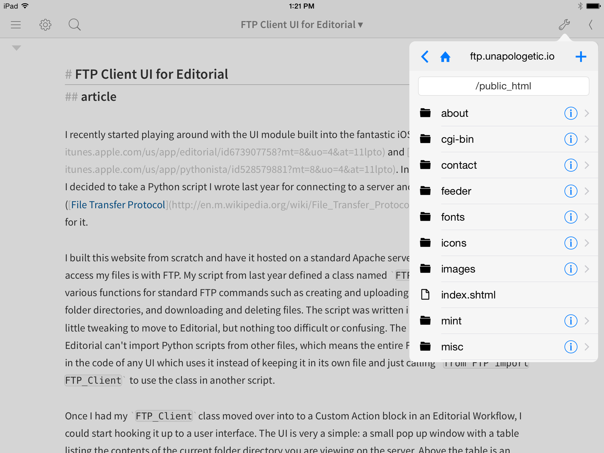
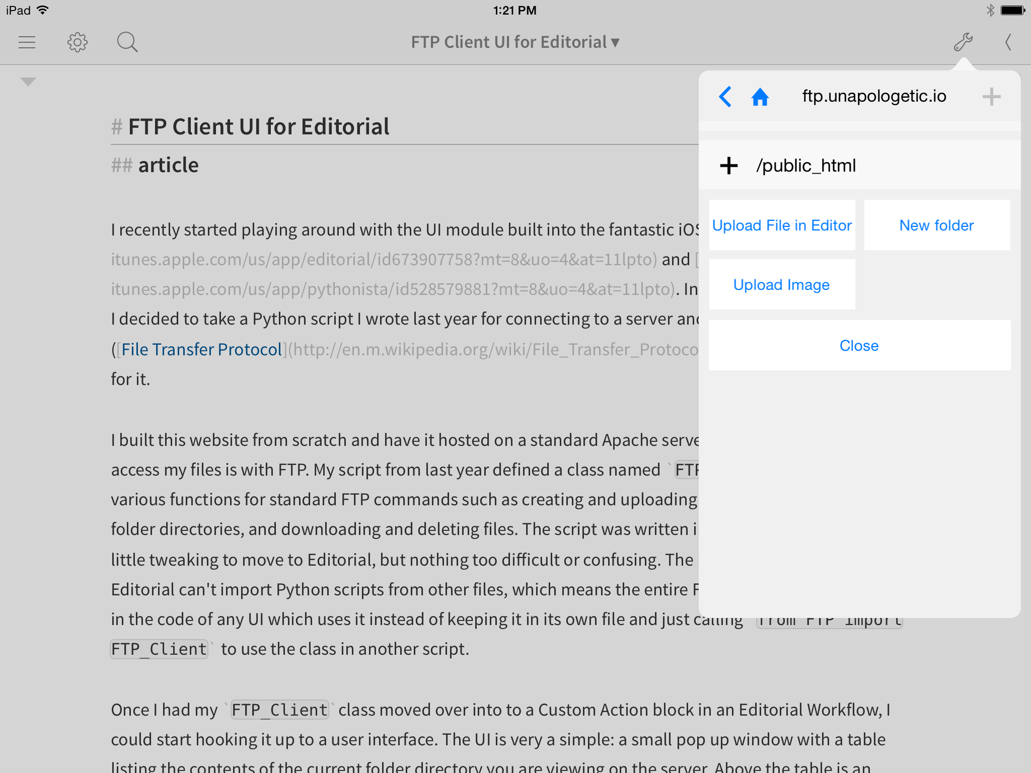
Once I had my FTP_Clientclass moved over into to a Custom Action block in an Editorial Workflow, I could start hooking it up to a user interface. The UI is very a simple: a small pop up window with a table listing the contents of the current folder directory you are viewing on the server. Above the table is a text field to display the path of the current directory. This field is editable, so if you manually type in a path and hit return you will be taken to that path on the server (assuming it exists). Above the path field is a navigation header with a label (the name of your FTP server) and three buttons. The first button is a back button, which will navigate backwards one directory; the second is a home button, which will navigate to your chosen home directory no matter where you are; the last is a plus button, which allows you to upload a file or create a folder within the current directory.

UI main view

There are only two other views in the UI: a view for button actions and a secondary view to confirm your choice when you tap a button. The button actions view can be accessed in three different ways and will display a different set of buttons depending on which way you access it. The aforementioned plus button will bring up the button actions view with three buttons: one to upload the file that is currently open in the editor, one to upload an image from your photo library, and one to create a new empty folder. Above the buttons is a text label which will display the current path, where the file/folder will be added. There is also a another button, always present at the very bottom of any button actions view, which allows you to close the view (▼)(▲)Anytime a button actions view is open, the back button in the navigation bar also takes on this same function, and will simply close the open view instead of taking you back a directory.. Upon tapping any of the three action buttons you will be presented with the secondary action view. Here the label that was displaying the path changes to an editable field in which you will type the file name or folder name for the new item you are adding. This view always has only two buttons, the first to confirm the action you picked in the previous view and second to cancel it and return to the main button actions view. For the plus button actions, the confirm button (labeled “Upload File”, “Create Folder”, or “Show Image Picker” depending on which button you tapped in the previous view) is disabled until you have begun to edit the text in the file name/folder name field, so that you don't forget to actually pick a name for your file before uploading. When you tap the confirm button you will be returned to the main view with the new item added (the exception being the Show Image Picker button, which will first have you pick an image to be uploaded under the chosen name before returning to the main view).

UI plus button view

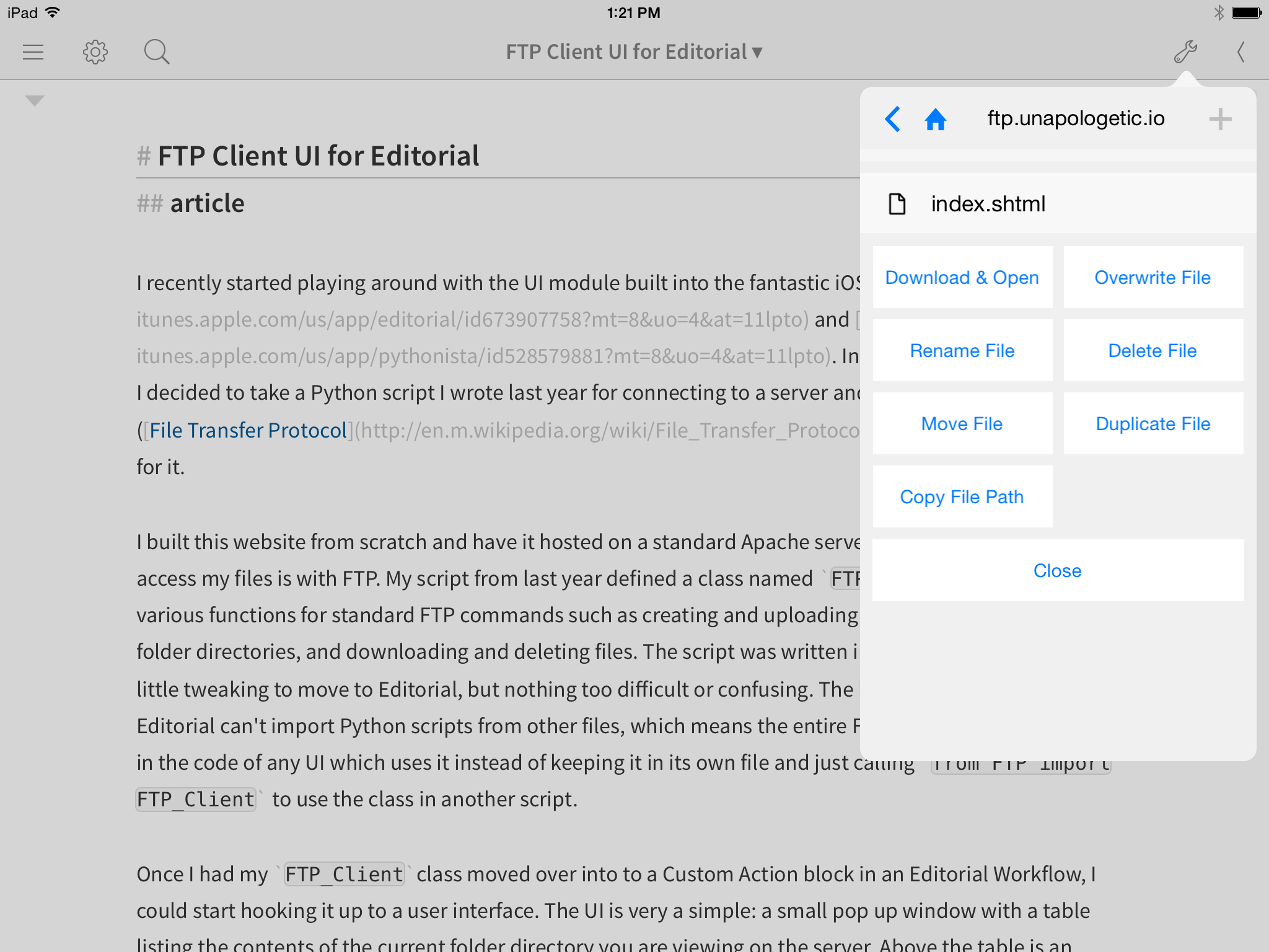
The next way to open the button actions view is by tapping anywhere on a file within the main table. Files are differentiated from folders by the small file icons on their left (▼)(▲)Furthermore, files have no other markings while folders' left-side folder icons are joined by small info buttons on their right sides as well as chevrons indicating they lead further into the hierarchy.. When you tap a file the button actions view appears with now seven different buttons, plus the Close button at the bottom. These allow you to download and open the selected file, overwrite it with the file in the editor, rename it, delete it, move it, duplicate it, or copy its path on the server. Above the buttons is a label which displays the filename of the file you selected. The download and open button will immediately download the file and open it in the editor in Editorial, dismissing the entire UI as it does so. The Copy Path button simply copies the path and gives you a HUD alert that it is on your clipboard. All the other actions will first ask for confirmation before performing actions which are in some cases unchangeable. The Rename button acts similarly to the plus button secondary actions, disabling the confirmation button until you have typed a new name for your file. The Move File button is the once exception to all the other rules, as it opens a unique view available only to itself and the Move Folder button.

UI move view

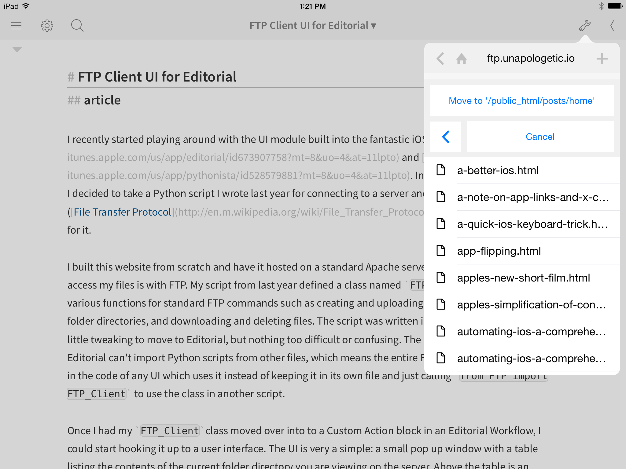
This view displays a slightly shorter version of the main table, located beneath a large button with title “Move to” followed by the path of the directory the shortened Move table is displaying. Beneath the Move to... button is a duplicate of the main back button, but this one will navigate backward only in the Move table instead of in the main one. Next to the back button is a cancel button to cancel the move and dismiss the view. Within the Move table, folder info buttons are no longer present. Files can be seen, but tapping them does nothing. The view's only purpose is to let you navigate through directories by tapping folder names until you reach the directory where you wish to move the file. Then tap the Move to... button and the view is dismissed and the file relocated to the chosen directory.

UI file buttons view

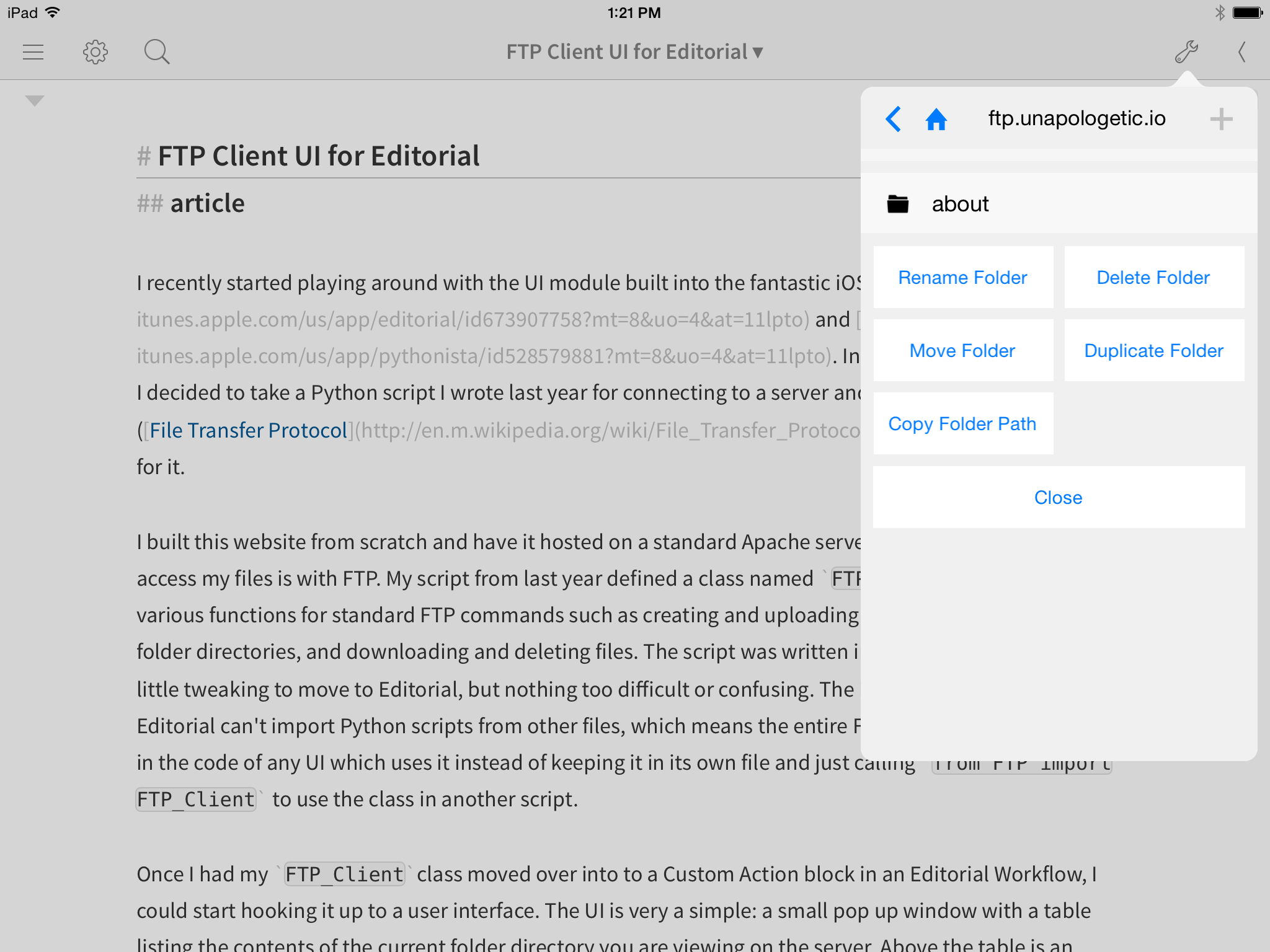
The final way to open the button actions view is by tapping the info button on the right side of any folder. This opens the folder specific button actions view, which contains only five buttons beyond the normal Close button. Folder button actions allow you to rename the folder, delete the folder, move the folder, duplicate the folder, or copy the folder's path. The label above the buttons shows the name of the folder you tapped the info button on. The buttons themselves work just like their file button action counterparts. Make note that deleting, moving, or duplicating a folder will also delete, move, or duplicate its entire contents, and these actions (particularly the delete action) cannot be undone. One thing to note is that FTP is a slow protocol (or at least the servers it is connecting to are slow to respond), especially so if you are on a subpar internet connection. Thus, performing actions which require a large amount of server calls can take quite a long amount of time. This mainly goes for the three actions mentioned above. The most complicated actions (code-wise) within the entire UI, moving, deleting or duplicating a folder requires the script to navigate all the way into every folder within the selected folder and duplicate, move, or delete those folders and the files within them. Depending on the size of the directory you chose, this can require a large amount of work and many calls to the server over FTP.

UI folder buttons view

While I may do something about this in the future, as of now the UI does absolutely nothing while it is waiting for a return from an FTP call to the server. As such, Editorial will appear frozen during this time. Generally you can tell it is still doing something because the button you tapped will appear “held down” until the function is finished, but sometimes if you tap the button too quickly it won't have time to change its appearance before the app freezes up waiting for a server response. I've done extensive testing myself, as well as enlisting a small team of testers to try the UI out themselves, and I'm fairly confident that any bugs in the code which could actually freeze the app have been squashed, so just bear with it while it is slowly getting through your command. There is a very low chance that nothing is actually happening, even if it may seem like it when you have to wait for 30 seconds to a minute on big folder-related tasks.

Set Up

If you're interested in trying out the UI yourself, there are only a few steps you need to take after installing the workflow. Obviously, you need to fill in your credentials. The obvious way to do this would be to request them the first time you run the workflow, but that would require a lot of extra code on my part, as well as finding some place on your device to store the values, which could accidentally be deleted or otherwise lost. For simplicity's sake, I just made them variables in the Custom Action block of the FTP Client workflow.

To enter your login information, when you first install the workflow, tap the info button on its right side and choose “Edit Workflow...”. This will bring up a view with a large block labeled “FTP UI”. Tap somewhere on the block and it will expand to reveal four variable values: Initial_Path, FTP_Server, FTP_Username, and FTP_Password. The last three are self explanatory, but Initial_Path is important because this is the directory to which your UI will automatically open to every time you launch it. This is also the directory that the home button on the main navigation bar will direct you to. If you don't want to set an initial path, but just want to start on the topmost directory of your server, just set this value to /.

The last thing to note is that, unfortunately, there is no way to make the password field conceal your password, so while it is fairly hidden based only on its location, it's worth keeping in mind that your password will be displayed in plain text to anyone who might for some reason go through the steps of editing the workflow and opening the list of variables.

iPhone

While I've only done limited testing, the UI should work fine on iPhone. There is no extra code to distinguish the iPhone version from the iPad version, but the only two differences I found this to cause we're that the status bar on iPhone is annoyingly close to the navigation bar buttons (a minor detail which doesn't actually affect usability) and there is no obvious way to dismiss the view since you can't just tap off the side of the pop up like on iPad. You can still dismiss the view however by swiping downward with two fingers, a feature built into all Editorial UIs which do not show the default title bar. At some point in the future I may build a tweaked version that is more obtomized for the smaller display, but for now it works well enough.

Where to Get the UI

If you wish to get your hands on the UI, you can download and install it on your iPad or iPhone from here.

If you have questions or comments, or find any bugs that need fixing, please drop me a line. Enjoy!

Relay FM

August 18, 2014

Today marks the much anticipated launch of Relay FM, the new podcast network from Myke Hurley and Stephen Hackett. I've been missing the voices of some of my favorite podcasters, and can't wait to hear the new stuff they've been preparing.

If you listen to your podcasts in Overcast, I made a nice little LCP action to automate subscribing to your choice of Relay podcasts (hat tip to Eric Pramono). It will loop through offering to subscribe you to each podcast. If you don't want to subscribe to one, just tap cancel and it will continue to the next one.

Direct Import Link for Relay Subscriptions action.

My podcast repertoire has been missing some key players the last several weeks, and I'm very excited to have them back.

Restore hunt?

If you're switching from another device, you can restore your progress here.

If you found this randomly, I recommend doing the hunt yourself, but you do you.


(Just basic tasks?)

(Hard cube tasks too?)

(Here on accident?)


legend!

May your name be forever emblazoned on the Bonk leaderboard.

Truly, thank you for exploring this website.

Now go forth and make Easter eggs!


(Again?)


To do (as well) :

  • Solve the cube in 4 moves or less
  • Scramble the cube by at least 50 turns, flip it, and reset it (for more fun: solve before resetting)

You probably need a touch device for the rest of these. If you switch devices, long-press the Easter egg to restore your progress.

  • Make it to level 9 in Bonk
  • ?????????????
  • Make it to level 10 in Bonk
  • ?????????????
  • Make it to level 11 in Bonk

(Sick of this?)

(Miss victory?)


Congrats!

You found all the Easter eggs.

If you enjoyed this, let me know and then go play Goose Game (not an ad, Goose Game just rocks).


(Finished?)

(Thirsty for pain?)

(Again?)


To do :

  • Flip the cube
    Hint?(Double-click the cube)
  • Learn pronunciation
    Hint?(Of the author's last name)
  • Send an important message
    Hint?(The message is "yo")
  • Locate the troublesome goose
    Hint?(Ghee I wonder where it coule be?)
  • Anger the goose
    Hint?(Honk til it's red in the bill)
  • Shoot a rainbow
    Hint?(Look reeeeal low)
  • Shoot some stars
    Hint?(Above the rainbow)
  • Find out what is happening
    Hint?(First shoot lots of stars)
  • Make a full commitment
    Hint?(Get help understanding)
  • Have fun
    Hint?(You have to really want it)
    (Or, find a page that doesn't exist)
  • Play with a slinky
    Hint?(Ask questions after game over)
    (Or, poke around the colophon)
  • Get insulted (at least three times)
    Hint?(Ask the right question, wait for enough answers)

(Stuck?)

(Got it now?)

(Hate cursive?)

(Miss the cursive?)

(Over it?)