(▼)(▲)
This space is currently unused, and I'm not quite sure what to do with it. If you have any ideas, I would love to hear them.

Archive.


List View

Obama's 2007 Stance on Net Neutrality

(▲)

April 23, 2014

Via Daring Fireball, Anne Broache back in 2007 on Obama's pledge to support net neutrality:

The question, selected through an online video contest, was posed via video by small-business owner and former AT&T engineer Joe Niederberger, a member of the liberal advocacy group MoveOn.org. He asked Obama: "Would you make it a priority in your first year of office to reinstate Net neutrality as the law of the land? And would you pledge to only appoint FCC commissioners that support open Internet principles like Net neutrality?"

"The answer is yes," Obama replied. "I am a strong supporter of Net neutrality."

Today, not only is the chairman of the FCC a former venture capitalist and lobbyist for the cable and wireless industry, but he and his agency are proposing rules which severely threaten the neutrality of the internet.


The FCC's Net Neutrality Turnaround

(▲)

April 23, 2014

Today, the FCC announced plans to completely reverse their previous position on net neutrality. Edward Wyatt, for the New York Times:

The Federal Communications Commission will propose new rules that allow Internet service providers to offer a faster lane through which to send video and other content to consumers, as long as a content company is willing to pay for it, according to people briefed on the proposals.

The proposed rules are a complete turnaround for the F.C.C. on the subject of so-called net neutrality, the principle that Internet users should have equal ability to see any content they choose, and that no content providers should be discriminated against in providing their offerings to consumers.

[...]

Proponents of net neutrality have feared that such a framework would empower large, wealthy companies and prevent small start-ups, which might otherwise be the next Twitter or Facebook, for example, from gaining any traction in the market.

If this goes through, the consequences are immense. As consumers, we're looking at higher subscription prices as content companies try to subsidize the new fees they're paying internet service providers for faster and more reliable streaming. These payoffs will be exorbitantly high, making it nearly impossible for newcomers to slip in with lower subscription prices because they won't be able to pay for the same speeds as Netflix, Disney, and other giants. The FCC is legally allowing the ISPs to rip the content companies off, and encouraging content giants like Netflix, Disney and HBO to entrench themselves against future competitors who can't afford to buy into the internet "fast lane". Worse, the charges for this fast lane are completely at the discretion of the ISPs, so they can charge more to one company as to another for the same service. The potential for unfairness and corruption is mind boggling.

The neutrality of the internet, which until now has been fair for every content provider, is being put in the hands of Comcast, AT&T, Verizon, and others like them. Maybe I'm wrong, but to me these don't seem like the most trustworthy companies to hand the equality of the internet over to. (▼)(▲)I'm not wrong.


The Fantastical Action Series (2.0)

(▲)

April 23, 2014

I've posted Fantastical actions before, but since then some changes to the URL schemes of Fantastical and Launch Center Pro have allowed for better implementations. (▼)(▲)Fantastical has added a few new options to its URL scheme. Most notably, you can trigger a parameter to automatically parse events without you needing to press "add" each time, so after you launch the action you don't have to touch the device again until all of your events have been parsed. Another new parameter allows you to tell Fantastical that you are sending it a reminder to be parsed without manually adding "todo" before the text of the reminder. This isn't that big of a deal, since "todo" was added automatically in the old action set anyways, but it looks a little bit nicer as your reminders are parsed, and I like their attention to such small details. As for Launch Center Pro, new features have allowed for the creation of recursive actions, massively simplifying my previous Fantastical actions for LCP by removing the need for both Pythonista and Drafts to be used in the action chain. This post will detail a series of actions which will allow you to send a list of events from either Drafts or Launch Center Pro and have them be automatically parsed, one by one, in Fantastical. Unlike the last version, the Launch Center Pro actions will no longer require the use of Pythonista or Drafts, they run completely via URL scheme between LCP and Fantastical.

The Parse in Fantastical Action

The Parse In Fantastical Action takes a draft (or Launch Center Pro prompt) and sends it to Fantastical to be parsed. You can parse a single event or multiple events using the same action.

Drafts

Type your event or list of events in Drafts, then run the Parse in Fantastical action to launch the sequence.

If you want to parse a list of events, leave one completely blank line between each event in your draft. Type each event in natural language as you would if you were typing it directly into Fantastical.

Direct Import Link for the Parse In Fantastical Drafts Action

Launch Center Pro

In Launch Center Pro, first run the Parse in Fantastical action. This will bring up an input prompt in which you can type one event. Even if you need to parse multiple events, type only the first one in the prompt box. With your first event typed, hit "Launch" to run the action. You will be sent to Fantastical where the event is instantly added to your calendar, then you are automatically redirected back to LCP, without any input required. This action is recursive, so on your return to LCP, you will immediately be provided with another empty prompt box. Type your second event here and hit "Launch" to parse it and return to LCP for a third. This process will repeat until you hit "Cancel" instead of "Launch". If you only needed to parse one event, just hit "Cancel" after it has parsed the first event and you're done. (▼)(▲)An important thing to note: recursive actions in Launch Center Pro only work by utilizing a clipboard hack, so make sure not to copy anything onto the clipboard between starting and finishing parsing your events, or you will break the action. Furthermore, make sure you don't have anything important stored only in the clipboard when you launch this action, as it will be overwritten.

Direct Import Link for the Parse In Fantastical LCP Action

The Parse Reminders in Fantastical Actions

The Parse Reminders In Fantastical Action takes a draft (or Launch Center Pro prompt) and sends it to Fantastical to be parsed as a reminder. You can parse a single reminder or multiple reminders using the same action.

Drafts

Type your reminder or list of reminders in Drafts, then run the Parse Reminders in Fantastical action to launch the sequence.

If you want to parse a list of reminders, leave one completely blank line between each reminder in your draft. Type each reminder in natural language as you would if you were typing it directly into Fantastical.

Direct Import Link for the Parse Reminders In Fantastical Drafts Action

Launch Center Pro

In Launch Center Pro, first launch the Parse Reminders in Fantastical action. This will bring up an input prompt in which you can type a single reminder. Just like the event parsing version of this action, it is recursive, so if you have multiple reminders to parse, only type one each time before hitting "Launch". After that reminder has been parsed you will return to LCP and immediately be given the option to parse your next reminder. Whenever you are finished parsing, just hit "Cancel" instead of "Launch" to end the sequence.

Direct Import Link for the Parse Reminders In Fantastical LCP Action

The Fantastical Action Menu

If you want To conserve space in your Launch Center Pro action grid, you can combine these Fantastical actions into an "action menu". This will be a single action which, when run, will bring up a list menu in LCP with three options: "Parse Events", "Parse Reminders", or "Launch Fantastical". The first two will begin the corresponding recursive actions listed above, giving you prompt boxes to keep parsing reminders or events until you hit "Cancel". The third option will, of course, simply launch Fantastical.

Direct Import Link for the Fantastical Action Menu


Recursive Actions In Launch Center Pro

(▲)

March 17, 2014

Yesterday, I was playing around with some deep nested actions and multiple levels of encoding in Launch Center Pro. The results of that were largely useless, but they did give me an idea for how to get recursive actions working in LCP, and the results of that are described in detail below. Be forewarned: this gets pretty technical. If you don't want to bother with the inner workings of the method, you can jump to the bottom and get your hands on the recursive Fantastical action via the direct import link (▼)(▲)Launch the action in LCP to be presented with a prompt box for an event that you want to be parsed in Fantastical and added to your calendar. Tap Launch and Fantastical will automatically parse and add your event, then take you back to Launch Center Pro where you are automatically presented with another prompt box for the same thing again. The loop goes on until you hit cancel on a prompt box. If you want to add multiple events to your calendar, this is the fastest, easiest way to do so..

Unlike Drafts, Launch Center Pro does not allow you to save actions by a certain name and then call that name to run the action. This would seem to render recursive actions impossible in Launch Center Pro, as we only create them in Drafts by having an action call its own name and run itself again when it completes. We can have an action cycle a handful of times by manually nesting it in its own x-success variable, but this method means that the action will only run a preset amount of times (the number of times you nest it inside itself, no more and no less), and that does not make it very versatile. Furthermore, every level of nesting requires another level of encoding, and that gets extraordinarily complex very quickly. What we want isn't a massive, incomprehensible chain, it's a small chain, with no more than a single x-success, that will loop infinitely until we cancel it. Since we can't save an action by a name and then call it, there's only one other way: variables. Unfortunately, LCP only supports a single persistent variable (▼)(▲)A persistent variable is one that is maintained with the same value across multiple actions. In Drafts, you can fill in a variable in the first action, then call that variable in the second action and get the same value., the [clipboard] variable.

In general I dislike clipboard hacks, as they clear whatever is on your clipboard and also render the clipboard variable itself useless in the actions. In this case, however, it's the only way. In order to get a recursive action working in LCP, we first have to load the action onto the clipboard, then place the contents of the clipboard in the URL action. Launch Center Pro has a parameter in its URL scheme called “url”, and if we put an action in that parameter, LCP will call itself and then call the URL. That basic action looks like this:

launchpro://?url=[URL To Launch]

Note that the URL you are launching needs to be encoded.

From here the process gets more complex. At first I thought I would need two actions, one to prep the clipboard and another to run it. Then I realized that we can do it all in one single action, but it requires quite a bit of encoding. First we have to copy the action we are repeating to the clipboard. Since LCP's built in clipboard actions support x-callback-url, we can chain another Launch Center Pro action to the x-success variable of the clipboard action, then call the contents of the clipboard in the url parameter of the action. In case this doesn't sound complex enough already, there are still a few more issues to consider as well (bear with me, it's worth it in the end).

The way the LCP URL handler works is to first look at the top level of the URL (the unencoded part) and fill in any variables there (that would be calling [prompt]s and [list]s and swapping the user's input for the variable in the code, as well as also replacing any [clipboard] variables for the contents of the clipboard). This means that if it finds any unencoded, bracketed variables, it will fill them in before the action runs. Since we want to place our action in the clipboard before we put its contents in the URL, the clipboard variable has to be encoded for the first part of the action, which means placing it in the URL parameter of a Launch Center Pro action. Unfortunately, placing it one level deep isn't quite enough. Due to how the URL handler works, the URL action on the clipboard has to be placed in the action before LCP parses the level of the code that the clipboard is on. I know that's a confusing statement, so I'll try to clear it up below. Here's the action:

launchpro://?url=launchpro%3A%2F%2F%3Furl%3Dlaunchpro%253A
%252F%252F%253Furl%253D%5Bclipboard%5D

And here's the breakdown of that action:

First, LCP reads the unencoded portion of the URL, launchpro://?url=. All this does is call itself and step forward, unencoding the next level of the URL action. That may seem frivolous, but it's necessary when we are placing the action in the x-success variable of another action because we want to move a level away to avoid prematurely filling in the clipboard variable. Now the action, decoded by one level and with the first portion thrown away, looks like this:

launchpro://?url=launchpro%3A%2F%2F%3Furl%3D[clipboard]

At this point LCP sees a variable, [clipboard], and swaps it out for the contents of the clipboard. Since we are chaining this to a clipboard action that loads a URL action onto our clipboard, that will be what is placed here. Let's say the URL action we are loading simply launches Drafts, and thus would look like this: drafts://. Note that the part of the URL that the clipboard is being exchanged for is in an otherwise encoded region of our action. This is because LCP will not run a URL action from the clipboard if we fill it in in the same step that we are running it (I'm not actually sure why that doesn't work). Since we're placing it in an encoded spot, the action itself needs to be encoded too. However, it's also coming after a ?url=, so it has to be encoded for that as well. The result is that we double encode whatever is going in the clipboard. In this example, LCP adds drafts%253A%252F%252F (drafts:// double encoded) into the action from the clipboard, then calls itself, steps forward, and decodes and runs the next portion of the URL. Since the clipboard was just filled in, it looks like this:

launchpro://?url=drafts%3A%2F%2F

Finally, LCP calls itself once more, steps forward, decodes, and completes by running the simple drafts:// and launching Drafts.

So that's how we run an action which we have saved in the clipboard, but this is part of a bigger subject, so remember that all of that is happening in the x-success variable of an LCP clipboard action. The clipboard action is what is loading the hard-coded URL action onto the clipboard and then launching it later, and the entire thing (minus the action we're loading) looks like this:

launch://x-callback-url/clipboard?text={{[Your Encoded Action 
Here]}}&x-success={{launchpro://?url=launchpro%3A%2F%2F%3Furl
%3Dlaunchpro%253A%252F%252F%253Furl%253D%5Bclipboard%5D}}

So now we understand how to hard code an action into the clipboard and then call that action later on in an x-success, but how does this allow for recursive actions? The key is that the clipboard is the only value in LCP's URL scheme which never changes. The first step is that your chosen action needs to support x-callback-url. Once you've picked an action, you simply use the same method that we used above for the x-success value, calling Launch Center Pro and running [clipboard] from the URL parameter. Let's use a Fantastical URL action as an example:

fantastical2://x-callback-url/parse?sentence=Test&add=1
&x-success=launchpro%3A%2F%2F%3Furl%3Dlaunchpro%253A
%252F%252F%253Furl%253Dlaunchpro%25253A%25252F%25252F%25253F
url%25253D%255Bclipboard%255D

This action launches Fantastical 2, sends it the word "Test" to be parsed, automatically adds the event, then calls x-success and decodes and launches the exact same LCP action that we broke down earlier:

launchpro://?url=launchpro%3A%2F%2F%3Furl%3Dlaunchpro%253A
%252F%252F%253Furl%253D%5Bclipboard%5D.

To finish, we encode our entire Fantastical URL and place it in the text parameter of the first LCP action, which saves it to the clipboard so it can be repeated (recall that the action needs to be encoded twice, but we can do one of these automatically within the code by wrapping the action, single encoded, in {{curly brackets}}. You still need to manually encode it once on your own though). Run the action in LCP and you'll get an infinite loop adding "Test" events to Fantastical (If you do run it, remember you can just press the home button to cut the loop). Obviously, that isn't very useful. What would be useful would be to have LCP throw up a prompt box each time so that you can add actual events. This is easy, just replace “Test” with [prompt] (although make sure it's encoded with the rest of the action as “%5Bprompt%5D”). Now if you run the action, LCP will prompt you for an input each time, meaning you can automate almost the entire process of adding multiple events to Fantastical directly from Launch Center Pro. The only difference between this version and the Drafts version is that in Drafts you write up the whole list and then call the action on everything at once, whereas in LCP you write one event at a time and then wait about one second for it to go add the event before jumping back to get the text for another. When you're finished adding, just hit cancel on the next prompt box and the process comes to an end.

Complete with the [prompt] input variable, the final product will look like this:

launch://x-callback-url/clipboard?text={{fantastical2%3A%2F
%2Fx-callback-url%2Fparse%3Fsentence%3D%5Bprompt%5D%26add%3D1%26
x-success%3Dlaunchpro%253A%252F%252F%253Furl%253Dlaunchpro%25253A
%25252F%25252F%25253Furl%25253Dlaunchpro%2525253A%2525252F
%2525252F%2525253Furl%2525253D%25255Bclipboard%25255D}}
&x-success={{launchpro://?url=launchpro%3A%2F%2F%3Furl%3Dlaunchpro
%253A%252F%252F%253Furl%253D%5Bclipboard%5D}}

That code block probably looks pretty daunting, but the best part about this method is that it's almost identical for any action you want to create. You can reuse that exact URL action, but simply change the Fantastical part, and get an entirely different action which works the same way. Just use this format, but paste in your own action (make sure it is encoded a single time!) in the designated area:

launch://x-callback-url/clipboard?text={{[Your Encoded Action 
Here]}}&x-success={{launchpro://?url=launchpro%3A%2F%2F%3Furl
%3Dlaunchpro%253A%252F%252F%253Furl%253D%5Bclipboard%5D}}

Inside of your action, make sure the x-callback-url parameter looks exactly like this:

launchpro%3A%2F%2F%3Furl%3Dlaunchpro%253A%252F%252F
%253Furl%253Dlaunchpro%25253A%25252F%25252F%25253F
url%25253D%255Bclipboard%255D

(That is only single encoded, so you can place it directly on the end of the &x-success= value of whatever action you use before you encode the action. Don't forget that you will then need to encode the entire action before you paste it into the code template, so this part after your x-success will actually end up double encoded.)

The recursive Fantastical action is the most useful one I've come up with so far, but make sure to ping me if you come up with any other cool uses for this method of recursion.

You can grab the fully functional recursive Fantastical action we built above through this Launch Center Pro direct import link.


Phraseology 2.0 Review

(▲)

February 5, 2014

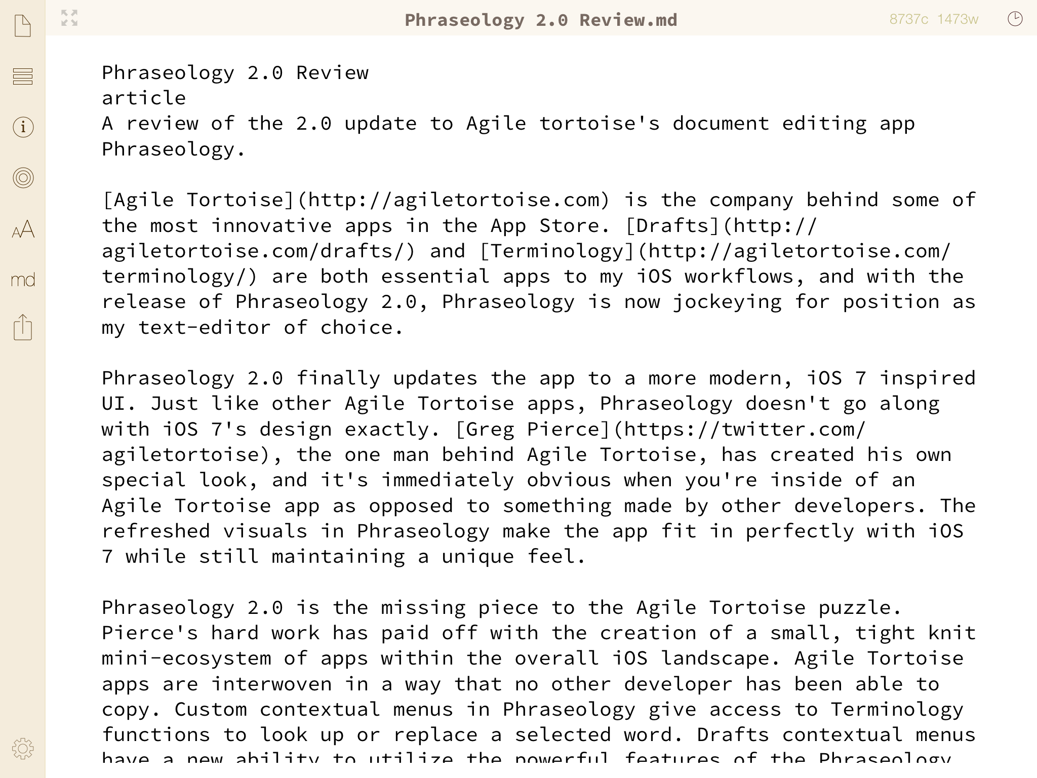
Agile Tortoise is the company behind some of the most innovative apps in the App Store. Drafts and Terminology are both essential apps to my iOS workflows, and with the release of Phraseology 2.0, Phraseology is now jockeying for position as my text-editor of choice.

Phraseology 2.0 finally updates the app to a more modern, iOS 7 inspired UI. Just like other Agile Tortoise apps, Phraseology doesn't go along with iOS 7's design exactly. Greg Pierce, the one man behind Agile Tortoise, has created his own special look, and it's immediately obvious when you're inside of an Agile Tortoise app as opposed to something made by other developers. The refreshed visuals in Phraseology make the app fit in perfectly with iOS 7 while still maintaining a unique feel.

Phraseology 2.0

Phraseology 2.0 is the missing piece to the Agile Tortoise puzzle. Pierce's hard work has paid off with the creation of a small, tight knit mini-ecosystem of apps within the overall iOS landscape. Agile Tortoise apps are interwoven in a way that no other developer has been able to copy. Custom contextual menus in Phraseology give access to Terminology functions to look up or replace a selected word. Drafts contextual menus have a new ability to utilize the powerful features of the Phraseology Arrange and Inspect views, allowing you to quickly and easily manipulate your text by rearranging sentences or even full paragraphs, or to get an in-depth analysis of your writing. All of the apps support x-callback-url (▼)(▲)Which should come as no surprise since Greg Pierce was actually the inventor of the protocol., so jumping back and forth between them to utilize their unique functions is a simple and seamless task. The powerful synonym functions of Terminology have proven extremely useful to me to spice up my writing or swap out repetitive words, and the process of looking up and switching these words is beautiful in its simplicity. Send your completed essay or article over to Drafts to have access to your complete library of URL actions to upload it to Dropbox, send it out to an Editor, or upload it directly to your website. The power of inter-app communication between these apps is an amazing hint at the capabilities of iOS, and that all of it exists within the bounds of Apple's strict rules is amazing as well.

Phraseology 2.0 brings support for iCloud document storage, as well as Dropbox mirroring for two different ways to store your documents. While the app does not have full support for Dropbox storing anywhere in your Dropbox, it's only two taps to open the export menu and send your document directly to Drafts, where you could run your own custom Dropbox actions on it. This is not a complete solution, but it's the best you'll get for now and is better than no Dropbox integration at all.

The Phraseology documents menu now allows you to swap between viewing your documents in order of the date they were created, the last time they were modified, the last time they were accessed, or alphabetically by title. This makes getting to your documents easy even as the list grows longer and longer. A simple swipe to the right on any document in this view will allow you to send it to Dropbox if it's in iCloud, or to iCloud if it's in Dropbox. In some future update I would hope for the ability to save documents in both places at once so that I don't have to distinguish between the two.

Phraseology also supports an excellent Markdown previewing module directly from the side bar (which is ever present unless you hide it with the full screen button, in which case it is one tap away). I've found this quick access to a markdown preview to be extremely convenient when editing posts I've written for Unapologetic.

The Phraseology Arrange and Inspect views are also featured prominently on the side bar. The Arrange view separates your entire text (or just a selection of it if you press the button while text is selected) and separates it into paragraphs by dividing on line breaks. From here it allows you to drag paragraphs around and reorganize your document with great ease and efficiency. A small button that appears when this view is enabled allows you to switch from paragraphs to sentences, and dragging sentences around is amazingly more simple and quick than the slow process of selecting, cutting, and pasting sentences that we have to use to mimic this function in other apps. I can particularly see the arrange view being useful in school papers or particularly long articles, where you write so much that reorganizing at the end can be quite useful to make sure the thread of your thoughts move in the most sensible way.

Phraseology Inspect View

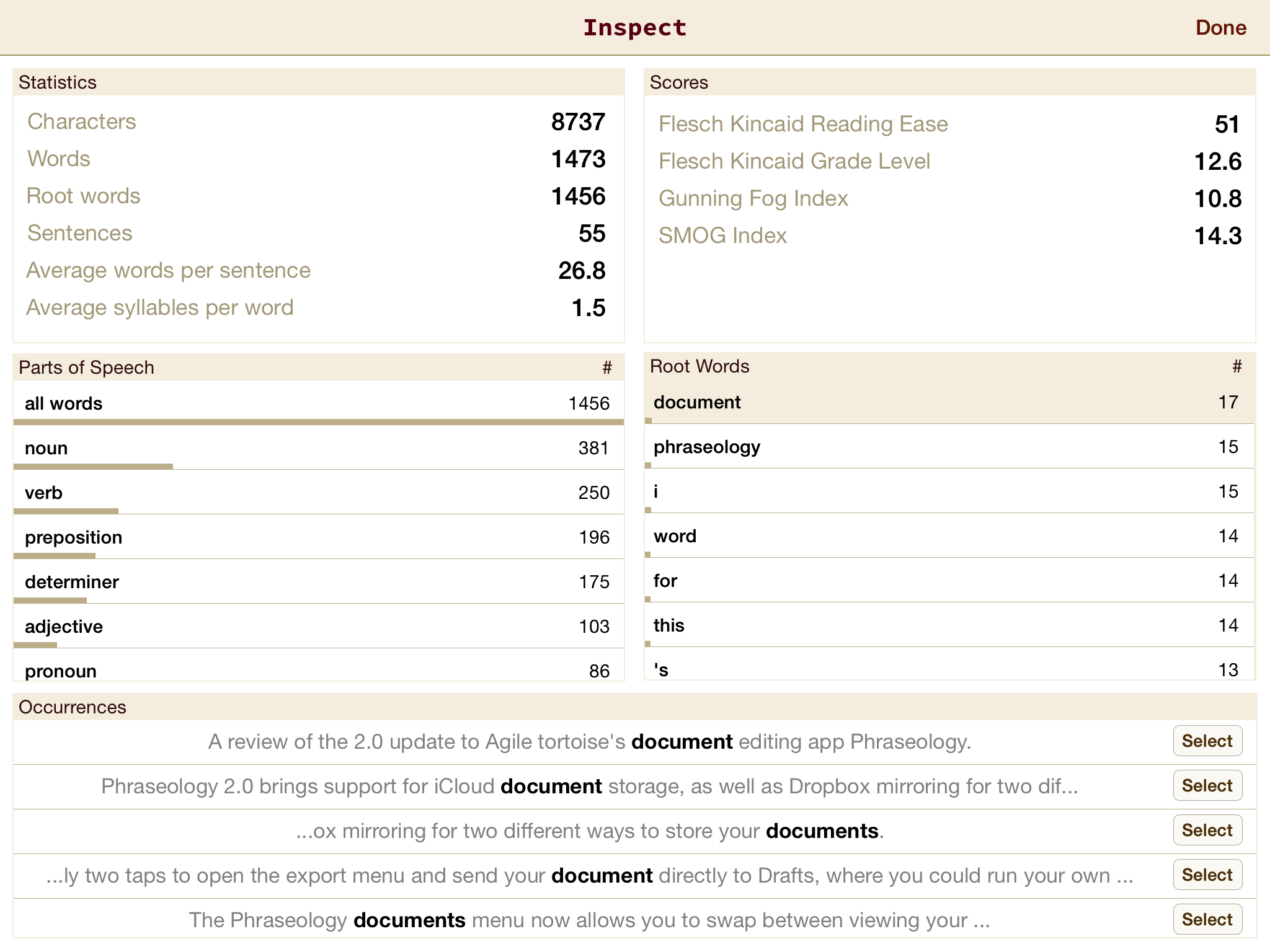
The Phraseology inspect view has grown to become one of my favorite parts of the app. Tapping inspect for the sidebar brings up a screen divided into five subsections. Statistics displays totals for the number of characters, words, root words, sentences, average words per sentence and average syllables per word for your entire document, or just a selected portion of it. To the right of Statistics is Scores, which displays some intriguing numbers which I had never heard of, but have been enjoying looking at and thinking about as I've written articles from Phraseology. These scores consist of the Flesch Kincaid Reading Ease score, the Flesch Kincaid Grade Level score, the Gunning Fog Index, and the Smog Index. You can check those links to see exactly what each score means, but my favorite one to think about has been the most self explanatory one, the Flesch Kincaid grade level score, which has been driving me to make sure my writing ranks at a high level. I've found trying to beat my scores after each article has been an interesting and fun new way to push myself to better writing.

Below the Scores section is a Root Words subdivision. This area displays a list of every root word used in your document, and a number for how any times each occurs. Looking through every one is unnecessary, but it can be great to check out which words I've used most to help determine if there's anything I have been repeating too many times. To the left of Root Words is Parts of Speech, which of course displays a list of different parts of speech that you have used in your document, and how many times you've used each. Selecting a part of speech will filter the Root Words section to display only words of that part of Speech.

The final section of the Inspect view is a wider box below the other four spanning the whole width of the screen. This box is empty at first, but when you select a word from the Root Words section, the Occurrences box is filled with actual sentences from your document in which you used these words. From here you can tap the small "Select" button to return to your document with the word in the sentence in question selected.

Phraseology also includes a syntax highlighting mode which will highlight different parts of speech all throughout your document. I personally have never found much use in features like this, but I know some people do, and it works well if that's your thing.

What I love above Phraseology, and all of Agile Tortoise's apps, is the vast amount of innovation that these apps are expelling with every new release and update. X-callback-url and the Drafts URL action engine are some of the driving forces behind the iOS automation and inter-app communication initiatives. Clever manipulations such as Terminology integration for finding and replacing words, sending documents and back forth between Drafts and Phraseology, and using the Phraseology inspect and Arrange views to analyze and manipulate text sent from Drafts are all great examples of new and never before seen features and functionalities. Phraseology 2.0 tightens the seams between Agile Tortoise's apps even further, and widens the gap that Pierce is building between himself and other developers to come up with the most intriguing new ideas for how to make writing on iOS simpler, more powerful, and an overall better experience.

You can get Phraseology 2.0 for $1.99, a limited time introductory price, on the App Store, or as a free update if you already own Phraseology 1.


Maxims On Life And Stuff

(▲)

February 4, 2014

On the second episode of Andrew J Clark’s one man podcast, Life and Code and Stuff, Andrew discussed a few maxims that himself and listeners of the show came up with which he thinks are important. I loved the maxims and his comments on them, particularly since my own adventures with starting The Axx and, later, Unapologetic give me some very personal connections to them. I’ve transcribed the maxims below, and added some thoughts based on my own experiences.

Don’t get cozy, sweatpants are the enemy.

This first maxim has applications far and wide, from major companies like Apple to minor bloggers like myself. Just because you take the lead, see a taste of success, or get noticed does not mean that you can just settle in and coast the rest of the way. Your previous successes will not continue to carry you forward for long. We live in a world that moves at a rapid pace. The biggest subject of debate one week will be forgotten by the next. If you make a splash, you need to use that opportunity to work harder than ever before and make a bigger one, not just settle back and think that now you’ve made it. If you don’t keep going, always trying to best your last best, you will fail. Your one success will be gone with the next news cycle.

I’ve had personal experience with this. Last April, just a few months after I started blogging for the first time, I woke up to the massive surprise that one of my articles on The Axx had been Fireballed. That day, my fledgling website went from less than 100 views on the average day, to landing over 10,000 in just one. By the end of April, 2013, The Axx had garnered over 27,000 page views. That was absolutely incredible, but unfortunately, I failed to follow Andrew’s first maxim in the aftermath. I didn’t follow up my big post with anything else worthy of great attention. I thought a Fireball meant I’d “made it big”, but what it had really done was simply give me an opportunity to make it big, an opportunity that I failed to take advantage of. Within days The Axx had tapered back down from the massive levels of attention it had been receiving. I did still maintain about double the paltry amount of average daily page views I had been getting, which was really great for my previously tiny site, but these levels were not nearly as objectively impressive as they could have been if I had worked harder on follow up pieces. (▼)(▲)If I sound like I’m putting all the emphasis on page views, please don’t mistake me for someone who cares only about such numbers. Page views are in no way the most important metric of a website, not even close, but they are the easiest metric to exemplify the rise and fall of a website’s overall success for various time frames, so they’re appropriate here, I think.

I don’t regret what happened in April at all. Being Fireballed was an honor that I will never forget, and even though I missed the opportunity to keep hold of all of the new readers, it was a fantastic learning experience. Firstly, it taught me that I am worthy. It showed me that I am capable of producing work that tens of thousands of people will be interested in, and this endows me with a confidence that I (foolishly) never would have had beforehand. I say foolishly because there was no reason to doubt myself, as there is no reason for anyone reading this or anyone at all to doubt themselves. I knew in my heart that I had something to contribute, that’s why I started The Axx in the first place. If you’ve had the courage to start a blog, that immediately should prove to you that you have something worthwhile to contribute. If you are even thinking about starting a blog, that should prove it to you as well.

The second thing the Fireball taught me was exactly the lesson that this maxim is trying to teach us all: don’t get cozy. Just because you make a splash does not guarantee continued success. In fact, it guarantees nothing. It is, however, an opportunity, and I argue an opportunity is even more powerful than success. Success has boundaries. (How much further can John Gruber go now that he’s reached critical acclaim?) An opportunity is bounded only by imagination, determination, and will.

Try something new, say yes more often.

Definitely think this is a big one. It’s very easy, if an opportunity presents itself, to, to second guess it; to worry about what happens if it fails, or worse yet, worry about if it succeeds. I think, sometimes, the scariest thing of a new venture, a new proposition, is that it will work and it will demand everything of you, as most new ventures do. But, on the whole you’re better to say yes to most things.

Personally I cannot say that I have experienced the fear of success, although I know many have. Rather, it is another ugly face of self doubt which plagues me: the fear of failure. From school to sports to blogging, failure has always been something I’ve feared. Trying something new instead of staying in the same old tracks and doing the same old thing means facing this fear, and that fact made starting The Axx really difficult for me. I postponed it for many months before finally deciding that it was time to say yes to what my heart was telling me to do. As it turns out, that was one of the best decisions I’ve ever made. The new people I’ve met and the new places I’ve gone all because of finally saying yes and following my dream have been incredible. Certainly the work is demanding, writing a blog and being a full time student both at once is extremely difficult. It does demand everything from me, but it is absolutely worth it.

Make bad stuff, then make better stuff, and don’t be afraid to ask for help. That is a paraphrasing of the quintessential Jake-ism from Adventure Time that I, at the moment, am living my life by because I make a lot of things that are not very good. A lot of apps, a lot of podcasts, whole lot of tweets, whole lot of websites. But as Jake so awesomely says in many online GIFs: “Sucking at something is the first step to being sort of okay at something.”

I think it’s very handy to try to keep a little bit of perspective when the thing you like is not getting linked to, not working, crashing on launch, whatever, whatever the case might be. It’s all a process. Everyone is on a path. Sometimes all you can do is stay on the path and hope it leads somewhere eventually.

Particularly in regard to starting a blog, this one is vital. When you first start out, you will not have a large audience. You will probably not get linked to, probably not get retweeted or even favorited. The thing is, it doesn’t matter. The only way you’re going to build an audience, the only way to start, is to put your best foot forward from the very beginning. Make yourself known by socializing with people in the community. Twitter is an amazing place for that. I can attest that the people of the tech community are some of the friendliest people I’ve ever known. Talk to them, comment on what they tweet or write, and when you’ve written something you think they’ll find interesting, gently prompt them with a link and a quick tweet telling them they might enjoy it. The one thing you should not do is beg them for retweets or links on their blogs. If what you’ve written is good enough, they’ll retweet it themselves or link to it themselves.

An experience I’ve had with the first part of that maxim regards starting Unapologetic. While I would not call The Axx bad, I fully believe that it was not nearly as good as this new site is. When I first started out, I was eager to get going before I lost my motivation. This meant going with a Squarespace site was the smartest move. I chose the quickest name I could think of and the simplest design I could build and got down to writing. The Axx worked great, but it was never the full vision I had for my website. I dreamt of writing my own code from scratch, having a name I was proud of, and being completely free to do anything I wanted. Restrictions have always annoyed me in all parts of life, so Squarespace could never have been where I stayed. (▼)(▲)That’s not to be taken as a bash against Squarespace. In fact, I love the Squarespace and think it’s one of the greatest services on the web today. My dream simply included writing my own code. That’s why I moved from Squarespace and left the meaningless name “The Axx” behind. I had made something which, in some aspects at least, was “bad”, and then I made something which was better. Even on my second round, I ended up unhappy with Unapologetic’s host and moved from the restrictive Cloud Cannon to the free and unrestrained Host Gator. Iteration, this will always be the key. You won’t do it right on your first try, ever. This does not mean you should give up, it means you make something better on round two, and even better than that on round three.

Do more stuff in public.

I think that’s really nice. I think my experience is the more honest and open I am on Twitter, with friends, with family, with my girlfriend, the better stuff tends to work out. And it makes sense if you think about it. If people can see that you’re a real person, that you’re trying, even if what you’re doing isn’t working, they have a whole lot of compassion for that. You’re no longer just another voice screaming for attention, you’re a human being. You’re flesh and blood.

I admittedly do not follow this one very well, but it’s one I’m now going to work on. Currently I have two Twitter accounts so that I don’t have to bother my friends with my tech stuff, or my tech followers with my personal stuff. While I do think that’s a generally good practice, as my friends following @ajguyot don’t want their timelines filled with technology tweets and those of you who follow @the_axx don’t care about some of the Tucson-specific or inside joke tweets, after listening to Andrew’s podcast I think I’ll work on blurring the lines a little more. My friends know I like tech, so they won’t be too bothered if a little more of that is filtered in, and I want the rest of the world to know who I am a bit more instead of just seeing me chime in on the latest news and geek out about URL actions.

Don’t panic when shit is out of control.

Yeah, um, so many things spiral out of control. I think that might be one of the big keys to actually being a person that does anything in this strange world we live in, that things are going to fuck up a whole lot. Like it’s just part of the process. You can launch a website, or a podcast episode and it turns out the MP3 file is corrupted or everyone is linking to the wrong blog post and everything is spiraling out of control and the money that you had set aside for the music in your short film has run out and everything kind of threatens to careen out of control, but… but that’s okay. You’re not gonna get eaten by it. You’re not gonna get killed by it. It may suck, it may turn out well, but usually things do just turn out the way that they turn out, and panicking because you’re not able to control and micromanage every little factor of a thing and it does get too big for you to, sort of, to control and hold onto, doesn’t usually result in your world ending or your untimely demise. It usually means you have to hold your breath for a second, for a minute, for a week, for a year, but you come out of it on the other side eventually. Seventy years from now, on your death bed, surrounded by robots, you’re not gonna be thinking about the thing that failed.

At some point, you are going to mess up. I’ve done it, John Gruber’s done it, everyone’s done it. I have linked to articles that turned out to be false, I’ve written thoughts that turned out to be really dumb, I’ve posted URL actions that actually don’t work. When this happens, it sucks. It’s embarrassing, but it’s not the end of the world as long as you handle the situation properly. By that, I mean don’t stick to your guns when you’re in the wrong. Don’t keep defending your position if a huge flaw has been pointed out in your argument. Don’t keep pretending that the thing you linked to was correct when you know it wasn’t. Don’t tell everyone the action doesn’t work because they made a mistake when they installed it if it’s really just bad code. Take the blame for your own mistakes, apologize if necessary, update posts if necessary, and then go right back to working hard and striving for greatness. Everything will be forgotten within just a few days and no one will think less of you. In fact, many will think higher of you with the knowledge that you aren’t afraid to make mistakes, and will admit to them when you do.

On the other hand, what this doesn’t mean is that if you have a completely valid argument or article which someone else disagrees with and attacks you for, you should back down. Quite the opposite, you need to be, cough, unapologetic in regard to your own work. You know the difference between making a mistake and making a valid point or a great post, and if it’s the latter that you’ve made, stand behind your work no matter who tries to assault it.

There is no trick to getting known. There’s no trick to getting people to talk about your thing. If you make something good, then slowly, eventually, piece by piece, bit by bit, people will find it. If they’re not finding it, then either the thing you’ve made is not actually that good, or you haven’t communicated effectively why it might be good, so no one actually ever gets into the door. But you can get both of those kind of right, you will find an audience. There are people out there in exactly your situation, who need exactly what it is you’re trying to tell them. If you don’t have many followers on Twitter, well, maybe you’re just not actually tweeting the right things. Maybe you’re actually not really sharing enough of yourself on Twitter.

This is the cardinal rule. Do good work and eventually you’ll get noticed. I think it often starts with a niche. For blogging, mine was URL schemes. If you’re also interested in that blogging, yours may be something different. Everyone has something which their perspective is unique about, find your niche and take as much advantage of it as you possibly can, then expand. Not explicitly in that order, but if you only comment on the things everyone else is talking about, you’ll never get away from the crowd. You don’t need a niche, although if you have something that really interests you and you know a lot about then it certainly helps, but otherwise just experiment in a lot of different areas of discussion. If you diversify your blog and seek out interesting subjects that are not necessarily in the mainstream tech press then you can easily draw an audience like that as well. Just don’t be scared. Simply because John Gruber or Jim Dalrymple have not yet linked to something on a particular subject does not mean that no one cares about it. Who knows, if you write something unique then maybe they’ll link to you. If a 17-year-old high schooler with three months of blogging experience can be linked to, anyone can.

What it comes down to is this: the one and only way that you will never know if you are worthy is if you never have the courage to try.


JavaScript Bookmarklet Builder On iOS

(▲)

January 28, 2014

Yesterday, John Gruber released an update to his Make Bookmarklet Perl script. The script performs the following functions, as stated on Daring Fireball:

My solution: A “Make Bookmarklet” Perl script that I run as a BBEdit filter that (1) takes as input a file containing JavaScript source code; (2) creates a bookmarklet URL from that source code; and then (3) places the bookmarklet code in a comment at the first line of your JavaScript source, but otherwise preserves your original script.

Bookmarklets are a key ingredient to a few of my Safari workflows on iOS. Most notably, when I want to link to a post on Unapologetic. I copy the text I wish to quote on the webpage, then run a bookmarklet which launches Drafts and creates a new draft with the title of the webpage and the URL formatted as a link in Markdown, and the copied text formatted as a Markdown blockquote. I have a few other bookmarklets too which I use less often, but the one thing they all have in common is that they were exceedingly annoying to manually create on my iPad.

I hadn't known about Gruber's script until I saw its update yesterday, but when I saw it I knew immediately that it was a function I wanted to be able to have access to on my iPad, not just my Mac. So, I set to work converting Gruber's Perl script into a Python script that can be run from Pythonista on an iPad or iPhone.

My script performs basically the exact same function as Gruber's. You can send your JavaScript code to Pythonista by running a URL action in Drafts, an Editorial workflow, or by simply pasting your code into the script itself in the designated area and hitting the run button (this is the default). If you choose to run the script by the default option, I purposely left a single space on either side of the input zone, marked [YOUR CODE HERE], in case the code you paste in begins or ends with a single quote, which would break the three single quote comment block method being used to set the code as a string in the Python script. Leaving a space on either side will not affect your bookmarklet, as line-leading and line-trailing whitespace is removed by the script anyway. (▼)(▲)If you run the script using the Drafts action or Editorial workflow you do not have to worry about leaving spaces.

Using Gruber's example from DF, if you were to send the Make_Bookmarklet python script the following code:

var str = document.title;
alert(str);

It would result in this code being printed to the Pythonista prompt page:

// javascript:var%20str%20=%20document.title;alert(str);
var str = document.title;
alert(str);

And this bookmarklet being copied onto your clipboard:

javascript:var%20str%20=%20document.title;alert(str);

Since there is no main document like a BBEdit text file for the code to be placed on, I just have Pythonista print it so that you can copy and paste it anywhere you wish. The bookmarklet itself will be on your clipboard when the script completes, so you can go straight to Safari (or whatever browser you use), bookmark the first page that comes up, then change that bookmark title and paste your bookmarklet in for the URL.

My script also mimics Gruber's in that if you run it on code which already has a commented out bookmarklet on the first line (i.e., the first line contains // javascript: somewhere inside of it), the script will cut that line out before running, so you can keep recycling the code printed out by Pythonista until you've gotten the bookmarklet right. If you wanted to, you could set it up to open the code as a new draft in Drafts or in a file in Editorial each time instead of just printing it in Pythonista. Then you could immediately go back to editing the script without copying from the Pythonista prompt and pasting it somewhere else.

Gruber set his script up to not encode every character, making the resulting bookmarklet more readable. Mine encodes a little bit more than his, but leaves some of the most popular characters unencoded. If you want encode everything you possibly can, just remove the characters in the safe= parameter of the urllib.quote command on line 31. If you want to encode less characters, add those you don't want encoded into that same parameter.

Source Code to Make_Bookmarklet Script for Pythonista

import sys
import re
import clipboard
import urllib

if len(sys.argv) > 1:
	source_code = sys.argv[1]
else:
	source_code = ''' [YOUR CODE HERE] '''

split_code = source_code.split('\n') # Split code at newlines

# Remove first line if it is already a bookmarklet
if '// javascript:' in split_code[0]:
    split_code.pop(0)

source_code = '\n'.join(split_code) # Rejoin lines of source code without bookmarklet line (if it was present)

# Strip line-ending and line-leading whitespace
for i in range(len(split_code)):
    split_code[i] = split_code[i].rstrip()
    split_code[i] = split_code[i].lstrip()

bookmarklet = ''.join(split_code) # Rejoin code as bookmarklet with newlines removed
bookmarklet = re.sub(re.compile("//.*?\n" ) ,"" ,bookmarklet) # Kill commented lines
bookmarklet = re.sub(re.compile('/\*.*?\*/',re.DOTALL ) ,'' ,bookmarklet) # Kill block comments
bookmarklet = re.sub('\s\s+', ' ', bookmarklet) # Space runs to single spaces, tabs to spaces

# UTF-8 encode and URL escape
bookmarklet = bookmarklet.encode('utf-8')
bookmarklet = urllib.quote(bookmarklet, safe='=;()+?!')

bookmarklet = 'javascript:' + bookmarklet # Append 'javascript:' before bookmarklet

print('// ' + bookmarklet + '\n' + source_code) # Print full source code with new bookmarklet as commented first line
clipboard.set(bookmarklet) # Put bookmarklet on clipboard

Running the Script With Code Sent From Drafts

If you want to send JavaScript code from Drafts to be made into a bookmarklet in Pythonista, you'll need to import one Drafts action and make sure that your Pythonista script is named "Make_Bookmarklet". (▼)(▲)If you really want to name your script something different, just make sure you change the name in the Drafts action as well. The Drafts action utilizes the [[selection]] variable tag. This means that if you want to write your JavaScript inside of a larger body of text, then select only what you want to be made into the bookmarklet and then run the action, only the code that was selected will be sent. If you do not make a selection before running the script (i.e., you want to send the entire contents of the draft to be converted), the [[selection]] tag will act identically to the [[draft]] tag, sending the whole draft as most other actions do. (▼)(▲)Hat tip to Charles Bucher

Direct Import Link for "Make Bookmarklet" Drafts Action

Running the Script With Code Sent From Editorial

To run the script from Editorial, import the workflow below. Instructions are identical to those for Drafts: the Pythonista script must be named "Make_Bookmarklet" and the code sent will either be whatever text you have selected in Editorial or the entire document if you have no selected text.

Direct Import Link for "Make Bookmarklet" Editorial Workflow

Feedback

If you see any errors or have suggestions for the script, please contact me with them.

UPDATE:

Tweaked script so it senses whether it is being executed with a sys.argv argument (i.e., from an external source like Drafts or Editorial or from holding down the run button and typing code manually in Pythonista). If it is then it will use that argument for the source_code parameter, otherwise is will use the code in the [YOUR CODE HERE] slot.


A Better iOS

(▲)

January 28, 2014

Earlier this month, Federico Viticci wrote an excellent post regarding the possibilities of the rumored "iPad Pro" (▼)(▲)I won't go into the specifics of the rumors here since Federico already researched and discussed them extensively in his post, so check them out there if you're curious.. Viticci pondered the options for such a device, and came up with three possible manifestations of the most likely outcome:

Simply, a bigger iPad:

The obvious candidate would be an iPad Pro with a larger screen and no exclusive hardware or software features. Just like the iPad Air and iPad mini are essentially the same device with a difference in weight and size, the iPad Pro would be an addition to the iPad family with no major internal or software changes.

A "Pro" iPad With Substantial Software & Hardware Changes:

I’m mildly intrigued by the idea of an iPad Pro that, as the invented name suggests, would target pro users with substantial hardware and software changes.

[...]

Apple could make notable changes to the user experience and beef up the hardware to entice the pro audience. The 64-bit CPU of the A7 is a solid foundation to build upon, and if Apple could make that even faster without impacting battery life, while driving a larger screen and adding more RAM (needed) and a more powerful GPU in the process – at that point, interesting possibilities would open up to developers and users.

Or a hybrid:

The third option is, according to an analyst’s report, the hybrid. An iPad that “could serve as both a tablet and a notebook”.

Viticci discusses the pros and cons of each option after stating them, and I highly recommend you read the complete article. At the end, he concludes:

On multiple occasions, Cook said that they consider the tablet market “huge”. I don’t think that a larger iPad – laptop convergence or not – is the answer Apple and consumers are looking for, and I don’t think that a bigger screen would empower millions of people as much as a better iOS could.

"A better iOS". Three words which I've been thinking about since reading Federico's post. I absolutely agree that, regardless of whether or not Apple is going to release a bigger iPad, significantly changing the software to be more powerful than versions of iOS for smaller screens is not the answer. That's not a better iOS overall, it's a single instance of a better iOS, and the existence of that instance would fragment iOS as a whole. iOS's unity is one of its most compelling features, so breaking it, making users choose whether they want the most powerful version or the most portable version, results in a worse iOS overall. Maybe the argument goes that this iOS will only be targeting the enterprise, but when has Apple ever been a company to do that? Steve Jobs once set out to bring powerful computing to the masses, and Apple as a whole has continued to follow that vision in various materializations ever since. Following this vision, iOS has brought computing to the masses in new forms and in greater numbers than ever before. Why would Apple change its course on that mission now and target only a small portion of the market?

Instead of fragmenting iOS and giving better features to a smaller market, Apple needs to take advantage of the mass market success that it already has. It needs to concentrate on improving the iOS that already exists in the hands and homes of hundreds of millions of people. The newest hardwares on iPads and iPhones boast 64-bit architectures, Apple's powerful A7 chips, ridiculously long battery lives, and beautiful retina displays. Certainly this hardware still needs improvements, particularly in RAM and memory, but in terms of raw power these devices are now capable of a lot more than iOS is currently allowing them to handle.

iOS needs to improve to bring new power and capabilities to the masses, to make new dreams possible and empower more people. This doesn't require a larger iPad, it requires, as Federico stated, a better iOS.

A Better iOS

What can Apple do to improve iOS? Well I've been thinking about that since reading Federico's article, and I've put together a few examples of new capabilities that could make iOS significantly more powerful without losing its inherent simplicity. The main caveats to thinking about improving iOS is that it needs to be both screen size independent, and invisible if it's not needed. For iOS users who are not power users or who do not want impediments to the simplicity of the system, these features need to stay out of the way. Allowing iOS apps to be shrunk down into smaller windows and moved all over the screen, one of the popular rumors for the supposed iPad Pro, breaks both of these basic principles. These examples, however, do not:

Windowless Apps

A concept inspired by Benjamin Mayo, Apple could go in the exact opposite direction of windowed apps. While forcing all developers to update their apps to be responsive in height and width and fit into arbitrarily sized windows would be a horrible idea, giving developers the option to have a mode in which they require no window at all would be easy, and is completely screen size agnostic. As Mayo suggests:

Apps should also have the capability to be ‘faceless’, so that other apps can query for data without needing any intermediary UI. This would enable apps like to draw on information available in other apps without pushing additional UI.

This idea is reminiscent of the integration already implemented between Greg Pierce's Agile Tortoise apps. When writing in Drafts or Phraseology, Pierce has customized the contextual menu that appears when you tap and hold or make a selection. Beside the standard "Select All", "Copy" and "Paste" options, Pierce has added "Te:Lookup" and "Te:Replace", among a few others. Selecting one of these choices will utilize the URL schemes and x-callback-url support built into the apps to launch you from Drafts or Phraseology directly into Terminology with the selected word in the search box. From there you can simply read the definition and return to the source app, or you can select a different word from Terminology's fantastic synonym engine. This activates the "Replace" feature, and when you return to the source app the word that you had selected is automatically replaced by the word you chose in Terminology. This functionality is already powerful and useful, but what if the entire process could be achieved without ever having to leave Drafts or Phraseology? If Terminology could just provide the data to be popped up in a small UI akin to the current one used by the system dictionary, and from there you could still use the powerful replace feature without ever switching apps, that would be an amazing new ability for iOS. Beyond definitions and single word swaps, apps like Text Tool could be activated from a contextual menu, and their actions used to transform an entire selection of text in some way or another. You could run an action to upload the document you're working on to Dropbox and then put the link on your clipboard, all without leaving the app you wrote it in. I'm thinking of every task that we currently use action chains in Drafts or Launch Center Pro to complete, all available to be launched in the background, from any app, without requiring any visible application switching. If Pythonista could run scripts in the background in a similar manner, possibilities become nearly endless. All this has been functionality that we already have, simplified. If we think beyond what we can currently do with URL schemes, more powerful prospects that we wouldn't even consider in the current state of iOS become feasible.

All this sounds nice, but a big question still remains. If Apple adds all of this background functionality, where are they going to hide the triggers for the actions in a way that won't layer complexity onto iOS? As it happens, they've has already solved this problem.

Control Center

Control Center, introduced with iOS 7, is a small, transparent panel that extends upward when you drag up from the bottom of the screen on any iOS device. Control Center is a really nice addition to iOS, but in its current form it is the epitome of untapped potential. Imagine a Control Center in which the icons to open the clock or camera app where customizable and in greater supply. Currently, on the iPad, Control Center extends to only a small fraction of the height of the screen, and includes two of these app buttons. What if Control Center extended twice as high and revealed two rows of customizable buttons which could be configured, like a Launch Center Pro main screen, to not only open apps, but run actions or workflows like the ones mentioned above? Alternatively (or even in tandem), after swiping Control Center into view, it could become horizontally swipeable, revealing more of these function slots, or other features such as multi-slot clipboards. On the iPhone, where Control Center is already pretty large and would look bad if it extended any further, horizontal swipes could reveal all of the custom functionality. Regular users who are uninterested would never have to think about it; power users would have a field day.

Improved External Keyboard Support

Power users love using the keyboard to navigate their devices. iOS should be no different. Apple needs to add stronger support for external keyboards, making it possible to navigate iOS without having to touch the display nearly as much. If the capabilities and Control Center actions I discussed above were implemented, the external keyboard would need to be able to open Control Center (▼)(▲)This is vital. Have you ever tried to open Control Center while the bottom bezel of your device is stuck into an external keyboard? It depends on the design, of course, but with my ZAGG Keys Cover on my iPad Air, getting close enough to open Control Center is really difficult. and navigate and choose actions to run from whatever a user has set up. Furthermore, users could bind actions to custom keyboard commands, and these would work anywhere across the entire system, regardless of whether the software keyboard would be visible or not at the time.

To Infinity and Beyond

Both a pro and a con of the functionality that I described above is that in general it doesn't call for any tasks to be made possible which cannot already be done on iOS through our URL schemes. Windowless apps are the closest to being an exception to that rule, but even that kind of functionality can be hacked together through URLs with enough collaboration, as shown by Agile Tortoise. The advantage to most of this being possible is that Apple could theoretically implement these features fairly easily, without completely changing the manner in which iOS works. The disadvantage, however, is identical. iOS is seven years old now. It has matured in many ways from its original state, but its stand on sandboxing and inter-app communication has not. It's time for these facets of the OS to mature as well. (▼)(▲)I'm not saying Apple needs to completely open up the system. Sandboxing certainly provides the benefit of iOS' famed security. However, it could be loosened to allow more powerful features without being completely removed, and security could still remain just as strong. If Apple changed the rules, the possibilities described above could simply be small steps toward a universally better iOS, bringing empowering new features to the entire line of iOS devices, big and small, and enabling new avenues for creation and creativity which all of the hundreds of millions of iOS users could pursue.


Easily Run Drafts Actions Via Editorial Workflows

(▲)

January 25, 2014

While building Editorial workflows, I've often run into times in which I wanted to launch Drafts and run an action that I've previously built and have in my URL action library. I've grown tired of having to remember and put together the necessary blocks in Editorial, so I created a couple generic groups of actions to save as presets so that I can easily add Drafts actions into my Editorial workflows.

The groups of actions are bundled as their own workflow. Import the workflow into Editorial, then choose edit. There are two options for the presets, one for a simple Drafts action which creates a new Draft from your input text and runs a single action on it, and one for a chained Drafts action which creates a Draft from your input and runs an action on it, then chains back and creates another draft from the input and runs another action on it. Since I'm not aware of any standard way to bundle groups of actions, I placed each set within an "if.. end if" block. Save the block as the preset, then each time you want to use it just drag the if.. part down to the bottom so that the actions pop out and then delete it. There's a brief video below showing how easy it is to use this to add a Drafts action into your Editorial workflows.

One last note: remember that the action title in the first action needs to be manually URL encoded, and the action in the chained URL needs to manually double URL encoded. Same with the input, but the action groups do that for you.

Direct Import Link for the "Drafts Actions" workflow.


Linking Dropbox With Pythonista

(▲)

January 23, 2014

Pythonista has a built in Dropbox module to allow you to manipulate files on your Dropbox. The module itself is fairly simple and straightforward (assuming you know some basic Python), but when I first started scripting on my iPad, I found the online instructions for linking my Dropbox account to Pythonista to be unclear and overly complex. Since the implications of being able to write scripts which access and manipulate files on your Dropbox account are very powerful, I think that everyone should be able to do it. As a result, I've written below what I hope are significantly simplified, step by step instructions to help you circumvent the confusion I ran into trying to give Pythonista access to a Dropbox account.

Linking Your Dropbox to Pythonista

The first thing you should do to link your Dropbox to Pythonista is to copy and paste this script into a new empty script in Pythonista. You can name the script whatever you want, but I named mine "dropboxlogin", and that's how I will be referring to it for the rest of this post (and in future posts involving Dropbox).

The first few lines of the dropboxlogin script are the only ones that you need to think about, don't touch the rest of the script. These lines are as follows:

# YOU NEED TO INSERT YOUR APP KEY AND SECRET BELOW
# Go to dropbox.com/developers/apps to create an app.

app_key = 'YOUR_APP_KEY'
app_secret = 'YOUR_APP_SECRET'

# access_type can be 'app_folder' or 'dropbox', depending on
# how you registered your app.
access_type = 'app_folder'

The directions here make the process seem pretty simple, but it gets a bit more complicated when you actually attempt to follow them. To start out, go to the URL in the script, as it tells you to. That will direct you to a page prompting you to log into your Dropbox account (assuming you aren't logged in already). After signing in you should be presented with a page that has a "Create App" button. Tap that button to get started.

The first option that you will be presented with will ask you if you want to create a "Drop-ins app" or a "Dropbox API app". Choose the latter. Once you've selected Dropbox API app, the next option will appear below automatically. For this one, choose "Files and datastores", for the next, choose "No – My app needs access to files already on Dropbox.", and for the one after that choose "All file types – My app needs access to a user's full Dropbox." Finally, choose a name for your app. Now press the "Create app" button.

The next thing you should see is an overview of your new "app". You can ignore everything on here except for the "App key" and "App secret". These two strings of characters need to be copied and pasted into the corresponding regions of your python script in Pythonista. Make sure you replace only the text "YOUR_APP_HERE" and "YOUR_SECRET_HERE", so that the strings of characters are still between the apostrophes.

To finish off your script, change the access type from "app_folder" to "dropbox", because we want Pythonista to have full access to our Dropbox for the most versatility with future uses of the Dropbox Module.

The dropboxlogin script comes with a built-in main method to test whether your efforts have been successful. Run the script from Pythonista and the interactive prompt should slide over, displaying the output "Getting account info...". A few seconds later, a string of data should be written to the screen with information about your account. If there is an error then check to make sure your app is completely set up, that you correctly copied your app key and app secret into the right places, and that you chose the proper access type for the app you set up.

If you've followed all the steps correctly, you should be ready to go. Now anytime you want to be able to access your Dropbox via the Dropbox module in a different python script, simply include the line from dropboxlogin import get_client at the top of your script. The get_client method begins a Dropbox session, so if you include another line beneath the import command, dropbox_client = get_client(), then you can now call methods from the Dropbox module on your "dropbox_client" variable.

Happy scripting.


Nest's Mounting Privacy Concerns

(▲)

January 21, 2014

Last week the news broke that smart thermostat company Nest was being purchased by Google. There were quite a few concerns voiced in response to this announcement, most of which concerned privacy. On the day of the announcement, Nest posted a short announcement article and Q&A on its blog. One seemingly key piece in the Q&A section was the bit on privacy:

Our privacy policy clearly limits the use of customer information to providing and improving Nest’s products and services. We’ve always taken privacy seriously and this will not change.

While this sentence was certainly posted to alleviate fears regarding privacy, an interview with Nest CEO Tony Fadell yesterday brought about this comment regarding the privacy policy:

If there were ever any changes whatsoever, we will be sure to be transparent about it, number one, and number two, for you to opt in to it.

So while the current Nest privacy policy may limit the data garnered from the device to only be used to improve Nest’s products and services, Nest clearly has no qualms about changing that policy in the future to give more information to its new owner. Sure Fadell may say these will be opt-in only services, but Google doesn’t exactly have a great track record in tweaking privacy rules in a way that defaults to users being opted-out. I would not be too confident that this will change in the case of Nest.


Time Delaying URL Actions

(▲)

January 20, 2014

Early last year I posted The Due Later Action Series on The Axx. The basic concept was to use the URL scheme of the timer app Due, combined with Drafts, to time delay the launching of a particular action. While the implications of such a workflow were powerful, I was never quite happy with the implementation. First off, I've never much liked the Due UI, and especially now that it has still not been updated for iOS 7, I prefer to avoid ever having to look at the app. Secondly, after the Due notification would go off, just tapping it would not launch the action. Instead, tapping it would launch Due and you had to check off the reminder as complete, then accept a modal dialogue before the URL action would be executed. Finally, while Due could parse a natural language description of the time to launch the action, you had to remember to double tap the reminder before you created it in order for that parsing to come into effect. I often forgot this double tap and ended up ruining the entire process. Overall the workflow was delicate, finicky, and unforgiving of the slightest error in the complicated steps to make it work.

That was in early 2013, and since then iOS automation has come a long, long way. Today I'm releasing a new workflow for time delaying your URL actions. This one no longer requires Due, and therefore can bypass all of the frivolous extra steps and having to look at the iOS 6 UI. I've been using the workflow myself for the past few days, and I find it is simple and straightforward enough that I actually use it and enjoy its benefits.

Using Pythonista and Launch Center Pro to Time Delay URL Actions

Pythonista 1.3, released in February 2013, came with a module to script notifications on iOS devices. This would probably have been a better choice to use for the original Due Later Action series back then too, but I didn't know any Python yet, Drafts didn't have any options to separate more lines than just the first and all the others, and Launch Center Pro 2.1 had not been released, either. (▼)(▲)It's also possible I just liked the pun in the title. LCP 2.1 brought a way to pop up a list of choices when running actions. Your choice in the list would change the action that was run based on the value attached to that choice. Using a combination of that list feature in LCP, along with its ability to label prompt boxes and utilize the number pad keyboard, we can remove the need to remember exactly how to format a plain text Draft to properly time delay an action. It's still possible to run the action from Drafts if you're not an LCP user, or if you're on an iPad, but the process is not quite as simple in that case. Regardless, I'll describe both methods below.

Running Time Delayed Action from Launch Center Pro

Running the Time Delayed Action action from LCP requires only one action, but you'll need to edit it based on the actions you want to be running. The raw code for my version of the action looks like this:

pythonista://Time_Delay?action=run&argv=[prompt:Text for Action]&argv=[list:Choose Action to Run|Cross Post|Tweet: ajguyot|Tweet: the_axx|Post to App.net]&argv=[prompt-num:Hours to Delay]

This action will launch Pythonista and send three parameters to the "TimeDelay" script. The first parameter, as labeled by LCP, is "Text for Action", and should be self explanatory. The second parameter may be a little more confusing. It uses Launch Center Pro's list feature to allow you to choose which action to run. In this case it gives the option to run "Cross Post", "Tweet: ajguyot", "Tweet: theaxx", or "Post to App.net. Whichever choice is made will send that exact text to Pythonista. If you want to send different text than appears in the dialogue box, place an equal sign after the text, then the actual value to be sent. For example, [list:Choose Action to Run|Tweet=Tweet: the_axx] would display a dialogue titled "Choose Action to Run" with one option: "Tweet". Choosing this option would send the text "Tweet: the_axx" instead of "Tweet". If you don't include an equal sign, the text sent is identical to what is displayed as the option in the dialogue. Also important, make sure not to encode the titles of your actions in this list, the Python script will do that for you later.

For the final &argv= in the code, LCP will display a number pad prompt and ask how many hours you want to delay your action by. Pythonista can't parse natural language (or at least, I don't want to, nor would I likely be able to write a script that might allow it to do so), so we time delay based on hours instead of selecting an actual time and date. I actually like this implementation better. If it's late at night and I want to post a Tweet when I wake up in the morning, I just time delay by an hour or two, for a time when I know I'll be asleep, and the notification will be waiting for me in the morning.

When the notification does pop up, it displays in the form "Run [[action]] on [[text]]". So if I chose to Cross Post the text "Hello World", the notification that pops up would say "Run Cross Post on Hello World", and tapping it would automatically do exactly what it says. This method avoids confusion if you set up multiple time delayed actions for the same time, or at different times but you don't look at your device until multiple actions are queued up. Now you can remember exactly what each action is going to do. If the text is too long it gets cut off, but enough should still be displayed for you to remember what it was saying.

Once your action has been scheduled, the script also appends the same text, "Run [[action]] on [[text]]" to a file called "Scheduled Actions" in Pythonista. This way if you decide you want to change the text, post it early, or not post it at all between the time you schedule the action and the time it goes off, you can still retrieve your text from the file in Pythonista.

LCP Actions

Make sure to edit the code of this action and switch out the placeholder options with your own action options. You can add more than the four placeholders by placing more pipe characters followed by more actions at the end, or you can remove actions if you don't want that many. By default the script is running a basic Drafts action of the form drafts://x-callback-url/create?text=[[text]]&action=[[action]], where [[text]] is replaced by your text and [[action]] is replaced by one of the action options you write into the main Launch Center Pro action. This means that you can use any Drafts action in your library for these options, so don't feel limited to just time delaying social media posts. (▼)(▲)As an example, I'll be using this workflow to time delay posts to Unapologetic. I write a lot of my posts on weekends or at 2 or 3 in the morning, and posting at these times is not optimal, as many people don't end up seeing the tweets. The ability to time delay the posts to a better time and then post them with a single tap will be really nice. Furthermore, if you want to time delay an action for an app that is not Drafts, you can read the comments in the Python script to find the one line to change in order to use a different base URL.

Direct Import Link for "Time Delayed Action" Action

Pythonista Script

Make sure to title your Pythonista script "Time_Delay", or the actions won't call the right script.

import sys
import notification
import webbrowser
import console
import urllib

# Receive parameters from Drafts or Launch Center Pro and assign them to variables.
text = sys.argv[1]
action = sys.argv[2]
delay = sys.argv[3]

# Convert delay time into hours.
hours = float(delay) * 3600

# Encode action and text so they can bed used in URL action.
encoded_action = action.encode('utf-8')
encoded_action = urllib.quote(encoded_action, safe='')

encoded_text = text.encode('utf-8')
encoded_text = urllib.quote(encoded_text, safe='')

# Create URL. You can change this from a Drafts action to be something else if it better fits your needs.
url = 'drafts://x-callback-url/create?text=' + encoded_text + '&action=' + encoded_action

# Schedule notification.
scheduled = notification.schedule('Run ' + action + ' on "' + text + '"', hours, 'default', url)

# Append text for action and what action was run on it to a file called "Scheduled Actions" in Pythonista.
scheduled_actions = open('Scheduled Actions', 'a')
scheduled_actions.write(action + ' on "' + text + '"\n')
scheduled_actions.close()

# Return you to source app after action is scheduled. (Delete these last lines to just stay in Pythonista.)
webbrowser.open('launchpro://')
#webbrowser.open('drafts://')
# Uncomment line 35 and comment line 34 to open Drafts after success instead of Launch Center Pro.

Running Time Delayed Action from Drafts

If you want to time delay actions starting from Drafts instead of Launch Center Pro, things become a little more complicated. For starters, Drafts does not have the list feature that LCP does, so we have to either reserve a line to type the title of the action we want to run every time we run it (i.e., line 1 would be the actual typed title of the action to run, line 2 would be the number of hours to delay, and line 3 until the end would be the text to send for the action), or have a multitude of different actions specifically to time delay each type of action (e.g., have a "Time Delay Cross Post" action, a "Time Delay Tweet" action, a "Time Delay Post to App.net" action, etc.).

I can't choose which option is better for you, as both of them have pros and cons. If you have to manually type the action to run every time you want to schedule a time delayed action, then a single character typo would ruin the entire process. However, if you have a separate action for every single type of time delay you might want to use, then your action list quickly becomes very cluttered. Since neither option is perfect, I'll provide you with the code for both and you can pick which one you want to use yourself.

Don't forget that regardless of which way you want to run Time Delay Action, you still need to add the same Python script from above to your Pythonista library.

Drafts Actions

First is the action in which you have to hard code which action you want to time delay into every draft before you run it. This action requires no manual changes on your end after importing, but when you run it make sure that line 1 of your draft is the action you want to run, unencoded, but with NO typos (even a mistyped capital letter or an extra space at the end will ruin the action). Line 2 should be a single number representing the number of hours for which you want to delay your action, and the remaining lines will all be used for the text of your action. (▼)(▲)An advantage over LCP here is that you can time delay actions on multi-line text. The Launch Center Pro prompt keyboard does not have a return key, to my continued annoyance, so the only way to send multi-line text with it is if you paste in line breaks.

Direct Import Link for "Time Delayed Action" Action

If you've decided that hard coding the action into every draft to time delay is the better direction, you don't need to read the rest of this. Otherwise, the following action will be for those of you who wish to have specific time delay actions for each type of action to delay. This method will require you to tweak your action's code after importing it. Below I am providing a single template action. The template will use line 1 of your draft (which should be a single digit and no more) as the number of hours to delay your action, and line 2 and further as the text for the action. After importing, you'll need to change the code after the second &argv= to whichever action you want to run. (The words "ACTION TITLE" in all caps is in the code in the exact spot you need to change, so find those words and swap them with your chosen action title.) You will probably also want to change the title of the action to match whatever you're time delaying with it. If you want multiple actions set up, import the template code multiple times and change each one to the action you desire.

Direct Import Link for "Time Delayed Action Template" Action


Launch iOS Actions from the Mac using Alfred and Command-C

(▲)

January 17, 2014

Some excellent work from Eric Pramono over at Geeks With Juniors. He's figured out a way to use Alfred and Command-C to automatically launch URL actions on your iOS devices from your Mac.

By now, I'm sure you know that Command-C can send text/images from Mac to iOS. The problem with this built-in feature is the clipboard data still floats around the iOS pasteboard. What if we could put the clipboard data, assuming it's in text format, straight into Drafts instead?

To do this, we need to use the copyAndOpenURL action from Command-C. And, instead of sending just a string of text, we will send a Drafts URL Scheme instead. We can write the URL Scheme to create a new post in Drafts containing the text that's being sent from Alfred prompt.

But, we don't need to stop here. We can go even further by triggering any action that we already have installed in Drafts. All we need to do is define a delimiter to split the text we put in Alfred prompt into the text and action parameters of the URL Scheme.

My use for Command-C is unfortunately limited by the fact that it only works over local WiFi networks, rendering it useless for me in both my Dorm and at the coffee shops where I usually go to work. Still, there is some really powerful potential in this if you work in an environment with the right WiFi. You can launch any type of URL action from these workflows, so beyond Drafts you could also run Python scripts from Pythonista on your text, send it right into an Editorial workflow, or leverage any other app that has a URL scheme.


The Triple Cross Post Action

(▲)

January 16, 2014

The Triple Cross Post action takes a draft (or a prompt in Launch Center Pro) and automatically cross posts it to Twitter, App.net and Facebook.

Running Triple Cross Post From Drafts

In order to work, this action requires the Cross Post Action to also be installed in your Drafts Action List.

Actions

Direct Import Link for Triple Cross Post Action.

Make sure to go into settings in Drafts and change "USERNAME" to your actual Twitter username in the code for the Cross Post action:

Direct Import Link for Cross Post Action.

Running Triple Cross Post From Launch Center Pro

Adapting Triple Cross Post to Launch Center Pro requires the installation of two extra Drafts actions (as well as the Cross Post action mentioned above), and one Launch Center Pro action. The Launch Center pro action is what you will launch any time you wish to Triple Cross Post. It will first display a keyboard prompt, and after typing in your post just hit return to start the chain to triple cross post.

Since LCP does not have built in Post to App.net or Post to Facebook actions for us to chain together, we have to use Drafts instead. After you hit return on the prompt in Launch Center Pro, LCP will launch Drafts, create a draft with the text of the prompt, and run the launchpro-tcp action on it. This action in turn will run the Cross Post action on the same text, posting it to App.net and Twitter, then it will chain back and run launchpro-tcp2. This action first posts your text to Facebook, then chains back to Launch Center Pro so that you end up in the same place you started from.

LCP Actions

Direct Import Link for Triple Cross Post Action.

Drafts Actions

Direct Import Link for launchpro-tcp Action.

Direct Import Link for launchpro-tcp2 Action.

Cross Post is only necessary if you did not already import it from the Drafts section above. After importing, make sure to go into settings in Drafts and change "USERNAME" to your actual Twitter username in the code for the Cross Post action:

Direct Import Link for Cross Post Action.


Automating iOS: A Comprehensive Guide to URL Schemes and Drafts Actions

(▲)

January 14, 2014

A few months ago, I tweeted about a Drafts guide that I was working on. Quite a few people seemed interested, but then it never ended up being posted. That's because I was contacted by Federico Viticci of MacStories with the offer of guest posting it on his site instead.

It took a little longer than we had expected, but today my work has come to fruition. If you're at all interested in iOS automation through apps such as Drafts or Launch Center Pro, but have never been quite certain how to get into the field, I highly encourage you to check out my guide. It was written with the goal of taking readers from having little to no knowledge of Drafts and URL schemes to being expert action builders. If you're already an expert on the subject, feel free to skip to the end, where I wrote my best tips and tricks on building more advanced and complex actions involving looping and chaining multiple apps and actions together.

You can find the guide on MacStories.


A Quick iOS Keyboard Trick

(▲)

January 11, 2014

There were a few posts a few months ago on various tips and tricks about using the iOS software keyboard. Most of them talked about the ability to tap the ".?123" button and then slide your finger to choose a character from within that subset of keys. This method will also work with the caps lock key to capitalize a single letter with only a tap and slide instead of two taps. Small differences of course, but I've been using them for about four or five months, and while it takes a while to get used to them, once your fingers relearn how to operate the keyboard it becomes a much smoother and more instinctive way of typing. These kinds of tricks are an advantage that hardware keyboards can never compete with, so as software keyboard users we've got to take advantage of them.

I won't spend any more time reiterating what the linked posts above discussed, but I have noticed that none of them mentioned a trick I discovered which has become my favorite one of all. It regards the ",!" key located in the second row of keys from the bottom on the iPad keyboard, the third key over from the right. What many people (myself included for the first three years in which I used an iPad for almost all of my typing) don't realize is that if you tap on that key and then quickly swipe upwards it will immediately insert an apostrophe. Tapping and holding to reveal deeper functionality within the main keyboard keys is no secret, but what makes this key special is that there is no need to hold. As quickly as you can tap and swipe upwards and let go of the ",!" key is as quickly as it will place the apostrophe. This is significantly quicker than any other method of inserting an apostrophe, even using the apostrophes located on custom keyboards in apps like Drafts or Editorial. The exact same functionality works on the ".?" key, but inserts a quotation mark instead of an apostrophe.

It will likely take a while for your fingers to change the deeply ingrained behavior of tapping the ".?123" key and then tapping the apostrophe or quotation mark key from there (or sliding to it if you already use that method), but once you start using the quick tap swipe method described above, I find it makes my typing feel much more natural and less strained. Using this method, every one of the most popular punctuation keys are very small strokes of the finger away. Simply tap to get a period or comma, tap and swipe up promptly to get an apostrophe or quotation mark, and quickly tap swipe from the right caps lock key to the adjacent comma or period keys to immediately access an exclamation mark or question mark. If you start using each of these methods I guarantee that your software keyboard typing will feel more intuitive and have less slight irritations by cutting down the time it takes to use the most common keys.


The End Of The Axx

(▲)

January 11, 2014

As described in my last post regarding the new changes to Unapologetic, I've migrated all the necessities for posting to The Axx over to a new home here. My most recent automation articles are live here (▼)(▲)If you're interested in viewing those, you can find them by going to the home page of Unapologetic and selecting "Automation" in the view controller at the top., and in the coming weeks I plan to move my older automation articles over as well. What this means is that The Axx has finally become obsolete.

I won't go into detail here on my choice to leave The Axx behind, as I have already written about that decision in my first post on Unapologetic. At the time of that post I still planned on keeping The Axx around as a purely automation based blog, but that turned out to be a bad idea. So today I am officially announcing the end of The Axx.

Despite my pleasure at how Unapologetic has turned out, it's still sad for me to leave The Axx behind. I started The Axx on February 18, 2013, as a place to publicize my thoughts on technology and, especially, post my workflows for automating my iOS devices. This goal became the vision that I followed all throughout last year, and The Axx was the site within which it was realized.

I'm excited to continue my journey writing in this new home at Unapologetic, but I won't forget that The Axx is what brought me here. If not for The Axx, Unapologetic would never have existed, so to honor it, I plan to keep The Axx around as an archive of where I began. I reset all of the changes which I made when I was expecting to continue using it as an automation only blog, so now it rests in the original form I created it in, holding The Action Page and all of the content of the 78 blog posts I wrote there.

With The Axx peacefully at rest, and Unapologetic in its final form, now it's time to get back to what I love doing most: writing content. And I have quite a bit planned for the coming weeks and months.


Unapologetic 2.0

(▲)

January 10, 2014

I launched Unapologetic in early October, 2013, forking my old site, The Axx, so that long form articles would now reside on Unapologetic, while the URL actions I was best known for would take up a more prominent position as the main focus of The Axx. At the time, I justified this by saying that both types of content deserved their own specialized locations, but to be completely honest, I was in such a rush to ship Unapologetic that I chose to leave the actions at The Axx in order to avoid having to transfer each and every action article to the new site. (▼)(▲)This process could have been extremely easy if Squarespace supported a way to export all of my posts in Markdown. Since it does not provide such an option, manually pulling the text from each article was proving much more time consuming than I would have hoped.

Soon after launching Unapologetic, I realized that my decision to fork The Axx had been a mistake. Caught between two CMSs, having to leave my simple custom workflows for posting to Unapologetic from my Mac to return to the old Squarespace UI every time I wished to post to The Axx annoyed me to no end. I have nothing but respect for the service Squarespace provides, but interacting with the backend UI is often frustrating and prone to bugs. Furthermore, I found myself constantly faced with the conflict of whether articles which were mostly long form, but also automation themed, belonged on The Axx or on Unapologetic. Finally, I greatly prefer my custom, colorful design at Unapologetic to my old monotone design at The Axx, so posting new content to The Axx felt like I was displaying arguably my most important work in an inferior environment.

Beyond the annoyance of having two CMSs, I was even having second thoughts about my choice for the second one. I was using Cloud Cannon, a Dropbox based CMS which advertises itself as "steroids for web developers." Unfortunately, I was not fully confident of its stability, as it has no uptime guarantees, nor any evidence that it can handle large traffic spikes. (▼)(▲)At this time, my humble little blog doesn't garner nearly enough hits on the average day for traffic to pose an issue to any hosting provider, but I'm not worried about the average day. Back in April when my post on The Axx was linked to by Daring Fireball, my traffic that day spiked to over 10,000 unique visitors. In the days afterward it rapidly declined, but the traffic and attention I received on that single day from that single link was almost as much as The Axx has received overall on every day before and since then. If another one of my posts ever gets linked to again, I need to be completely confident that my hosting provider will not crumble under a traffic spike on one of the most important days for my blog.

Perhaps a bigger issue than my lack of trust for Cloud Cannon's stability was my discovery that the "optomizations" it was making automatically on my site were actually changing certain aspects of my code. Sometimes pictures which I uploaded would be loaded onto the website horizontally, with no explanation and no way to change this except to not include the pictures in the post. Another example, Cloud Cannon took the link to my RSS feed, which should have been "feed://unapologetic.io/rss.xml", and changed it into a feed://cloudvent.net URL, followed by a seemingly arbitrary stream of alphanumeric characters. I was helpless to stop this behavior from happening. I would include the link as it was, but at some point since I noticed, it has been reverted to its original form just as quietly as it was changed. As a result of these weird behaviors I'm now uncertain of how much I can trust Cloud Cannon not to mess with my carefully written code.

The main reason I chose Cloud Cannon was for its simplicity. All I had to do was drop my files into a folder in Dropbox and moments later they would be pushed to my website. I still think Cloud Cannon is a great tool, but it needs to learn not to go quite so far with its "optimizations". Furthermore, I left Squarespace to be freed from restraint on what my website could do and how it appeared, and Cloud Cannon, while significantly more free than Squarespace, was still limited. With no support for MySQL, I could not implement Mint site tracking as I wanted to. With only limited support for includes, I could not create a template system quite as powerful as I wanted mine to be. These issues, and those stated above, are the main reasons for My choice to leave Cloud Cannon, and convieniently timed podcast sponsorships lead me to Host Gator next. Since I was already going through the trouble of changing hosts, I decided to put some finishing touches on Unapologetic which I had been rushing too much to implement back in October.

Since making these decisions at the end of October, I've been working hard to learn JavaScript, Sass, and the ins and outs of an Apache server. Lynda.com proved an amazing tool to quickly get up to speed on these topics. (▼)(▲)While I was at it, I also took some time to learned the basics of Objective-C and programming in Xcode, but the fruits of those labors won't be revealed for some time... I rewrote my CSS in Sass, threw in some Jquery tricks to finally satisfy the full vision for my custom footnotes, and built a JavaScript view controller so those who are uninterested in iOS automation can filter out those articles, while anyone who is only interested in iOS automation can see just my articles related to that subject. (▼)(▲)This is my answer to the dilemma I originally attempted to tackle by forking The Axx. If you come to my site in search of workflows to automate your iOS devices, now you can press a single button and scroll through only articles on this subject. If you are not currently interested in automation articles, but wish to read the "normal" blog posts that I write on technology in general, you can filter out the automation articles just as easily. I was also finally able to implement the Mint site tracking that I wanted, and rid myself of the ugly and confusing UI of Google Analytics. Finally, I built some custom share sheets to make sharing my posts on social networks or adding them to a read-it-later service possible directly from the site with just two taps.

Beyond the aforementioned changes, I also spent a significant amount of time writing my longest and most complex python script yet. This script, written entirely in Pythonista, fully automates the process of posting to Unapologetic. I can now write up a post in markdown from any text editor I want to use, then use the open in menu to send the text to Pythonista. Pythonista recieves the text and automatically (via the awesome new ability to script the open in functionality in Pythonista 1.4) runs the script to post to Unapologetic. This script applies the code for my custom footnotes and images, converts the rest of the markdown to html, appends and prepends the necessary code that wraps each of my posts, then uses the Pythonista ftplib module to upload the permalink file and the partial file (to be included in the home page) to their proper places on my server. Finally, it inserts the proper code to include the partial file in my index.shtml file, and inserts the proper code to my rss.xml file to finish everything off. This process literally could not be done manually from my iPad without this script, and to do it manually on my Mac is incredibly time consuming and prone to error. Now the entire workflow is done in less than five seconds, with absolutely no manual input from me after sending the post via an open in menu. I will write about the script in more detail in the coming weeks, and probably give access to most of the code for anyone interested in using something similar for their own website. For now, suffice it to say that my love and respect for Pythonista has no bounds, as this app has finally allowed me to return to doing all of my work solely from my iPad, an ability which I lost when starting Unapologetic, and am now very pleased to regain.

The Future

While there are still a few tweaks I may make to Unapologetic in the coming months (▼)(▲)Chiefly, I plan to make changes to the mobile version of the new share sheets to give options to run actions on the data they send via Drafts, Editorial, or Launch Center Pro. If you have any ideas on cool automation-related options I could implement in the share sheets that would be useful to you if you wanted to share my posts, please contact me. I want to make my share sheets as powerful as possible., mostly the site is solidly in the condition that I plan to keep it in for the foreseeable future. This means that I can stop coding and get back to writing posts, something I've been looking forward to for the last few weeks as I've watched quite a few subjects float by which I would have loved to join in the conversations on. I love writing for this website, and I can't wait to be back in the game. I hope you'll enjoy reading my posts as much as I'm going to enjoy writing them.


Tweet A Coffee

(▲)

October 31, 2013

I love seeing innovative new ways in which companies are integrating with modern day services such as Twitter. The latest of these is a new initiative by Starbucks called Tweet a Coffee. Tweet a Coffee is a beautifully simple service. All you have to do is send out a tweet with the format “@tweetacoffee to @[friend's username]”, and your friend is automatically sent a $5 Starbucks gift card. That's it. You can also optionally add more to the end of your tweet as some sort of message to your friend. So long as the tweet begins in the exact format shown above, the rest of the Tweet's contents can be anything. Once your tweet has been sent, the tweetacoffee Twitter account will recognize it and @mention you and your friend, confirming the transaction and including a link to redeem the gift card.

Tweet A Coffee Compose ViewTweet A Coffee Reply View

The initial setup of Tweet a Coffee was easy and quick. I already have a Starbucks account set up, as I go to my local Starbucks almost every day to work. My Gold Card is linked to my Visa card, so that was ready to go as well. Tweet a Coffee prompted me to log into my Starbucks account, then to log into my Twitter account to link the two. After that, the service automatically pulled my card information and presented me with a box in the web view that was set up in the proper format to tweet a coffee. I went ahead and filled in the box, and moments later a free coffee was on its way to my friend Kelly.

If you don't have a Starbucks account, or don't have a credit/debit card linked to it, your initial set up will probably take slightly longer than the few seconds that mine did, but either way, once it's done it's done. If I want to tweet any more coffees in the future, I don't need to go through the web view, but can simply compose the tweet straight from Tweetbot from my linked Twitter account.

I was concerned when I first saw the service of the possibility of others stealing the coffees that I tweeted to my friends. Tweets are public, after all. I can't say for certain exactly how the process goes, as no one has tweeted me any coffees yet for me to try redeeming one myself, but when I clicked on the link that Tweetacoffee sent to my friend, the webpage that it directed me to included this text:

Someone sent you a Starbucks eGift through Twitter. We want to make sure that perfect cup ends up in your hands, not someone it wasn’t intended for.

Clicking the link beneath this sentence brought me to another Twitter authentication page, so presumably after authenticating yourself as the true recipient for the coffee, you will be able to redeem the gift card. Being able to trust that your tweeted coffee is going to the right place is the most important part of the process, and I see no reason anyone would be able to circumvent this authentication system.

I'm excited to see where Tweet a Coffee goes. It seems like an awesome new way to deal with things like owing your friends coffee, or sending someone a quick gift if they are sad or if it is their birthday. The simplicity of the system is extraordinary, and I think that Tweet a Coffee has potential to be a huge hit among average consumers. If you're curious about Tweet a Coffee, they're even doing a promotion in which the first 100,000 people to tweet coffees will receive a $5 Starbucks gift card themselves. Basically this means that you are giving coffee to someone absolutely for free. I can't be certain how many of these have been taken, but the Tweet a Coffee Twitter account has posted 23,479 times at the time of this writing, so I would assume it is somewhere around that number. Act quickly and you can try the service out like I have without wasting a dime, and give a friend some cheer as well.

Tweet a Coffee is a really cool idea, and I hope that more companies start taking advantage of Twitter or other social platforms to create their own innovative and useful new ways to interact with friends and followers. Currently the service is only supported in the US, but presumably they will expand into more regions if it is successful here. If you are in the US, you should check out Tweet a Coffee at its Twitter account or on its page on the Starbucks website.


The Parse Reminders In Fantastical Action

(▲)

October 30, 2013

The Parse Reminders In Fantastical Action takes a draft (or Launch Center Pro prompt) and sends it to Fantastical to be parsed, but prepends whatever is sent with “Todo” so that Fantastical will parse it as a reminder. You can parse a single reminder or multiple reminders in a list using the same action.

Drafts

If you want to parse a list of reminders, leave one completely blank line between each event in your draft. Type each event in natural language as you would if you were typing it directly into Fantastical.

Direct Import Link for Parse In Fantastical Action

Launch Center Pro

In Launch Center Pro, each line is set up as a new event, so do not leave a blank line between events. The LCP prompt is set up as [prompt-list]. This prompt replaces newlines with commas, which is why we require a Pythonista script to change the comma separated events sent from Launch Center into their own individual lines, then sends those to Drafts and run the Parse In Fantastical action to parse them one by one. If you don’t have Pythonista, or don’t want to have to run a script each time you add a single event, Launch Center Pro has a Fantastical action to import a single event which you can find in the Action Composer. If you want to be able to parse multiple events, use this one.

Launch Center Pro Action:

Direct Import Link for Parse Reminders Action

Pythonista Script:

Make sure to name your script “Parse Reminders” or change your LCP action to match if you choose to name it something else.

import webbrowser
import urllib
import sys

reminders = sys.argv[1]
i = 0
while i < len(reminders):
    if reminders[i] == ',':
        reminders = reminders[0:i] + '\n\n' + reminders[i+1:len(reminders)]
    i += 1

reminders = reminders.encode('utf-8')
reminders = urllib.quote(reminders, safe='')

base = 'drafts://x-callback-url/create?text=' + reminders + '&action=Parse%20Reminders%20In%20Fantastical'


webbrowser.open(base)

Fantastical 2 For iPhone

(▲)

October 30, 2013

Today marks the release of version 2.0 of Flexibits’ amazing iOS calendar app Fantastical. Fantastical 2.0 is not an absolute redesign. It keeps the app fundamentally the same, but definitely moves it away from the older iOS 6 style UI by flattening out the title bar and brightening up the colors. There is a new Light Theme as well, which I love. The main view is almost unchanged from the original version, but the Day Ticker now smartly starts at the first block, displaying four more days ahead of it instead of wasting space being in the center and leaving two days behind. Pulling down on the Day Ticker still reveals the full month calendar, which is unchanged. The Fantastical icon was made a little bit better than the old one by brightening up the colors and removing the ugly brownish calendar squares, but they still did not remove the simulated page curl in the bottom corner, which I continue to dislike. Admittedly though, I’m extremely picky about app icons, so you may find it perfectly acceptable.

Fantastical Day TickerFantastical Calendar

The most notable addition to the new Fantastical is support for Reminders. Your reminders and calendar events are now all laid out together in the main view. I love anything that increases my day to day efficiency, and this new integration allows me to no longer need to open an extra app dedicated to reminders. Furthermore, Fantastical now supports adding reminders through its incredible natural language parsing engine, meaning I no longer need to deal with the terrible date picker in the Reminders app to set up a reminder for a specific day.

Over at The Axx, I’ve created two actions to speed up the process of adding events or reminders to Fantastical by using Drafts or Launch Center Pro. I’m particularly looking forward to now being able to type out a list of reminders, since I often add more than one at a time, and parse each of them, one by one, through Fantastical automatically. This has always been useful for adding events as well, but I find myself adding multiple reminders far more often than I add multiple events. You can get the Parse In Fantastical action, the one for parsing events, here, and the Parse Reminders In Fantastical action here. Keep in mind that parsing multiple events or reminders starting from Launch Center Pro will require a Pythonista script to break them up and format them correctly for Drafts to run the necessary actions (the script is available at the same link as well). If you start in Drafts, no script is needed.

Fantastical is a great update to my favorite event (and now reminder) parser. I still prefer Logacal for actually viewing my upcoming events, but I never add a single calendar event except through Fantastical, as no other app comes remotely close to besting the ease and accuracy of Fantastical parsing. You can get Fantastical 2 on the App Store for $2.99.


The Parse In Fantastical Action

(▲)

October 28, 2013

The Parse In Fantastical Action takes a draft (or Launch Center Pro prompt) and sends it to Fantastical to be parsed. You can parse a single event or multiple events using the same action.

Drafts

If you want to parse a list of events, leave one completely blank line between each event in your draft. Type each event in natural language as you would if you were typing it directly into Fantastical.

Direct Import Link for Parse In Fantastical Action

Launch Center Pro

In Launch Center Pro, each line is set up as a new event, so do not leave a blank line between events. The LCP prompt is set up as [prompt-list]. This prompt replaces newlines with commas, which is why we require a Pythonista script to change the comma separated events sent from Launch Center into their own individual lines, then sends those to Drafts and run the Parse In Fantastical action to parse them one by one. If you don’t have Pythonista, or don’t want to have to run a script each time you add a single event, Launch Center Pro has a Fantastical action to import a single event which you can find in the Action Composer. If you want to be able to parse multiple events, use this one.

Launch Center Pro Action:

Direct Import Link for Parse In Fantastical Action

Pythonista Script:

Make sure to name your script “Parse In Fantastical” or change your LCP action to match if you choose to name it something else.

import webbrowser
import urllib
import sys

events = sys.argv[1]
i = 0
while i < len(events):
    if events[i] == ',':
        events = events[0:i] + '\n\n' + events[i+1:len(events)]
    i += 1

events = events.encode('utf-8')
events = urllib.quote(events, safe='')

base = 'drafts://x-callback-url/create?text=' + events + '&action=Parse%20In%20Fantastical'


webbrowser.open(base)

The Cross Post Action

(▲)

October 28, 2013

The Cross Post action takes a draft (or a prompt in Launch Center Pro) and automatically posts it to both Twitter and App.net.

Drafts

Before running Cross Post, make sure you open up the code after you import it and change “USERNAME” at the very end of it to your own specific Twitter username, otherwise the action will give an error.

Direct Import Link for Cross Post Action

Launch Center Pro

Porting the Cross Post action to Launch Center Pro was surprisingly more complex than I expected. Launch Center does not have support for posting to App.net, so we will use Drafts for that instead. Furthermore, Launch Center does not sustain variables across actions, meaning that we would have to have an input prompt for the Tweet action, and then another prompt for the Post to App.net action. Ultimately it becomes far easier to just write the prompt once and send it to Drafts to manipulated, where the same text can be reused.

Since we start in LCP, it seems logical that we would want to end there as well, so the Drafts actions will end with a callback to return to Launch Center. This complicates things, however, because Drafts has an issue with rushing through actions when they are all performed in-app. In other words, if we do this all in a single action, as would seem logical, first cross posting with the Cross Post action, then chaining back to Launch Center in the callback, Drafts will run past the Cross Post action before it actually finishes, triggering the callback and launching LCP before the task has actually successfully posted to both networks. In order to compensate for this odd behavior, we have to split the action into two different ones. The first action will Post to App.net, then chain back and call the second action. The second action will Tweet, then chain back and launch LCP. This method will properly delay Drafts long enough for it to complete both actions before launching LCP again.

Here are the necessary actions:

Launch Center Pro Actions

Direct Import Link for Cross Post Action

Drafts Actions:

Direct Import Link for launchpro-crosspost Action

Direct Import Link for launchpro-crosspost2 Action


The Import Actions

(►)

October 26, 2013

The first action ever posted to The Axx, it makes sense for the new Import Actions to be the first ones posted to The (new) Axx as well. These actions simply make importing new actions a lot easier by allowing you to type out the actions clearly in either Drafts or (now) Launch Center Pro instead of using the ugly and difficult to navigate new action area of Drafts. Once you’ve typed them out in a more friendly environment, just run an import action to have them automatically imported into your action list or Launch Center Pro setup.

The Import Actions action, for Drafts, allows you to import an infinite list of actions into your Drafts action list. If you are only importing a single action, just make sure your first line is the title for the action, and your second line is the code itself. If you are importing multiple actions, group them in sets of two lines in the same format as the single action would be, but separate each pair of lines with one completely blank line.

Drafts Actions

Import Actions requires two actions to be installed. The first is the actual Import Actions action, which you will run to import your actions. The second is the importURL action, which does the actual importing. importURL is the only one actually necessary if you are only importing a single action, but having them both keeps things simple. The Import Actions action includes an “allowEmpty=NO” parameter to stop the recursive action when it tries to run on a blank draft, bringing the sequence to an end once all the actions in the list have been imported.

Drafts

Here are direct import links for the Drafts Import Actions Action:

Direct Import Link for Import Actions Action

Direct Import Link for Import URL Action

Launch Center Pro

Launch Center Pro does not support x-callback-url in their /import URL scheme, but if you have a single action you want to build in Drafts and import into LCP, you can do so by importing the following Drafts action and typing your LCP action in the same format displayed above. Just remember to use Launch Center Pro variables instead of Drafts variable tags.

Direct Import Link for Import LCP Action

Launch Center Pro Actions

If you prefer to write your actions from Launch Center Pro, then import them into Drafts, or write your LCP actions in the same manner as you write Drafts action, but keep it contained in LCP, you can do so with the following Launch Center Pro actions.

Drafts

Make sure you have the Import Actions action from above installed in Drafts, then run this action in LCP. The action will give you two prompts, the first is for the title of your action, the second is for the action URL. Hit Launch from the second prompt and the rest should happen automatically. When complete, the callback will send you back to Launch Center Pro.

Direct Import Link for Import Drafts Action Action

Launch Center Pro

Run this action to get the same prompts as for the Drafts version, but they will cause an LCP action to be imported. It would probably be easier to just use the built in action composer in Launch Center, as it’s much more versatile than the one in Drafts, but I’ve provided this option anyway, just in case.

Direct Import Action for Import LCP Action Action


The New Face Of Tweetbot

(►)

October 25, 2013

Yesterday marked the release of the long awaited Tweetbot for iOS 7 update. Tweetbot 3 is a radical divergence from the classic Tapbots robot-inspired design language. No longer do we power on our friendly robot bird assistant for our daily dose of tweets. Instead our old friend has shed much of his armor, still clearly the same bird, but perhaps more human after all.

They say the early bird catches the worm, but despite the efforts of Twitterrific and the official Twitter client to get their updates for iOS 7 out of the gate quickly, Tweetbot 3 has been worth the wait. More than just a fresh coat of paint, Tweetbot 3 has introduced an entirely new design language based on Tapbots developer Paul Haddad’s custom physics engine. While the UI as a whole may appear flattened out in true iOS 7 style, Haddad’s engine makes every object feel more real than the fake buttons and sliding panels of the old bot ever did. Photos flip and twirl off screen based on the direction and speed with which you swipe them, avatar circles bounce onto screen while the background shrinks back and blurs when you switch accounts, options fold out into view when you tap on a tweet, and much more. By leaving the heavy robotics behind, Tweetbot 3 is faster, more responsive, and more beautiful than ever.

Tweetbot hasn’t completely flown the coop though. While it may be sporting a brand new UI, fancy physics engine and adorable new icon, the Tweetbot we all know and love has in no way been diminished. Above all else, this is the most impressive thing Tapbots has managed to pull off with Tweetbot 3. The moment you open the app you will see how different it is, but the moment you use the app, you will realize that it’s fundamentally the same. Very much akin to how iOS 7 is still the iOS we’ve always known and loved, but at the same time something completely new and different, Tweetbot 3 at it’s most basic level is still Tweetbot. The way it moves though, the way it responds so quickly and so gracefully, and the new way it speaks all go to show that this is a Tweetbot evolved to a higher state. Suffice it to say, the new Tweetbot rules the roost for the best iOS 7 Twitter app, by far.

But trying to describe Tweetbot through words alone is a wild goose chase. Here is a quick glance at some of the main changes between the Tweetbot of old and its new evolution.

Tweetbot 3 Timeline ViewTweetbot 3 Timeline View

The main timeline view of Tweetbot 3 has been lightened to fit the standard iOS 7 style. Gradients and fat, buttony buttons have been exchanged for lighter off-whites and thinner icons. The status bar has been integrated into the main title bar, and profile pictures are now circles instead of rounded rectangles. Unread posts are signified in the tab bar by small blue dots instead of thick blue bars, and the icon of the current tab is highlighted blue. Your personal profile picture has moved to replace the accounts icon, and the timeline button is no longer a button to access your lists. Instead, lists are now an option for the customizable tab bar buttons, which remain the last two in the row. Tap and hold on these icons to see the options to choose from bounce up into a column from the bottom. You can swipe to the left on any tweet to see the entire conversation, or tap on one to see the same options to respond, retweet, favorite, etc. as the old Tweetbot had. When you tap on a tweet it is highlighted dark grey as the options fold out underneath. The triple tap to reply gesture is for the birds in Tweetbot 3, but since this means Tweetbot no longer needs to wait to see if you’re going to tap multiple times, it can respond far quicker to your first tap, constituting much of the app’s new feeling of greater responsiveness.

Tweetbot 3 Conversation ViewTweetbot 3 Conversation View

Conversation view, revealed by swiping to the left on any tweet, is very nicely redesigned. The tweet you swiped to get there is displayed in the same black color as any selected tweet, with the action menu directly below it, and the previous tweets in the conversation below that. I love the new emphasis on retweets and favorites. Always buried within submenus on Tweetbot 2, now they are both displayed prominently within the selected tweet. You can tap the retweets button to see retweets within the app, but the favorites button will launch the web browser to show the tweet in Favestar. A swipe right gesture from the left edge will bring you back to the timeline when you’re finished.

Tweetbot 3 Profile ViewTweetbot 3 Profile View

The new profile view is possibly my favorite part of the app. Instead of the old model of placing the account username and description beneath the background photo, Tweetbot 3 instead overlays this info on top of it. This saves a significant amount of space, meaning you no longer have to scroll down to access a users tweets from their profile view, but the best part comes from swiping down from any point in the profile view (assuming the profile in question has a background photo). I’ll let you try it yourself to see what it does, but I was delighted by it, and played with the effect for a few minutes the first time I experienced it.

Tweetbot 3 Accounts ViewTweetbot 3 Accounts View

Instead of the old modal window from Tweetbot 2, tapping the accounts button in the top left in Tweetbot 3 now triggers a beautiful animation, blurring the background and zooming it back behind the darker interface for picking between your accounts. The account bubbles and names all slide from the right to the left of the screen, and bounce when they hit the left edge. The animation is beautiful, but I switch accounts quite a lot, so it’s a little too slow for my tastes.

Tweetbot 3 Compose ViewTweetbot 3 Compose View

When composing a new message in Tweetbot 3, it’s no longer necessary to pull down on the text box to view the contents of the message you are responding to. (The Tweetbot 2 screenshot above was taken while swiping down and holding so that the contents of the message I was replying to, normally hidden above the top of the frame, was visible.) Instead, the whole conversation before your reply is displayed between the text box and the keyboard so that you can easily check it and remember what exactly was being said. The view does feel a little cluttered now, but the added information seems worth the small sacrifice. The buttons above the keyboard for suggesting usernames or hashtags as you type them has been tweaked to fit the new UI as well. Thankfully, the odd symbols that Tweetbot 2 used for hashtags and at mentions, which always confused me, have been replaced by large “@” and “#” symbols, eliminating the issue. (These symbols show up above the keyboard when a username or hashtag is not being displayed.) It’s also a great relief to finally have access to the iOS 7 keyboard in Tweetbot, as being stuck on the old keyboard was my biggest annoyance with having to wait for the new app the last few weeks.

The New Face Of Tweetbot

Here’s a photo I cobbled together from screenshots of both apps showing a few of the new design aspects I mentioned above more closely, as well as some I didn’t discuss. The new loading animation is much more subtle and nice looking, although I admittedly miss the sound effect that the old one made, which had always been one of my favorites in the app. Speaking of sound effects, they’re all new as well, and while I definitely do like the new ones, I loved the old Tweetbot noises as well, so overall it will just take some time to adjust. I don’t think either set is necessarily better than the other, but the new one does sound a bit less robotic, fitting in with the rest of the app.

One of my other favorite changes to Tweetbot 3 is the new graphic for how many unread tweets remain in my timeline. Instead of the thick bar obscuring a good portion of the top tweet in my timeline, I now get a far smaller and simpler little tab at the top right of the timeline. Tapping the tab will still dismiss it just like swiping up on the bar did in Tweetbot 2.

An aspect of the design I don’t particularly like, verified users now receive blue checkmarks on their profile picture at all times, even inside of the timeline. This information seems superfluous, I don’t usually need to be reminded that someone I follow is verified every time they tweet. I hope Tapbots will remove this in the next update.

Overall, Tweetbot 3 is an incredible update to our favorite flying friend. While many developers flocked to simple, visual redesigns which were mostly no more than a new skin on their old app, Tapbots has taken a much different approach. Instead of prioritizing speed over functionality, Tapbots took its time and released a product that they could truly be proud of. Our little bird has spread its wings, evolving into the form it was meant to be, and I can’t wait to see where it flies from here.

You can get Tweetbot 3 on the App Store, and for a limited time, it’s on sale for only $2.99.


Apple's Simplification Of Consumer Choice

(►)

October 23, 2013

Yesterday’s Apple Event introduced a host of new products: Mavericks, iLife, iWork, Mac Pro, MacBook Pro, iPad Air and iPad Mini. Many of these products displayed incredible leaps forward, and after the event the Internet was abuzz with discussion of the new features, designs, price tags and release dates. However, amongst all the new releases Apple announced yesterday, all the revolutionary innovations and rejuvenating iterations, there was one new feature that went largely under the radar: Apple quietly announced a huge simplification of consumer choice, greatly reducing the difficult decisions that the average consumer must make when deciding whether to purchase an Apple product, and which Apple product to purchase.

MacBooks

Before yesterday’s event (▼)(▲)And technically continuing for certain products until the new models are released., if you’re a consumer looking to purchase an Apple product, you have an intimidating amount of decisions which you must make before pulling the trigger, and once that trigger is pulled, there’s basically no going back. If you’re looking to purchase a MacBook, you have to decide between the Pro and the Air. Each comes with a variety of advantages and disadvantages that may be difficult for the average consumer to make, or possibly even completely over their head. The best MacBook Pros have retina displays, something that anyone who owns a recent model of iPhone or iPad may find difficult to go without. However, that retina display comes with a price tag at least $500 more than the basic MacBook Air. If you’re willing to forgo the retina display to save the money, you can get an older model MacBook Pro, which is a few hundred dollars cheaper, but far thicker and heavier because it still ships with a SuperDrive which you likely never need to use anymore. Furthermore, it’s running on much older technology. Do you really want to spend over a thousand dollars to purchase a machine that is already slightly obsolete, and will only become more so in the near future? Then there’s one more issue to consider: battery life. If you buy a MacBook Pro, no matter what model, it is going to have significantly lower battery life than the MacBook Air. So perhaps a MacBook Air is the better idea, but then you lose the retina display and the processing power of the Pro models…

These are the types of decisions that every potential new Macbook owner had to make until yesterday. A spiderweb of complexity and choosing between tradeoffs. How could you ever know if you’re going to desperately need longer battery life, or if you’re going to really want that extra processing power, or just how much you will miss not having a retina display? Well yesterday, Apple launched a massive offensive on the variety and difficulty of these decisions. The new MacBook Pros with retina displays now have significantly improved battery life, the 15 inch models claiming eight or more hours and the 13 inch models boasting at least nine. This battery life, while still not quite as good as that of the longest lasting MacBook Airs, is competent enough to be negligible on your decision. The price of all retina MacBook Pro models has dropped by $200, and all but one non-retina model has been eliminated. Basically, if you absolutely know that you will need a SuperDrive for some reason, you should buy the non-retina model, but for everyone else, $100 extra is not very much when you’d already be spending $1,200 on the non-retina Pro: another tough decision vanquished. If you’re an average consumer looking to buy a MacBook, now you only have a few things you need to think about: size, resolution, and power. If you know you want the smallest device possible: 11 inch Air. If you want the biggest: 15 inch Pro. If you don’t care about size, or you want the middle range, now you choose based on resolution: want retina? 13 inch Pro. If you don’t care about that either, its just down to power. If you don’t need a work horse for processor intensive tasks, go for the Air. If you do, go for the Pro. The beauty of this new decision making process is not only that it is simpler, but that each decision is exponentially easier, because there are virtually no tradeoffs. No longer must you agonize about whether or not you are going to need longer battery life, whether that extra power is worth paying hundreds of extra dollars for, or if buying outdated hardware is a good middle ground. Your decisions are simple and easy, and best of all, if you end up making the wrong one, it’s highly unlikely that your mistake will be fatal. Your battery dying in a place where you desperately need your Mac but don’t have access to power could signify a huge mistake in your purchase, but now batteries are similar enough that that case would probably have occurred no matter what model you bought. If you purchase a 15 inch and you decide you should have bought a 13, not really that huge a deal.

iWork

You’re an average consumer, and you just bought a new Mac for thousands of dollars. You open it and want to dive in and get to work, but you come to the realization that it comes with very little preinstalled software for some of the most basic tasks like word processing, spreadsheet making, etc. Now you have another decision to make: Microsoft Office or iWork? Either one is going to cost, but Office is better known. Now you’re going to spend over $100 more (or sign up for a $20/month subscription) to buy Microsoft’s software for your Apple hardware. On the other hand, you could purchase iWork, which you are probably less experienced with, and then have to waste time learning how to work these new apps. Well as of yesterday, these decisions too have been hugely simplified. iWork is now completely free. While it may not have been worth spending money on new applications and then trying to learn them when you could have just bought Office and gotten to work, now you’re deciding between a $20/month subscription or a completely free, fully featured productivity suite which also comes with free apps for your iPhone and iPad, and syncs automatically and flawlessly between the three devices. Oh and you can access all documents online for free from any computer in the world. Is this even a decision anymore? (▼)(▲)Furthermore, since people will actually be using iWork apps now, maybe Apple will update them more frequently than every five years.

iLife

iLife already comes preinstalled on new Macs, but now you can view and edit your projects on your iOS devices too. Just one more reason to stay within Apple’s ecosystem for all your technological needs.

Mac OS X

In past releases of Mac OSX, many people chose not to update despite it only being twenty or thirty dollars. Their Mac functioned just fine, so there wasn’t necessarily much point. OS X adoption was still very strong, but not as strong as it could be. This year, Apple made the decision as easy as it could seemingly get. You now have the option to get the newest and most advanced desktop operating system completely for free. I can think of no reason that the average consumer would not want to do that. (▼)(▲)This could also be bad news for Microsoft, now the only company still selling an operating system.

iPads

The greatest area in which Apple has eliminated difficult consumer choices is in regard to buying an iPad. Previously, if you wanted an iPad, you had to decide between the full size iPad and the iPad Mini, but this choice could get quite difficult. The full size iPad ran Apple’s A6 SoC, state of the art until last month’s iPhone event. The iPad Mini, however, ran the notably slower two-year-old A5 chip. Furthermore, the Mini still maintained a non-retina display, something that is a much bigger deal on tablet devices than it is on laptops. Particularly in regard to running iOS 7, many iPad Mini owners reported the new OS really brought the A5 chip to its limits, and that the new, thinner UI was really made for a retina display. If you purchased an iPad Mini, there was no doubt going to be difficult tradeoffs. The full size iPad, on the other hand, may have housed state of the art technology and powered a retina display, but it was far heavier and thicker, making for a significantly worse experience when trying to use it with only one hand. The bigger screen as well could be a bit too much than some people needed. When purchasing a device that becomes so ingrained in your life, these decisions become exceedingly difficult to make.

With yesterday’s Apple event, more than with anything else described above, Apple has simplified the choice between which iPad to buy to as small a level as it possibly could. The iPad Mini made a huge jump forward, completely skipping the A6 chip to now power the top of the line A7, as well as the M7 motion co-processor chip introduced with the iPhone 5S last month. At the same time, it also received a retina display, and all of this with no effect on battery. The Mini did become 0.3 millimeters thicker, and 29 grams heavier, but the highly upgraded internals and retina display make up for the increase.

The full size iPad made similarly incredible leaps, but in different areas. Now dubbed the “iPad Air”, this new iPad shaved off a full 28% of its weight, dropping from 1.4 pounds to only one. At the same time, the iPad Air is now 20% thinner than its predecessor, making it only 7.5 millimeters thin. The bezel on either side of the iPad Air has also been reduced, and the taper changed to match the new form factor introduced with the iPad Mini last year. That means the iPad Air has become an overall smaller device in every dimension except hight, while still maintaining the same screen size, the same retina display, the same battery life, and of course being upgraded to the state of the art A7 SoC, and the M7 motion co-processor. That apple managed to decrease the size, weight and width of the iPad Air, while at the same time greatly increasing the power of its processor, and having no effect on battery life, is truly magical. Unlike the shift from the iPad 2 to the iPad 3 (or the iPad Mini to the iPad Mini 2), where size and weight were sacrificed for graphics and power, the new iPad Air is, amazingly, a completely uncompromising device. This is the kind of thing that only Apple can do.

So what do these new iPads mean for the average consumer trying to make a choice between them? It means that that choice has been ground down, in classic Apple fashion, to the simplest, most basic possibility: screen size. The internals on both iPad models are identical, the size and weight are comparable. The only thing you need to decide on is whether you want a bigger one or a smaller one. This amazing, no compromise approach clearly shows that Apple doesn’t consider the iPad Mini a second class citizen. No longer is the big iPad the flagship model, they both are. This is also fantastic for less tech-savvy consumers. Trying to explain to someone who doesn’t know much about technology that one iPad has a slower processor and less pixels is difficult, but now Apple store employees can simply say, “do you want the big one or the small one?”

With yesterday’s Apple event, not only did the tech giant release a host of revolutionary new products, but they also made huge strides towards improving the difficulty consumers face when choosing what devices to purchase or what software to buy. If you want an Apple product, no longer is it necessary to make compromises based on models or money, resulting in a poorer experience in some manner depending on which model you choose. If you purchase a MacBook, you’re going to have the amazing Mac experience with incredible battery life no matter what model you pick, so deciding on power, size and resolution is far easier than before. Once you own your Mac or iOS device, the problem of getting powerful software on it no longer exists, because Apple provides everything you need to be up and running free of charge. Deciding if upgrades to your Mac are worth the price or not, regardless of how low, is now completely negligible, because there is no price. Finally, the decision of which iPad to buy is now hugely simplified to the easiest, and most obvious decision of screen size. It may be hard for us Apple nerds to decide what we want in advance, but for people to walk into a store once both models are available and hold one in each hand, it’s going to be a much easier choice now that all the compromises have been removed.

All things considered, yesterday’s Apple event was revolutionary in more ways than are easily visible. It was an event to be remembered.


Skim

(►)

October 21, 2013

A few days ago, the guys at Shipp, along with a few others, released their new app, Skim, on the App Store. While still a young app, the idea behind Skim is really interesting. In wake of the recent Snapchat craze, Skim is taking advantage of the cultural interest in self-destructive exchanges and trying to apply that to text messaging. While Snapchat has always supported text as well, the design has never been very friendly, placing an ugly black bar with white text across your photo, and it limits the amount of text you can actually write. While the implementation of text in Snapchat could probably be improved, the problem of being able to write more text really cannot. Disregarding the fact that Snapchat is primarily a photo app anyway, and having more text on top of your picture doesn’t make a lot of sense, this would be a problem regardless because the time people take to read the text is going to vary so greatly that their simple time intervals of 1 to 10 seconds would no longer work. It only takes a moment to understand a picture, but it takes far longer to read text. Skim has solved this problem with an implementation that functions fantastically, while still maintaining an incredibly beautiful design.

Instead of following Snapchat, allowing users to choose from an assortment of predefined time intervals, which wouldn’t make sense in a text based app, Skim has the option for the receiver to choose between slow, medium or fast text speeds. The default is medium, and that works fine for me. When you receive a message, you will get a push notification which takes you to Skim, but does not immediately open the message. This is a smart choice, as you may not be quite ready to read when you hit the notification, and since messages self-destruct as you read them, you need to be prepared to do so or risk missing the message completely. Once you are in the app and a message is awaiting you, tap on the cell and the entire interface will slide off to the left as the message slides on behind it. You now have a few moments to begin reading before the message begins to self-destruct (I believe it is one second on medium speed). This is where Skim really shines. Instead of just giving you a set amount of time to read the message, then deleting it, messages in Skim begin to slowly fade away from the beginning to the end. Each letter disappears as if someone is erasing it bit by bit. The effect is beautiful, and the metaphor makes so much sense in regard to what the app is all about. Instead of reading your message and then assuming it has been deleted when it goes away, you are literally watching out of the corner of your eye as your message is being erased above the point at which you are reading.

Skim Erasing DesignSkim Erasing Design

The speed you have chosen in settings determines how quickly the text fades away, but even when set to fast I have no problem reading my messages in time. For slower readers, I would be surprised if medium or slow went by too fast for them. Once you’ve finished reading the message, it isn’t necessary to wait until the animation completes to reply, you can tap the reply button at the top right corner at any time you want to begin typing your response. When you tap the reply button, the screen slides to the left again, giving the whole interface a nice feeling of being set within three panes: the main area with all of your conversations listed, the second pane where you read messages, and the third pane when you reply. When you finish your reply, the screen slides to the right to bring you back to the main view, which makes sense again since the secondary view self-destructed, and thus, no longer should be between the other two. One feature I think would benefit the app even more would be the ability to swipe to the left from the right edge to move from the main view to the reading view, or the reading view to the replying view. The app is set around these three views so well that I think something along those lines would fit in completely naturally. The one piece of the app at odds with this metaphor of horizontal movement is the settings screen, which slides up from the bottom when you tap the gear in the top left corner of the main screen. I think it would be far more natural if settings was positioned as a fourth pane that was off to the left instead of the right, and it could be accessible from a left-to-right swipe. On the other top corner of the main view is a pencil icon to send a new message. Tapping that also brings a view up from the bottom, but this makes more sense because it is another view, just like the main view, to begin a conversation from. Once you pick a friend to send a message to, the screen slides left again to reveal the compose message panel as it naturally should. Maybe my settings suggestion is nit-picky, but as it is, swipe-right gestures are completely nonexistent in the app, and with the iOS 7 system wide swipe-right-from-left-edge gesture to go back, it would seem natural for a horizontal sliding app like Skim to access settings in this manner instead of only with the small button in the top left.

Within settings, your choices are pretty sparse, which makes sense for such a simple app. You have choices of Account, Friends, Text Speed or Notifications, then below those are options to see the About page, send feedback, or sign out. Within account the only options are to set your first and last name, or change your profile picture. Accounts themselves are drawn, when you first open the app, from either Facebook or Twitter, so the lack of a lot of options here isn’t too odd, but the account screen in settings still seems a bit sparse, leaving too much white space.

Skim Settings ViewSkim Account View

The second view in settings is Friends. Tapping this brings you to a list view of all your current friends in the app. At the top of the list are buttons to switch between confirmed friends and people requesting to be your friend, the latter also including pending requests of your own to others. Each friend you have is displayed as a list item, and you can swipe across any of these items to reveal options to delete the friend or send them a message (skim them? Send them a skim?). These are the same options available in the main view when you swipe conversation cells to the left, giving the whole app a nice and cohesive UI. An odd omission from the friends screen is the ability to actually add friends. This can only be achieved from the main view by tapping the new message icon. That reveals a screen displaying all your confirmed friends in a list, as well as a text field at the top to search for new friends by name. Once you find them you can request them, but you can’t actually send them a message until they confirm. The list of friends will also include Facebook friends or people you follow on Twitter, depending on which account you linked, who you haven’t yet friended, providing a quicker way of requesting people you’re more likely to be chatting with. Once your friends have confirmed your requests you can message them, and they will appear back in your friends list in settings. I do find it a bit odd that, while everyone’s accounts on Skim are created from their accounts on Twitter or Facebook, there are no links back to these accounts, so there is no way to get information on who a person is except through their profile pictures and names. It would be really nice if Skim would search for what apps you had installed on your phone, and then provide a quick link to view someone’s profile in Facebook or Twitter. For a really nice feature, they might even look for Tweetbot or Twitterrific, and let you open profiles in those as well.

The third view in settings, Text Speed, is very straightforward. It displays three large cells, each with a circle inside with the words “Slow”, “Medium” or “Fast”. Simply tap anywhere in any cell to select that option. There is no further indication of the exact speed which each option will erase content at.

The last option in settings, Notifications, is just a checklist of what you wish to receive notifications from Skim for. It includes the option to receive a notification if a friend takes a screenshot of a message you send them. Unlike in Snapchat, you do not have to hold a finger down on the screen or do anything else to allow you to take a screenshot. All the notifications are on by default. I do wish Skim would add support for in-app notifications, because if you receive a new message while in Skim your phone will buzz, but there is no other way to know the nature of the message without returning to the main view and looking for which friend has a blue circle on the side of their conversation cell, indicating a new message is awaiting you.

If I could add one more setting to Skim, it would be the option to change the font size in the compose screen. The current font size, which you cannot change, is far too big for my liking, and the margins on either side are too big as well. This is my own personal preference of course, but I think this font size is a bit too big for the average user in general, and an option in settings would be nice.

Overall, Skim is a beautiful app which focuses on doing one thing well: creating an environment for self-destructing conversations. Skim claims on the website that such conversations are more akin to real life conversations, in which you never have a back up and must always live in the moment of. Skim’s graphical way of displaying the destruction of your messages, by fading them out as you read, is beautiful and functional, and it’s my favorite part of the app. Skim is still young, and I hope they fix a few of the issues I brought up above, but overall, if the idea of “conversational freedom” appeals to you, or you just want to play around with and experience the great design, you should check Skim out. You can grab Skim for free on the App Store.


iPhone 5S: 3 Weeks Later

(►)

October 16, 2013

Last Friday marked exactly three weeks since I waited in line outside my local Apple Store and purchased my 32 GB iPhone 5S in Space Gray. (▼)(▲)Yep, I’m going with the capital S. Since that morning I’ve had my fingerprint scanned hundreds of times, taken hundreds of photos, slo-mo’d quite a few videos, used the flash once, and caught myself staring at the device an embarrassingly large amount of times. All in all, I believe I’ve had enough experience with the iPhone 5S by this time that my opinions on it are appropriately solidified.

The Design

This may be old news for most, since the iPhone 5S comes with almost the same design as the previous iPhone 5, but I upgraded from an iPhone 4S so it’s all fairly new to me, and there are still a few differences in the new model from the old.

The iPhone 5S is beautiful. From the lighter, slimmer profile to the shining chamfer edges, to the mysterious recessed black circle at the bottom center of the device, no detail has been overlooked in the iPhone 5S build. That black circle, with the sloping ring surrounding it and the rounded rectangle icon of previous iPhones removed, is far more pleasing to look at. By not breaking the solid black slab-like look of the iPhone's face with the white icon, the phone is even more elegant than previous models have been. Furthermore, the choice of Space Gray instead of the Slate Gray of the iPhone 5 makes an extraordinary difference. The contrast from the pitch black glass top and bottom on the phone’s back to the Space Gray aluminum center is stunning. The diamond cut chamfer around the whole picture catches the light brilliantly, adding another contrasting color on the other side of the glass. While I wasn’t sure before I bought it if my choice of Space Gray was going to be a good one, I absolutely am now. The gold or silver models cannot look this good.

From a purely aesthetic perspective, the iPhone 5S design seems almost perfect, but there are a few objections I have with the design when going beyond simple outward appearances. Most notably, the home button on the 5S has changed not only in look, but in feel from older models. It seems to be far more, for lack of a better word, clicky. While older iOS devices required only the slightest tap, and moved almost imperceptibly downwards, the button on the 5S requires a little more force, then makes a much more powerful click with a further downward movement. This change wasn’t to my liking right off the bat, but I figured it was just because I was used to the old version. Three weeks later, however, while I am a lot more accustomed to the new button’s feel, and it doesn’t particularly bother me, I still much prefer the function of the older iPhone home buttons.

Touch ID

Speaking of the home button on the iPhone 5S, it does quite a bit more than just click harder. Built into the button is a fully functional fingerprint scanner, and this feature is used to unlock the iPhone 5S, as well as to make purchases from the iTunes or App Store without needing to type in a password. Touch ID has been hailed by tech bloggers as incredible and almost flawless in function, many reporting estimated success rates of over 95% of tries.

I love Touch ID on my 5S, but unfortunately, I can’t claim to be seeing quite as high of a success rate on unlocking. Immediately upon getting the phone I was having some issues with Touch ID. It worked fairly well, and was (and is) undeniably more convenient than typing in a passcode to unlock, but it wasn’t quite as magical as I had been expecting based on early reviews. I tried rescanning my finger, and even using two different scans on the same finger, one for the top half and one for the bottom half. The latter actually did seem to work better, but the phone was noticeably slower to unlock. Finally, after 4 or 5 different scans, I got one that worked almost all the time for me. I think that at the very least the scanning process should allow you to scan a little more of your finger than it does.

As time has gone by though, I’ve recently been finding the scanner to be less and less dependable. I can’t be sure, but the best guess I can come up with for this is that the weather is getting colder, and my hands often get dry during the winter seasons. The sensor seems to be far less dependable on drier skin than it was on normal skin. Sure I should probably just put on some hand lotion in the mornings, but that doesn’t change the fact that the scanner should not become less dependable due to such a commonly occurring change in people’s skin throughout each year.

If I seem to be putting Touch ID down too much, don’t get me wrong, I love the technology. It’s far more natural than having to type in a four digit passcode, and it allows me to keep a full password lock on my phone and enable it immediately without being highly annoyed by having to type it in all the time. As great as touch ID is though, there is certainly room for improvement.

The Camera

I think that the number one reason to upgrade to the 5S is the camera. The basic specs may not seem to have been greatly upgraded, so it hasn’t gotten a huge amount of press attention, but the addition of new features like burst mode and slo-mo video have made the camera on the 5S incredible. I’ve been shooting photos and videos with my 5S at youth group (I’m a middle school youth group leader at my church) for the last few weeks, as well as on a weekend retreat we went on last weekend. Here’s a quick video with just a few seconds from one of the slow motion videos I took at the retreat.

One thing I do wish would be added into the camera’s feature set (on the software side) would be the ability to slow down multiple portions of each slo-mo video I take. If I’m recording an entire scene in 120 frames per second, shouldn’t I be able to slow down multiple different portions of that scene?

An even bigger issue at the moment is the complete lack of a good way to move slo-mo footage off of your iPhone. If you try to post your videos to Instagram or share them to Facebook or Youtube, the slow motion effect is removed for no particular reason, and with no warning. Even importing videos from my Mac through iPhoto or Final Cut reduces them back to 30fps and removes the slow motion. It seems really weird that Apple has made it this difficult to get your slow motion footage off of your iPhone. (▼)(▲)The ways I’ve managed to do it so far are either through emailing the videos to myself, a slow process which doesn’t work well, if at all, with very large videos, or airdropping the clips to my iPad, then airdropping them back to my iPhone. Either of these methods will result in a 30fps version of your video which still includes the slow motion effect, and therefore can be shared to various services or exported to your Mac.

As I said earlier, I’ve only actually taken one photo with my iPhone’s flash, but even that one photo showed a significant improvement in low light conditions. In fact, I took the photo in complete darkness (it was during a night game at the retreat last weekend and the leaders had to hide), yet the colors appear exactly as they were in real life. An impressive difference to the flash photos from iPhones with the older hardware, which always washed the color out with bright, unnatural white light. The quality of the photo is still not fantastic, it’s not nearly as crisp as photos taken in brighter conditions, but it’s acceptable. Low light photos are still the biggest area for improvement for Apple’s cameras. Here’s the photo to see what I’m talking about.

5S Flash

The final feature of the iPhone 5S camera I’ll touch on, burst mode, is absolutely incredible. This should be one of the flagship features of the new iPhone. While it is referred to as a “mode”, the best part about burst mode is that it’s not something that actually has to be enabled. Simply hold down the shutter button on the iPhone 5S and it automatically begins shooting at a crazy speed of 10 photos per second. Once you finish shooting, all the photos that you took are displayed together in a stack on the camera role. In the top right is a little text saying “Burst” followed by the number of photos in the burst. At the bottom is a “button” (it’s iOS 7, so just text actually) saying “Choose Favorites…” Clicking the button brings up a side swiping list of each photo from the burst. At the bottom of this view are thumbnails, similarly side by side. The display is very reminiscent of the multitasking view in iOS 7. If you swipe on the big photos at the top, they’ll move slowly, one by one. If you swipe the small thumbnails at the bottom, however, they will scroll quickly, and the photos at the top will actually turn into a stop-motion like stream of pictures that look almost like a video. The iPhone’s software automatically picks a few of the photos that it thinks are the best. These are signified by a small dot underneath the thumbnails on the Choose Favorites screen. When scrolling through Choose Favorites, you can tap any of the images to select them as your favorites. You can pick the ones the phone suggests or not, but in my practices I’ve found the choices by the 5S are always pretty accurate. When you’re finished, tap Done and the pictures you chose as favorites are placed in the camera role directly after the burst stack as their own individual photos. If you’re finished with the rest of the burst, scroll back to it and you can delete all of the other pictures at once. The ease of removing all of these photos is great. If you had to go back and select, one by one, all the photos from each burst, it would be far more trouble than it’s worth. Since you can delete all the ones not marked as favorites at once though, and since the whole burst is displayed as only a single photo until you go into the Choose Favorites view, your camera roll will stay uncluttered and easily managed.

One feature I wish burst mode would also have is an automatic prompt to delete the rest of the burst when you finish choosing favorites. As it is, once favorites are chosen you are returned to the full screen photo view on the last favorite chosen, so to delete the rest of the burst you have to scroll back through however many favorites you chose until you get to the full burst, then go through the standard motions to delete. In my experience, any time I decide to pick my favorite photos I always wanted the rest of the burst deleted, so it would be really nice to be able to tell it immediately to delete once I’ve picked the favorites. Most of the time when I don’t want the burst deleted, I don’t bother to pick favorites but just keep the whole burst connected. That’s mostly when I take an action burst, so I can still watch the awesome stop-motion effect of scrolling my finger back and forth through the burst. Here’s one of those action bursts, photos taken straight off the 5S:

Portrait

Bust mode is an awesome feature, and if you’re on the line of getting a 5S vs a 5C or something else, the mear presence of burst mode (and slo-mo) should push you to get the 5S.

The A7

The iPhone 5S runs Apple's newest processor, the A7 chip, and it is fast. How fast? It’s so fast that when I first started using it I didn’t even realize how fast it was. The utter lack of load times on apps that I was used to waiting seconds for on my 4S made me overlook their existence at all. When I picked my 4S back up and opened an app, all of a sudden this realization hit me. Where my 4S made me wait 1 or 2 seconds just to open a simple app like Tweetbot, Drafts, or Launch Center Pro, apps on the 5S are loaded and awaiting input so quickly that I can barely see the splash screen appear. The change is truly extraordinary. Particularly for apps such as LCP or Drafts, which are completely focused on opening quickly so that you can enter text or run an action as fast is possible, running on the 5S makes the experience ridiculously better. There may only be a difference of about a second, but it's a big difference between a second of load time versus no load time at all. Other apps that took far longer to load on my 4S, such as Pythonista, are now reduced to load times that are at least bearable of only a second or two as opposed to around five.

Conclusion

The iPhone 5S is a truly revolutionary device. The combination of the A7 chip, burst mode, slo-mo video and Touch ID put the 5S far above the competition in regard to speed, security (▼)(▲)While Touch ID may not be revolutionary in regard to maximum possible security, as it has already been defeated by some fairly advanced, but not incredibly complex techniques, it is instead revolutionary in regard to increasing the minimum security for the iPhones of the masses. Where previously people, myself included, kept no passcodes on their iPhones at all, or codes that only enabled after very long periods of time because typing them constantly was so inconvenient, now they will enable Touch ID because it's far less of a hassle. Even if Touch ID isn't the most secure way of protecting your phone possible, it is far more secure than having no security measures at all. It also works well enough that people will not get fed up and deactivate it. With Touch ID Apple has started down a path of changing iPhones, in the eyes of would-be common thieves, from easy, unprotected targets to useless, password locked and GPS tracker enabled tickets to trouble., and taking great photos and footage. Before the 5S was released, I heard a lot of people saying that there was no way Apple could make a phone good enough to merit paying an extra $100 to get instead of just buying an iPhone 5, which was so good already that it had reached the point of "good enough." Apple has answered that challenge with a phone featuring far more powerful internals and far more compelling features than many would have guessed. the iPhone 5S is absolutely the greatest iPhone to date.


Hello, World!

(►)

October 16, 2013

A New Beginning

Welcome to Unapologetic, my new foray into the tech blogging industry. My name is Alex Guyot. You may recognize me from previous work at my original website, The Axx. I started The Axx in February of 2013. At that time I had already been following the tech industry for a few years, and starting my own blog to contribute to all the other sources from which I was reading had been a goal of mine for quite a while, I just hadn’t gotten around to pulling the trigger. In all likelihood, I may never have gotten around to pulling that trigger had it not been for Federico Viticci’s insatiable appetite for iOS automation and a little app called Drafts. It was on a Wednesday, the 13th, when I finally got the prompt I needed to incite me to action. It came in the form of a blog post by Federico describing a sequence of Drafts URL actions I had built in response to his challenge, which chained together five different iOS apps, utilizing each to perform a different function on the same original piece of text. After Federico’s post, which had no way of linking back to me except through my Twitter account, and with a host of other action ideas in mind, I realized I needed a place to put them all so I could share them with others. It was time to pursue my ambition to start a tech blog and join the industry.

Even though I received the final motivation to create The Axx because of Drafts and URL actions, I still decided to relegate that aspect of the site to a subpage, known as The Action Page. The home page of my site was reserved for the blog I had been wanting to start for so long. I’ve always had a passion for writing, surpassed only by my passion for technology. Since a technology themed blog evoked a perfect union of the two, I was eager to get going. Once I had made up my mind to begin what would become The Axx, however, I was faced with an issue of impatience.

Starting your first website can be a daunting task, particularly when you have the goals that I was holding for my own: I wanted to write the entire site from scratch by myself, I wanted the design to be beautiful and simple, I wanted dedicated areas for the blog portion and the Drafts actions portion, I wanted an awesome name to represent me which I could also continue to use in future exploits in other areas of the industry, and I wanted it all finished and active within two days. Ultimately, for someone with very little actual hands on experience with HTML and CSS, and who was also in the midst of the last few months of his senior year in high school, all of these goals could not be accomplished in the timeframe I was allowing.

Compromises

So I made compromises. Mainly, I pushed away my goal of writing my entire website from scratch, as there was no way I could get that done quickly, particularly not while maintaining a good looking design. Instead, I went with Squarespace, which I had been hearing about constantly on many of my favorite podcasts. With a fairly generous discount code from The Talk Show in hand, I set to work.

Despite the fact that I really hated having to go with a template based design (there’s just something about writing the code for a project entirely by yourself), I have to hand it to Squarespace, it’s an excellent service. The templates were beautiful, and setting them up was a breeze. More importantly, even though my design was template based, Squarespace allowed for a fantastic amount of customization. Certainly not as much as I truly wanted, but more than any other service I’ve seen that’s anywhere near the same quality. I was able to create a website that was uniquely mine, despite starting from a template that every Squarespace user had access to. Best of all, my entire site was designed and ready to go in a single day. There was only one facet missing: the name.

The title “The Axx” never fully pleased me. It came from my App.net username, which in turn came from the sad fact that I had joined App.net as a fairly early adopter, and had wanted to display that by having a “cool” three letter username. When I sat down to try to think of a great name for my site, I found myself drawing a blank. Axx.net was the only thing I could come up with, and since that domain was taken, I had to throw “The” onto the front. I don’t think The Axx is an inherently bad name, and I don’t think it would be impossible for me to stick with it throughout my future exploits, but the simple fact of the matter is that I have never been fully happy with it. Perhaps this is mostly because, in actuality, “The Axx” means absolutely nothing. Not only does it not relate to what I’m doing, which wouldn’t necessarily be a problem (▼)(▲)Daring Fireball doesn’t appear to have anything to do with tech either, but it has certainly worked out for John Gruber. Similarly, other notable blogs like inessential, A Very Nice Website, and any blog simply named after the writer (Marco.org, Kottke.org, etc.) have no obvious ties to tech, but that hasn’t prevented them from succeeding. This is not the main issue., but the very word itself is nonsensical. It’s a word that I made up, three letters that I stuffed together seemingly at random. I could never be completely pleased with it because I wanted a title that actually represented my goals for the site. The Axx indeed has served me well, but it has never been that title. (▼)(▲)Marco Arment’s discussion on Episode 25 of ATP about a great name being necessary for motivation for your project mirrors my thoughts exactly. As long as I didn’t fully respect my blog’s name, I couldn’t be fully devoted to it, and I couldn’t stop myself from being self conscious about it whenever I described the project to my friends and family. That was simply not sustainable. I knew it wasn’t right at the time, but I also knew that, try as I might, I wasn’t coming up with anything better. Mainly this was because even I wasn’t fully sure what The Axx was, or what it was going to be. I knew I wanted to write a tech blog, and I knew I wanted to post my Drafts actions, but that was it. I was unsure if my writing would be good, I was unsure of exactly what type of tech blog I would become and I was unsure if my new actions would continue to generate interest, or even if I could continue to generate new actions. I was also keenly aware that, at that time, hardly anybody even knew who I was outside of my own home town in Tucson, Arizona. If my endeavor failed, and no one ever took interest in me, all the time I would spend building the site from scratch, thinking of a great name, and writing original content, would ultimately be for little gain. I wanted to make an impact, and I was convinced that the opportunity to make it had just been presented for me by Federico’s article, and that if I didn’t move quickly I would lose that chance. So I compromised on the coding and I compromised on the title. Still, despite my compromises, I managed to start a site that I loved, which I filled with content I was passionate about. My rapid movement did indeed catch the end of the swell of interest Federico had created for me, and I generated a small audience right away. As time went on, I wrote content I was proud of, posted actions people loved to use, got Fireballed and interviewed (and interviewed again), and made connections with all sorts of interesting and awesome people from all across the globe. All in all, I love where The Axx had taken me. I can absolutely, unequivocally call The Axx a resounding success, and even with the beginning of this new site, I don’t plan on bringing my time at The Axx to an end. Instead, I’m forking it. The home page of The Axx may have always been my blog, but really, Drafts actions and iOS automation have always been at the heart of it. So I’ll be moving the writing portion of The Axx over here, which means The Action Page will finally get the position it deserves as the face of the site. The Axx has always been a place for iOS automation, and now it can represent that role more proudly than ever.

An End to Lazy Writing

Despite the reasonable notoriety I received from my writing on The Axx, mainly in the form of the Fireball, I’ve never felt that I put enough effort into it. Particularly as time has gone by, I have grown lazy with my writing. The vast majority is now links with a very small amount of my own content. Link blogging is great, but ultimately, it’s an area that is already well covered by more infamous sources like Daring Fireball, The Loop, A Very Nice Website, and many more. Being just another link blog is not something necessarily impactful on the industry. More importantly, and unsurprisingly, link blogging is not something I’m particularly passionate about. As I stated before, my greatest passions are writing and technology, and I started The Axx as a place to integrate those passions. As The Axx has evolved, I’ve posted less and less original content, and I don’t like that. It's also resulted in my audience plateauing at around 100–200 viewers each day. This is a number that I’m still quite proud of, and I appreciate every person who comes to read my site more than I can say, but it’s also a number I want to grow, and by continuing to follow my current path, that’s not going to happen. (▼)(▲)I should emphasize that page views in and of themselves are not a metric I'm interested in. I hate the current obsession of many blogs and news websites to get the maximum number of page views possible by any manner of deplorable techniques, and I will never pursue those routes in a desperate attempt to increase page views. However, while trying to grow the number for the sake of growing the number is not a good practice or idea, the metric is still useful to identify whether or not my site is continuing to see growth based on the one method I do use to increase my page views: writing great content. What I've learned from watching page views at The Axx, and what I know from simple common sense, is that when I write interesting and original content on a regular basis, page views will grow naturally without the need for link bait headlines, ridiculous claims about Apple's impending doom, etc. With Unapologetic, my focus will be entirely on writing content my readers will enjoy, and based on that change alone I think my page views will grow as well. It’s time to reevaluate my goals for my website, reengage myself in the writing I so much enjoy and refresh the content of that writing to reflect what I’ve discovered myself to be best at, and what I enjoy writing about the most.

When I started The Axx, I didn’t know who I was as a writer. I doubted myself and my ability to write things that would interest others. I felt I had potential, but was unsure how that potential could be substantiated. All of this lead me to place more importance in my page views than in my content. When I had no page views, I had nothing to lose, and that lead me to write my best posts, on a wider variety of subjects. But once I gained my small audience, I stopped taking risks. I mostly just linked to others’ posts and wrote a few comments instead of writing posts of my own. I never wanted to offend people, so I never wrote anything controversial, or anything that I wasn’t absolutely sure about. I stuck to the subjects that I knew my readers were interested in, and often became just a clone of other, more popular link blogs. Compounding this overly cautious attitude is the fact that I’ve simply become lazy at The Axx, not posting enough and not taking the time needed to maintain it. Growth has been stagnant for months.

I realized all of these things a few months ago, and that was when I decided it was time to make a change. Sure I could just revamp The Axx and rededicate my work ethic for it, and that was what I had planned to do at first, but then I realized this was my chance to finally correct the compromises I made when I began. I finally wasn’t battling a ridiculous deadline. I could take the time needed to build up a site from scratch, the time needed to come up with a new name that I truly loved and that meant something to me, and the time needed to reevaluate my workflows around a new system. And so without further gilding the lily and with no more ado, after two months of hard work and decision making, here is my final, finished product. Welcome, to Unapologetic.

The Name

As you can tell, I place a lot of value in the names of things. Names can be powerful things, you know. (▼)(▲)Any fans of The Name of the Wind out there? I wanted the name of this website to reflect the core values which I hope to uphold throughout the writing that I do here. Unapologetic is an excellent match in almost every way I can think of.

First and foremost, Unapologetic represents the style I plan to enforce on all the writing that I do here. Bear with me, I don’t want to impose the wrong idea. When I say I’ll write unapologetically, I don’t mean that I will refuse to admit my mistakes. Quite the opposite, I plan to write in a manner that will allow me to make mistakes, something that the writing I’ve been doing at The Axx has not been open to. At The Axx, I never took any risks. I was too afraid to step outside the bounds of the few subjects I was fully comfortable with because I didn’t want to make any mistakes or lose a single reader who no longer found my topics interesting. I stuck mostly to posts relating to iOS automation and whatever topics were currently popular in the other tech blogs and Twitter feeds at the time. At Unapologetic, I will no longer limit my reach, and more importantly, I will no longer fear mistakes. Of course I will try to keep them to a minimum, but mistakes foster learning and growth, and an environment which stifles all chances of making them is not an environment where I can mature and develop as a writer and a blogger. So when I make mistakes in my writing here, I will not hide behind apologies while berating myself for the error. Instead I will own up to it, take it in stride, and do my best to correct the issue. As my readers, I welcome you to correct me in any mistakes you see. Whether it be a bad source I’ve linked to, a flawed thought process I’ve asserted, a faulty hypothesis, or even simple typos and errors in punctuation. I want to hear about these issues so that I may correct them, not have them ignored so I may never realize them. I’m a perfectionist at heart, and I feel a duty to the details, so I really do want to know about any and all issues you see in my writing so I can amend them. As for expanding my topics, don’t worry, I’m not going to start writing about nature or history. My passion is firmly entrenched in technology, and that’s where most of my topics will stay, but technology is an expansive landscape, and my reach can certainly go further than Drafts and the latest Apple, Google, or Microsoft scandal. I also hold other interests that I may touch on every once in a while: coffee, soccer, religion, movies, music and leather crafting, to name a few. I hope my views in other areas can be as interesting to my readers as my views on tech. Every once in a while it can be nice to take a break from technology and examine something new. When I do write these posts, I would truly love to hear your comments and feedback, but before you complain that I didn’t write about technology, remember that the subjects of my posts will, in almost all instances, be unapologetic.

Another big reason for the new name: I think Unapologetic is a title with potential to carry me into the future far more naturally than The Axx. (▼)(▲)It’s my most forward thinking blog title yet! I’ve long planned on building my own iOS app, and The Axx has never been a title that could fit very well into that area. Unapologetic, being a descriptive word, easily flows into all sorts of different possibilities. Be it this blog, an app, or any other venture I may pursue in the future, Unapologetic is a name that won’t fail me in a time of need.

Finally, Unapologetic represents the attitude I’ll be taking in respect to this new website. The lack of sense that the title of The Axx made often made me hesitant to discuss it freely or proclaim it easily. I dreaded the question “why is it called The Axx?” because I had no answer. That’s something I’ll be changing here. As you can tell, I have quite a long answer to the question “why is it called Unapologetic?”, and I can’t wait to give that answer to anyone who asks. No longer will I dodge questions about titles. It’s time to stand tall behind my creation.

The Design

Upon first reading the title of this website, you may have recalled the instantly famous words of Jony Ive in the recent iPhone 5c introduction video:

The iPhone 5c is beautifully, unapologetically plastic.

While this was not the actual source of inception for the idea, when I came up with the name this sentence immediately came to mind. I quite like the parallel, as it ties this site back to Apple in a unique and interesting way, which only those of us following the industry would understand. Furthermore, this connection reveals the unapologetic inspiration of many of the design choices I’ve made: the colors of the iPhone 5c and iOS 7.

I’ve always loved the simplicity of my design for The Axx, and I’ve gotten quite a few compliments on it from some awesome readers, but all in all it’s always been a bit on the boring side. Simplicity is great, but unbridled chaste can easily lead to monotony. By adding in the bright colors, subtle transitions, and larger, friendlier text and font, I’ve thrown some much needed personality into the greyscale dullness. Not by accident, the six chosen colors are the major colors used in iOS 7, as well as the same colors found in the original Apple logo. I’m particularly fond of the way the six colors cycle through the hyperlinks in each paragraph, blasting a surprise color into the black and white whenever they’re hovered over, then fading away out of sight when they’re not needed. (▼)(▲)I must give some credit for the changing of colors to my pal Phillip from App.net, who gave me the idea of using the CSS 3 nth-of-type selectors to create the effect of having a different color pop up for each article title, cycling through the main colors used in the site’s scheme. I ended up expanding the idea to encompass the title, links, horizontal rules and footnotes, and I love the playful feeling it’s given the site. (Tap that, it’s a pop up footnote!)

Speaking of pop up footnotes, I’m very proud of my own personal implementation of footnotes for Unapologetic. I hate the clutter caused at the end of posts by conventional footnotes, and the jarring confusion of being launched to a completely new position in the page and then back. My pure CSS 3 footnotes are completely invisible until you call for them. Then they still jump the page, but only to directly underneath the line in which the footnote lies. This allows you to scroll ever so slightly upwards and see directly where you are in the page, or reread the context of the footnote without having to keep bouncing around from the middle of the page to the bottom and back. The background of the footnotes are also just barely transparent, so you can see the text below showing through. This is a particularly cool effect when there is an image lower down on the page, as it allows you to really keep your bearing of where you are in the text while reading the footnote. It’s not quite as great as the blur effects in iOS 7, but it’s about as close to that as I can get using only CSS.

Last but not least is Unapologetic’s responsive design. Using CSS media queries, Unapologetic will automatically adjust based on the screen size of the device it’s being viewed on. This means that when you open Unapologetic on your iPhone, the design is still simple, beautiful, and most importantly, readable. The body fills the screen, eliminating excessive, wasted white space. The title, the article titles, posts, footnotes, and everything else blow up to two to three times their normal size, so you can read them from a normal viewing distance without needing to first double tap the screen or zoom in any way. One of my favorite aspects is the pictures, which expand to beautifully fill the entire width of your screen. If you’re reading this on your iPhone right now, you can see one in the wild over at the About page.

All in all, I love Unapologetic’s design, and I’m proud to have finally realized my goal of writing my entire website from scratch, while still maintaining a great design that is fun, unique, responsive, and simple. If you have any thoughts, praises, questions or feedback, or even critiques or criticisms, please don’t hesitate to contact me with them. I really want to know what everyone thinks of my new design.

Closing

(▼)(▲)For those of you still with me almost 4,000 words later, I feel I should warn you in advance that this is what you should expect from many of my posts if you continue to read what I’ll be writing here. It’s always been my tendency to write in large volumes. In high school, instead of having the difficulty faced by normal kids of needing to add enough content to essays to satisfy the minimum requirements, I was constantly faced with the (in my opinion) far more annoying problem of needing to cut content out of assignments because I had written more than the maximum. Now that I’m writing about topics I truly care about, that characteristic is magnified even more, so I hope you enjoy long reads.

Many thanks to all of you reading this through. I hope this post has served to pique your interests for what I have to come. If you are interested in reading my future posts, you can subscribe to the Unapologetic RSS feed, follow Unapologetic on App.net or Twitter, or follow me on App.net or Twitter. More importantly (and I’ve already said this, but will say it again because it’s important to me), if you have any comments, questions, concerns, critiques, praises, jokes or Seinfeld references regarding this post or any future posts, make sure to send them to me. As I set out to accomplish these new goals, entering new domains of interest, taking more risks, making and correcting (hopefully not too many) more mistakes and writing unapologetically, your feedback will be more important than ever.