The New Face Of Tweetbot
Yesterday marked the release of the long awaited Tweetbot for iOS 7 update. Tweetbot 3 is a radical divergence from the classic Tapbots robot-inspired design language. No longer do we power on our friendly robot bird assistant for our daily dose of tweets. Instead our old friend has shed much of his armor, still clearly the same bird, but perhaps more human after all.
They say the early bird catches the worm, but despite the efforts of Twitterrific and the official Twitter client to get their updates for iOS 7 out of the gate quickly, Tweetbot 3 has been worth the wait. More than just a fresh coat of paint, Tweetbot 3 has introduced an entirely new design language based on Tapbots developer Paul Haddad’s custom physics engine. While the UI as a whole may appear flattened out in true iOS 7 style, Haddad’s engine makes every object feel more real than the fake buttons and sliding panels of the old bot ever did. Photos flip and twirl off screen based on the direction and speed with which you swipe them, avatar circles bounce onto screen while the background shrinks back and blurs when you switch accounts, options fold out into view when you tap on a tweet, and much more. By leaving the heavy robotics behind, Tweetbot 3 is faster, more responsive, and more beautiful than ever.
Tweetbot hasn’t completely flown the coop though. While it may be sporting a brand new UI, fancy physics engine and adorable new icon, the Tweetbot we all know and love has in no way been diminished. Above all else, this is the most impressive thing Tapbots has managed to pull off with Tweetbot 3. The moment you open the app you will see how different it is, but the moment you use the app, you will realize that it’s fundamentally the same. Very much akin to how iOS 7 is still the iOS we’ve always known and loved, but at the same time something completely new and different, Tweetbot 3 at it’s most basic level is still Tweetbot. The way it moves though, the way it responds so quickly and so gracefully, and the new way it speaks all go to show that this is a Tweetbot evolved to a higher state. Suffice it to say, the new Tweetbot rules the roost for the best iOS 7 Twitter app, by far.
But trying to describe Tweetbot through words alone is a wild goose chase. Here is a quick glance at some of the main changes between the Tweetbot of old and its new evolution.
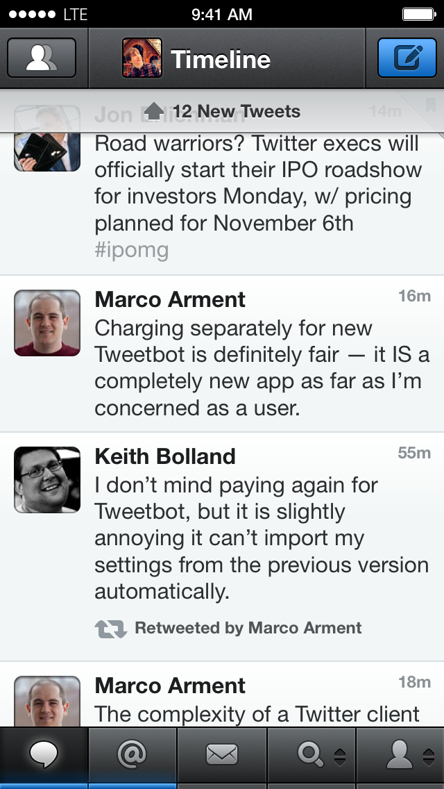
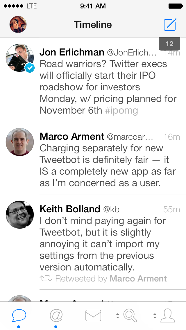
The main timeline view of Tweetbot 3 has been lightened to fit the standard iOS 7 style. Gradients and fat, buttony buttons have been exchanged for lighter off-whites and thinner icons. The status bar has been integrated into the main title bar, and profile pictures are now circles instead of rounded rectangles. Unread posts are signified in the tab bar by small blue dots instead of thick blue bars, and the icon of the current tab is highlighted blue. Your personal profile picture has moved to replace the accounts icon, and the timeline button is no longer a button to access your lists. Instead, lists are now an option for the customizable tab bar buttons, which remain the last two in the row. Tap and hold on these icons to see the options to choose from bounce up into a column from the bottom. You can swipe to the left on any tweet to see the entire conversation, or tap on one to see the same options to respond, retweet, favorite, etc. as the old Tweetbot had. When you tap on a tweet it is highlighted dark grey as the options fold out underneath. The triple tap to reply gesture is for the birds in Tweetbot 3, but since this means Tweetbot no longer needs to wait to see if you’re going to tap multiple times, it can respond far quicker to your first tap, constituting much of the app’s new feeling of greater responsiveness.
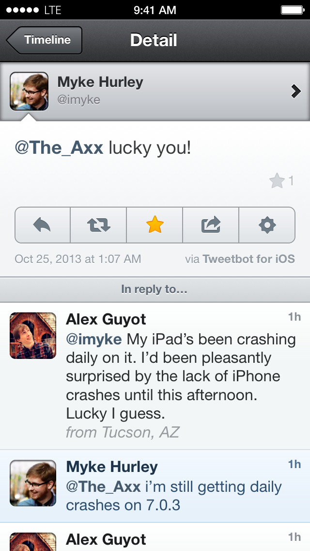
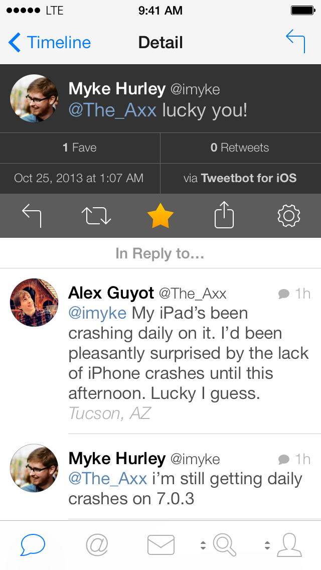
Conversation view, revealed by swiping to the left on any tweet, is very nicely redesigned. The tweet you swiped to get there is displayed in the same black color as any selected tweet, with the action menu directly below it, and the previous tweets in the conversation below that. I love the new emphasis on retweets and favorites. Always buried within submenus on Tweetbot 2, now they are both displayed prominently within the selected tweet. You can tap the retweets button to see retweets within the app, but the favorites button will launch the web browser to show the tweet in Favestar. A swipe right gesture from the left edge will bring you back to the timeline when you’re finished.
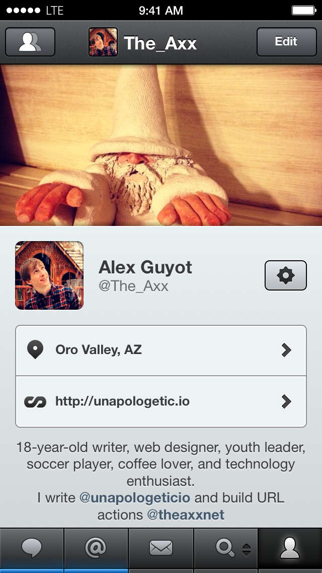
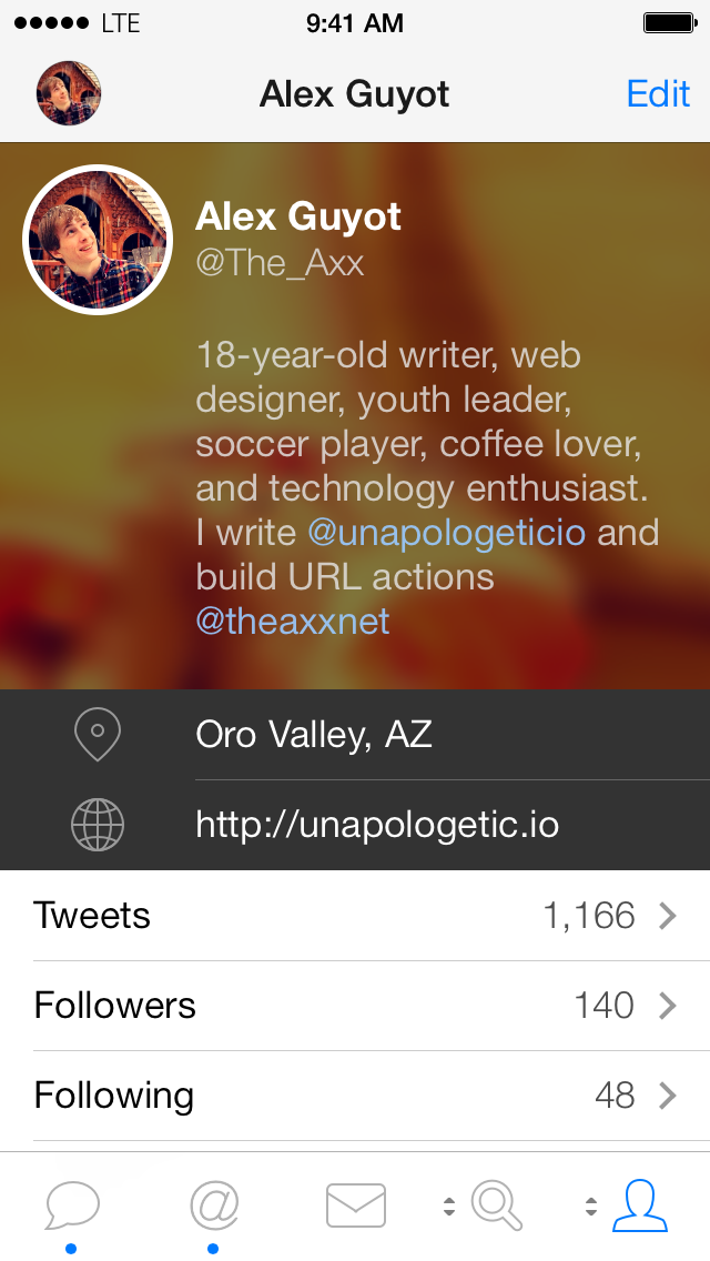
The new profile view is possibly my favorite part of the app. Instead of the old model of placing the account username and description beneath the background photo, Tweetbot 3 instead overlays this info on top of it. This saves a significant amount of space, meaning you no longer have to scroll down to access a users tweets from their profile view, but the best part comes from swiping down from any point in the profile view (assuming the profile in question has a background photo). I’ll let you try it yourself to see what it does, but I was delighted by it, and played with the effect for a few minutes the first time I experienced it.
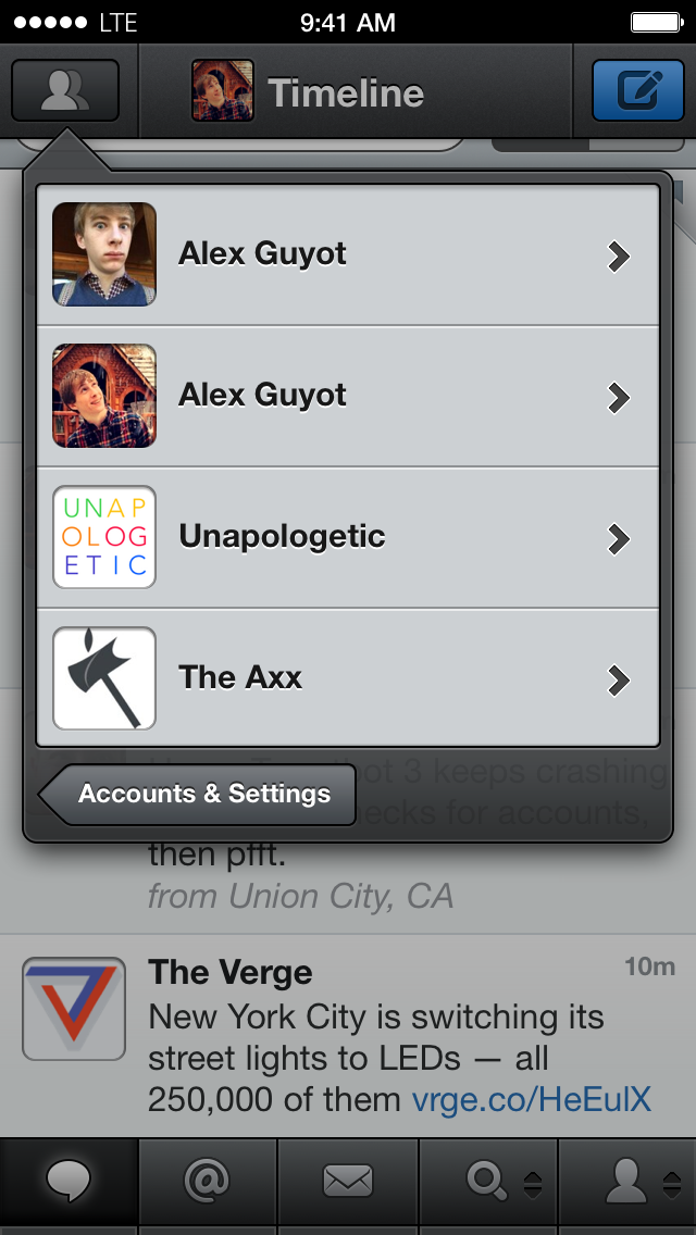

Instead of the old modal window from Tweetbot 2, tapping the accounts button in the top left in Tweetbot 3 now triggers a beautiful animation, blurring the background and zooming it back behind the darker interface for picking between your accounts. The account bubbles and names all slide from the right to the left of the screen, and bounce when they hit the left edge. The animation is beautiful, but I switch accounts quite a lot, so it’s a little too slow for my tastes.
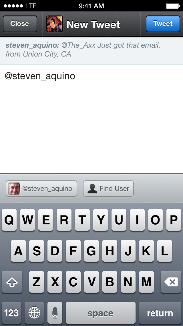
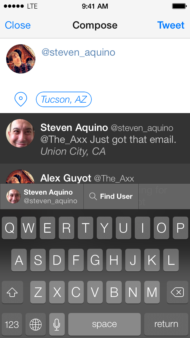
When composing a new message in Tweetbot 3, it’s no longer necessary to pull down on the text box to view the contents of the message you are responding to. (The Tweetbot 2 screenshot above was taken while swiping down and holding so that the contents of the message I was replying to, normally hidden above the top of the frame, was visible.) Instead, the whole conversation before your reply is displayed between the text box and the keyboard so that you can easily check it and remember what exactly was being said. The view does feel a little cluttered now, but the added information seems worth the small sacrifice. The buttons above the keyboard for suggesting usernames or hashtags as you type them has been tweaked to fit the new UI as well. Thankfully, the odd symbols that Tweetbot 2 used for hashtags and at mentions, which always confused me, have been replaced by large “@” and “#” symbols, eliminating the issue. (These symbols show up above the keyboard when a username or hashtag is not being displayed.) It’s also a great relief to finally have access to the iOS 7 keyboard in Tweetbot, as being stuck on the old keyboard was my biggest annoyance with having to wait for the new app the last few weeks.
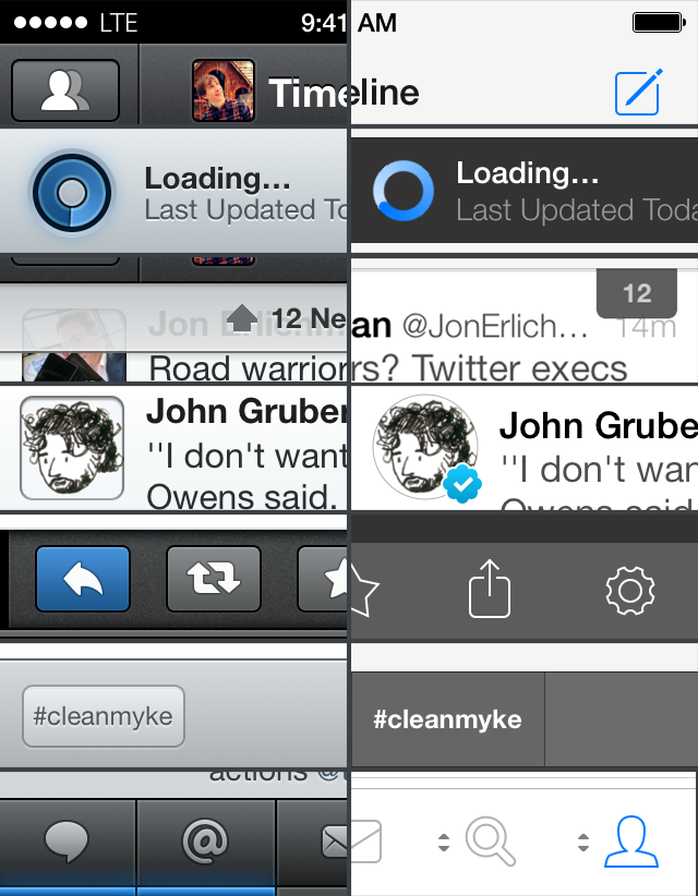
Here’s a photo I cobbled together from screenshots of both apps showing a few of the new design aspects I mentioned above more closely, as well as some I didn’t discuss. The new loading animation is much more subtle and nice looking, although I admittedly miss the sound effect that the old one made, which had always been one of my favorites in the app. Speaking of sound effects, they’re all new as well, and while I definitely do like the new ones, I loved the old Tweetbot noises as well, so overall it will just take some time to adjust. I don’t think either set is necessarily better than the other, but the new one does sound a bit less robotic, fitting in with the rest of the app.
One of my other favorite changes to Tweetbot 3 is the new graphic for how many unread tweets remain in my timeline. Instead of the thick bar obscuring a good portion of the top tweet in my timeline, I now get a far smaller and simpler little tab at the top right of the timeline. Tapping the tab will still dismiss it just like swiping up on the bar did in Tweetbot 2.
An aspect of the design I don’t particularly like, verified users now receive blue checkmarks on their profile picture at all times, even inside of the timeline. This information seems superfluous, I don’t usually need to be reminded that someone I follow is verified every time they tweet. I hope Tapbots will remove this in the next update.
Overall, Tweetbot 3 is an incredible update to our favorite flying friend. While many developers flocked to simple, visual redesigns which were mostly no more than a new skin on their old app, Tapbots has taken a much different approach. Instead of prioritizing speed over functionality, Tapbots took its time and released a product that they could truly be proud of. Our little bird has spread its wings, evolving into the form it was meant to be, and I can’t wait to see where it flies from here.
You can get Tweetbot 3 on the App Store, and for a limited time, it’s on sale for only $2.99.