Skim
October 21, 2013
A few days ago, the guys at Shipp, along with a few others, released their new app, Skim, on the App Store. While still a young app, the idea behind Skim is really interesting. In wake of the recent Snapchat craze, Skim is taking advantage of the cultural interest in self-destructive exchanges and trying to apply that to text messaging. While Snapchat has always supported text as well, the design has never been very friendly, placing an ugly black bar with white text across your photo, and it limits the amount of text you can actually write. While the implementation of text in Snapchat could probably be improved, the problem of being able to write more text really cannot. Disregarding the fact that Snapchat is primarily a photo app anyway, and having more text on top of your picture doesn’t make a lot of sense, this would be a problem regardless because the time people take to read the text is going to vary so greatly that their simple time intervals of 1 to 10 seconds would no longer work. It only takes a moment to understand a picture, but it takes far longer to read text. Skim has solved this problem with an implementation that functions fantastically, while still maintaining an incredibly beautiful design.
Instead of following Snapchat, allowing users to choose from an assortment of predefined time intervals, which wouldn’t make sense in a text based app, Skim has the option for the receiver to choose between slow, medium or fast text speeds. The default is medium, and that works fine for me. When you receive a message, you will get a push notification which takes you to Skim, but does not immediately open the message. This is a smart choice, as you may not be quite ready to read when you hit the notification, and since messages self-destruct as you read them, you need to be prepared to do so or risk missing the message completely. Once you are in the app and a message is awaiting you, tap on the cell and the entire interface will slide off to the left as the message slides on behind it. You now have a few moments to begin reading before the message begins to self-destruct (I believe it is one second on medium speed). This is where Skim really shines. Instead of just giving you a set amount of time to read the message, then deleting it, messages in Skim begin to slowly fade away from the beginning to the end. Each letter disappears as if someone is erasing it bit by bit. The effect is beautiful, and the metaphor makes so much sense in regard to what the app is all about. Instead of reading your message and then assuming it has been deleted when it goes away, you are literally watching out of the corner of your eye as your message is being erased above the point at which you are reading.


The speed you have chosen in settings determines how quickly the text fades away, but even when set to fast I have no problem reading my messages in time. For slower readers, I would be surprised if medium or slow went by too fast for them. Once you’ve finished reading the message, it isn’t necessary to wait until the animation completes to reply, you can tap the reply button at the top right corner at any time you want to begin typing your response. When you tap the reply button, the screen slides to the left again, giving the whole interface a nice feeling of being set within three panes: the main area with all of your conversations listed, the second pane where you read messages, and the third pane when you reply. When you finish your reply, the screen slides to the right to bring you back to the main view, which makes sense again since the secondary view self-destructed, and thus, no longer should be between the other two. One feature I think would benefit the app even more would be the ability to swipe to the left from the right edge to move from the main view to the reading view, or the reading view to the replying view. The app is set around these three views so well that I think something along those lines would fit in completely naturally. The one piece of the app at odds with this metaphor of horizontal movement is the settings screen, which slides up from the bottom when you tap the gear in the top left corner of the main screen. I think it would be far more natural if settings was positioned as a fourth pane that was off to the left instead of the right, and it could be accessible from a left-to-right swipe. On the other top corner of the main view is a pencil icon to send a new message. Tapping that also brings a view up from the bottom, but this makes more sense because it is another view, just like the main view, to begin a conversation from. Once you pick a friend to send a message to, the screen slides left again to reveal the compose message panel as it naturally should. Maybe my settings suggestion is nit-picky, but as it is, swipe-right gestures are completely nonexistent in the app, and with the iOS 7 system wide swipe-right-from-left-edge gesture to go back, it would seem natural for a horizontal sliding app like Skim to access settings in this manner instead of only with the small button in the top left.
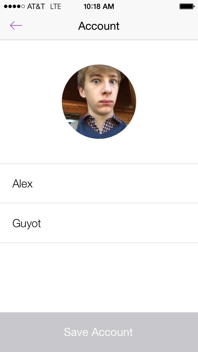
Within settings, your choices are pretty sparse, which makes sense for such a simple app. You have choices of Account, Friends, Text Speed or Notifications, then below those are options to see the About page, send feedback, or sign out. Within account the only options are to set your first and last name, or change your profile picture. Accounts themselves are drawn, when you first open the app, from either Facebook or Twitter, so the lack of a lot of options here isn’t too odd, but the account screen in settings still seems a bit sparse, leaving too much white space.
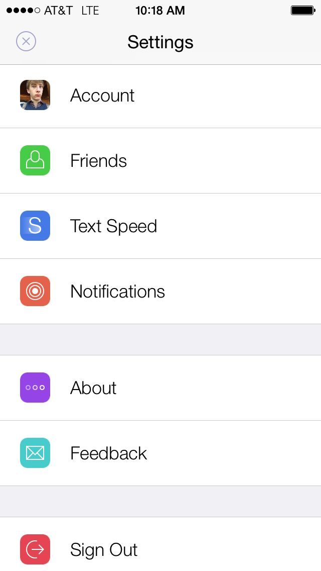
The second view in settings is Friends. Tapping this brings you to a list view of all your current friends in the app. At the top of the list are buttons to switch between confirmed friends and people requesting to be your friend, the latter also including pending requests of your own to others. Each friend you have is displayed as a list item, and you can swipe across any of these items to reveal options to delete the friend or send them a message (skim them? Send them a skim?). These are the same options available in the main view when you swipe conversation cells to the left, giving the whole app a nice and cohesive UI. An odd omission from the friends screen is the ability to actually add friends. This can only be achieved from the main view by tapping the new message icon. That reveals a screen displaying all your confirmed friends in a list, as well as a text field at the top to search for new friends by name. Once you find them you can request them, but you can’t actually send them a message until they confirm. The list of friends will also include Facebook friends or people you follow on Twitter, depending on which account you linked, who you haven’t yet friended, providing a quicker way of requesting people you’re more likely to be chatting with. Once your friends have confirmed your requests you can message them, and they will appear back in your friends list in settings. I do find it a bit odd that, while everyone’s accounts on Skim are created from their accounts on Twitter or Facebook, there are no links back to these accounts, so there is no way to get information on who a person is except through their profile pictures and names. It would be really nice if Skim would search for what apps you had installed on your phone, and then provide a quick link to view someone’s profile in Facebook or Twitter. For a really nice feature, they might even look for Tweetbot or Twitterrific, and let you open profiles in those as well.
The third view in settings, Text Speed, is very straightforward. It displays three large cells, each with a circle inside with the words “Slow”, “Medium” or “Fast”. Simply tap anywhere in any cell to select that option. There is no further indication of the exact speed which each option will erase content at.
The last option in settings, Notifications, is just a checklist of what you wish to receive notifications from Skim for. It includes the option to receive a notification if a friend takes a screenshot of a message you send them. Unlike in Snapchat, you do not have to hold a finger down on the screen or do anything else to allow you to take a screenshot. All the notifications are on by default. I do wish Skim would add support for in-app notifications, because if you receive a new message while in Skim your phone will buzz, but there is no other way to know the nature of the message without returning to the main view and looking for which friend has a blue circle on the side of their conversation cell, indicating a new message is awaiting you.
If I could add one more setting to Skim, it would be the option to change the font size in the compose screen. The current font size, which you cannot change, is far too big for my liking, and the margins on either side are too big as well. This is my own personal preference of course, but I think this font size is a bit too big for the average user in general, and an option in settings would be nice.
Overall, Skim is a beautiful app which focuses on doing one thing well: creating an environment for self-destructing conversations. Skim claims on the website that such conversations are more akin to real life conversations, in which you never have a back up and must always live in the moment of. Skim’s graphical way of displaying the destruction of your messages, by fading them out as you read, is beautiful and functional, and it’s my favorite part of the app. Skim is still young, and I hope they fix a few of the issues I brought up above, but overall, if the idea of “conversational freedom” appeals to you, or you just want to play around with and experience the great design, you should check Skim out. You can grab Skim for free on the App Store.